 View review
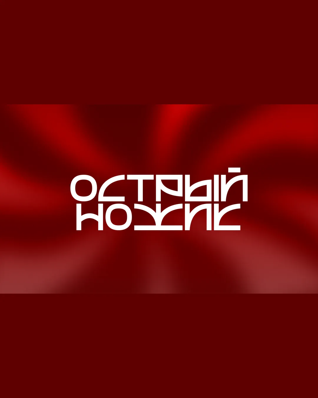
Logo score
Logo review of
Острый Ножик (ostryy Nozhik In Cyrillic..
Review the detailed scores below to see what is working and what should be refined first.
Objective AI feedback. Your creative decision.
Legibility
Originality
Misread
Balance
Scale
Detailed review
Logo performance breakdown
Legibility
 Typeface is bold and consistent in weight. Text forms a recognizable block for visual unity.
 Legibility is severely compromised by experimental letterforms. The custom geometric style makes individual characters hard to distinguish. Lower row is a mirrored version, which disrupts readability.
Originality
Unconventional mirrored type treatment is highly creative. Custom letterforms offer strong uniqueness.
Originality comes at the cost of usability. Stylistic approach may alienate audiences unfamiliar with the type trick.
Color harmony
Red and white palette provides energetic, high-contrast harmony. Color usage is focused and not overwhelming.
Background gradient risks overpowering the main mark.
DarkRed
#A30303
BrightRed
#F80000
White
#FFFFFF
Your palette is close. Refine the color roles and combinations before updating the logo.
Build brand colorsBalance alignment
Symmetrical layout provides good visual weight balance. Forms a visually pleasing geometric block.
Mirrored lower line creates mild visual confusion and disrupts natural reading flow.

Scalability
Strong geometric form maintains structure at larger sizes. Simple color palette aids some scalability.
Thin line spacing and intricate character connections may get lost at small sizes such as on business cards or social media avatars. Complexity may not translate well to embroidery, stamps, or low-res applications. Background gradients can reduce versatility on non-digital media.
200x250 px
100×125 px
50×62 px
Misinterpretations
No inappropriate or unintended imagery present in the composition.
Try your own review
Review my logo
Wondering how your logo performs?
Get a clear logo score, key risks, and priority fix ideas before your client or audience sees it.
Keep exploring


