View review
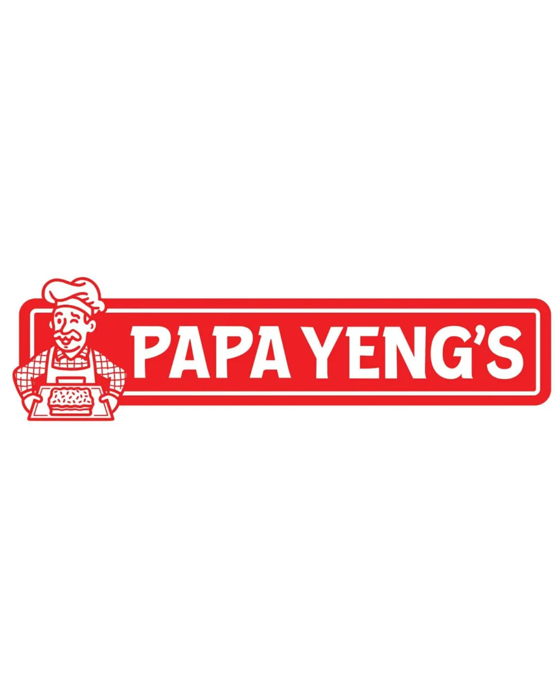
Papa Yeng's
Workable starter logo with clear readability—needs product cues and integration improvements before broader deployment.
What to fix first
The most important fixes to handle before polishing the full presentation.
Update the mascot or background elements to include an identifiable cassava cake or more direct representation of the core product.
High priorityCurrent mascot is generic; stronger product linkage will better serve in capturing target market.
Impact: Improves Product Recognition/focus And Brand Distinctiveness · Effort: Medium
Refine mascot-to-frame/join for a more integrated silhouette and modern polish.
Medium priorityCurrent join between mascot and box feels tacked-on; a unified construction will visually strengthen the whole logo.
Impact: Enhances Cohesion And Professionalism · Effort: Medium
Logo performance breakdown
Legibility
Strong contrast and clear bold font enhance readability.
Letterforms are highly legible at most sizes.
Originality
Mascot illustration personalizes the branding.
Chef mascots and rectangular wordmarks are common in food branding; lacks a unique twist.
Color harmony
Red and white combination is energetic and food-appropriate.
Palette is simple, maximizing recall.
May appear too generic or similar to other food brands using the same palette.
Red
#ED1C24
White
#FFFFFF
Your palette is close. Refine the color roles and combinations before updating the logo.
Build brand colorsBalance alignment
Wordmark and mascot are visually balanced horizontally.
Rectangular container creates clear edges.
Mascot's placement interrupts the left frame and may feel slightly disconnected from the box.
Scalability
Simple lines and limited colors promote scaling.
Wordmark remains visible at reduced sizes.
Mascot illustration may lose detail at very small sizes.
200x250 px
100×125 px
50×62 px
Misinterpretations
No inappropriate or confusing dual readings detected.
No AI design signals found
Likely designed by a human
Mascot details and layout appear purposefully constructed without AI artifacts.
- Consistent linework and human-like illustration style.
- All text is clearly constructed and error-free.
Visual assessment; not definitive proof of authorship.
Logo structure & brief match
Mascot thematically fits with the brand’s food category and complements the wordmark.
Integration could be tighter to form a more cohesive unit.
Product Focus (cassava Cake And Pasalubong): Chef mascot suggests homemade or baked specialties, which fits the product context. However, no direct visual reference to cassava cake or pasalubong items.
Wondering how your logo performs?
Get a clear logo score, key risks, and priority fix ideas before your client or audience sees it.