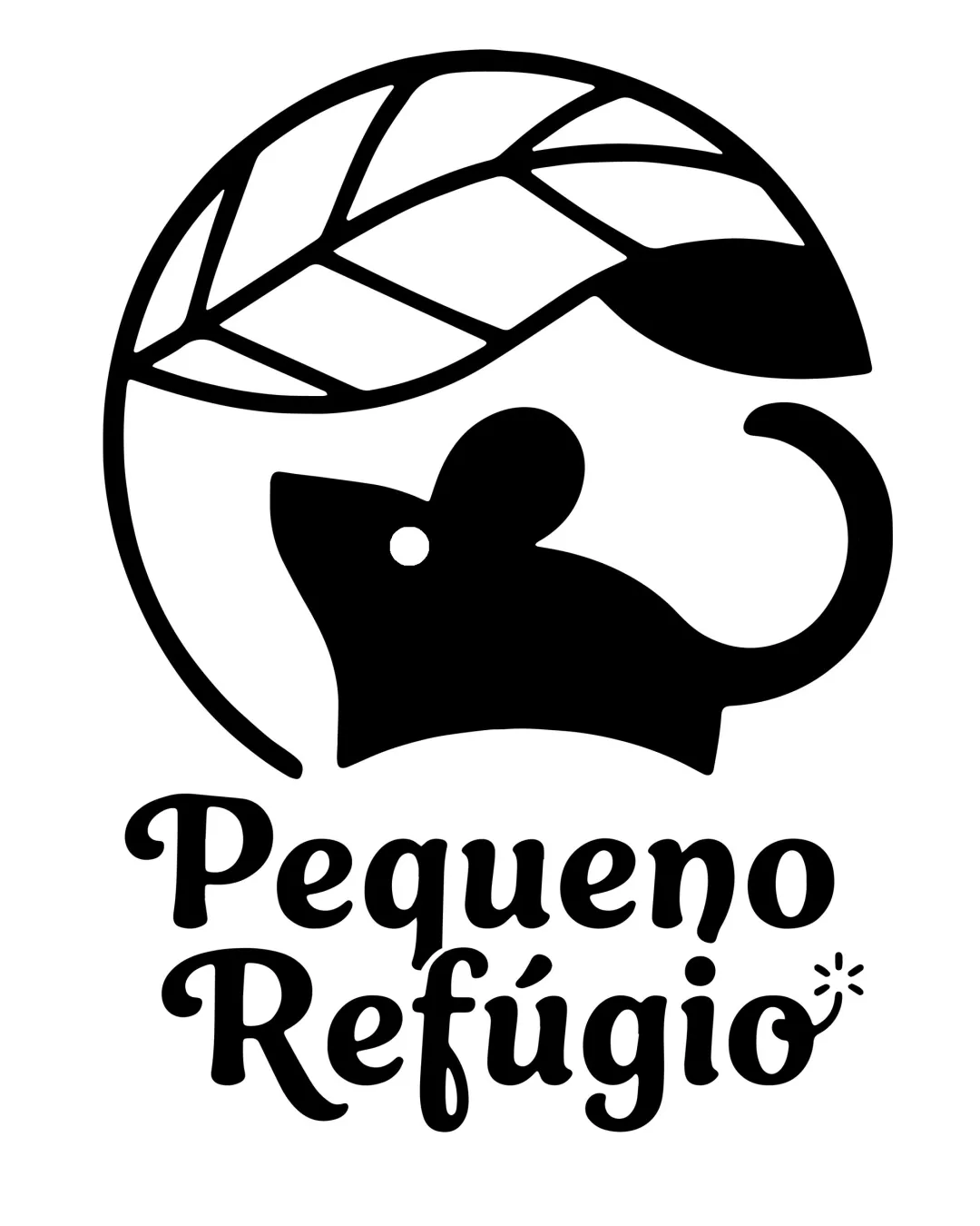
Pequeno Refúgio logo review
4.2 / 5
Logo score
Logo review of

Pequeno Refúgio

Distinctive, on-brief, and nearly client-ready.

Combination Mark Cute Minimalist Arts And Crafts
4.5/5
Legibility
4/5
Originality
5/5
Misread
4.5/5
Balance
4/5
Scale
Action plan

What to fix first

The most important fixes to handle before polishing the full presentation.

1

Minimize or simplify the decorative spark/hook on the 'i' for legibility at small sizes.

Medium priority

Tiny embellishments can hinder readability in reduced versions.

Impact: Ensures Optimal Clarity For All Display Sizes. · Effort: Low

Detailed review

Logo performance breakdown

4.5/5

Legibility

Checkmark icon Text is large and clear with decorative but readable font

Warning icon Slight embellishment on 'i' may reduce clarity at very small sizes

4/5

Originality

Checkmark icon Mouse and leaf integration is clever and fitting; inviting character

Warning icon General silhouette is not highly unique within cute/animal logo category

4.5/5

Color harmony

Checkmark icon Monochrome is strong for versatility, easy to recolor

Warning icon Lacks a defining palette for emotional nuance, could feel flat if color needed

Black
#000000

White
#FFFFFF

Your palette is close. Refine the color roles and combinations before updating the logo.

Build brand colors
4.5/5

Balance alignment

Checkmark icon Good centering of symbol over text; overall layout feels harmonious

Warning icon Logo mark proportionally larger than text, slightly top-heavy

logo 200x250 pixels scalability test alignment grid overlay
4/5

Scalability

Checkmark icon Bold solid shapes allow good reduction; works monochrome

Warning icon Small decorative spark on 'i' may be lost at small sizes

logo 200x250 pixels scalability test

200x250 px

logo 100x125 pixels scalability test

100×125 px

logo 50x62 pixels scalability test

50×62 px

5/5

Misinterpretations

Checkmark icon No inappropriate or embarrassing resemblance detected

Beta

No AI design signals found

Likely designed by a human

Logo construction and coherence appear deliberate, with consistent style throughout.

  • Consistent geometry and character shapes
  • No detectable AI artifacts or nonsensical forms

Visual assessment; not definitive proof of authorship.

5 / 5

Logo structure & brief match

Checkmark icon Style and mood of mark and wordmark are strongly unified

Checkmark icon Comfortable, Cute, Whimsical, Cozy: Mouse, rounded typography, and supportive leaf all evoke coziness and friendly charm.

Try your own review

Wondering how your logo performs?

Get a clear logo score, key risks, and priority fix ideas before your client or audience sees it.

Review my logo