What to preserve
A dynamic 3D 'W' symbolizes creativity and digital-forward thinking, supported by clear, confident typography for a marketing/design firm.
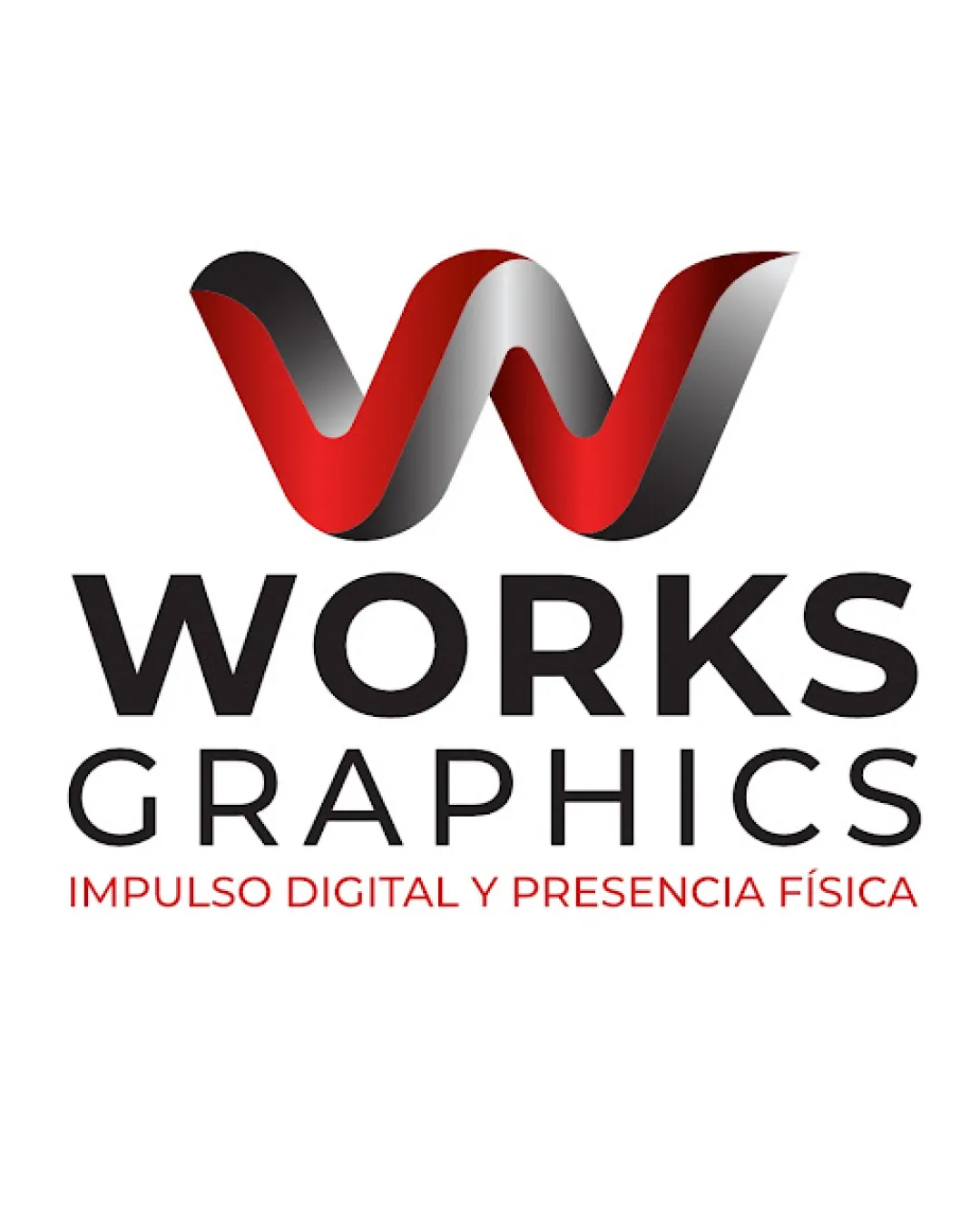
Flat elements and rendered 3D shading use conflicting visual treatments; unify the style and simplify the shaded details.
This logo lockup needs a consistent rendering style; mixing flat elements with rendered 3D detail limits its originality, style consistency and scalability scores.
Focus on the changes that matter. Keep what makes the logo work.
A dynamic 3D 'W' symbolizes creativity and digital-forward thinking, supported by clear, confident typography for a marketing/design firm.
Logo preview unavailable. The written feedback is still available on this card.
3D mark
Fine gradient transitions and highlights may lose definition at very small scales or in reduced color contexts.
See the category reviewThe 3D W mark and strong wordmark express creativity and digital presence, fully aligning with the creative and marketing firm brief.
Wordmark 5/5 · Layout 5/5
Symbol 4/5 · Wordmark 4/5
Gradient silver/black shading adds realism but creates a more complex palette compared to the flat black/red text; not jarring but nuance is perceivable.
Estimated colors. Use the original design file for exact values.
Create a full color palette using these colors
Create new paletteSymbol 4/5 · Wordmark 4/5 · Layout 4/5
The 3D 'W' symbol is visually heavy and attracts attention away from the wordmark below, slightly competing for primary focus in the lockup.

Inspect spacing with the guide. Optical balance may differ from geometric centering.
Symbol 2/5 · Wordmark 5/5 · Layout 3/5
Modeled highlights and shadows add detail that needs simplification for consistent flat reproduction.
Fine gradient transitions and highlights may lose definition at very small scales or in reduced color contexts.
Try: Test the symbol at small scale and in single-color versions to ensure recognizability.
Logo preview unavailable. The written feedback is still available on this card.
Symbol 2/5 · Wordmark 3/5
Conflicting flat and rendered 3D treatments weaken the coherence of the logo's distinctive forms.
Flat elements and rendered 3D shading use conflicting visual treatments, even when their colors match.
Get a clear logo score, key risks, and priority fix ideas before your client or audience sees it.
More credits needed
Add credits to continue without losing your work.
Then $7/month. Cancel anytime.
Essential logo review with AI
Estimated progress