Concept & direction
The emblem combines automotive imagery, desert landscape, and suspension parts to express a performance automotive theme, but is visually complex for a logo.
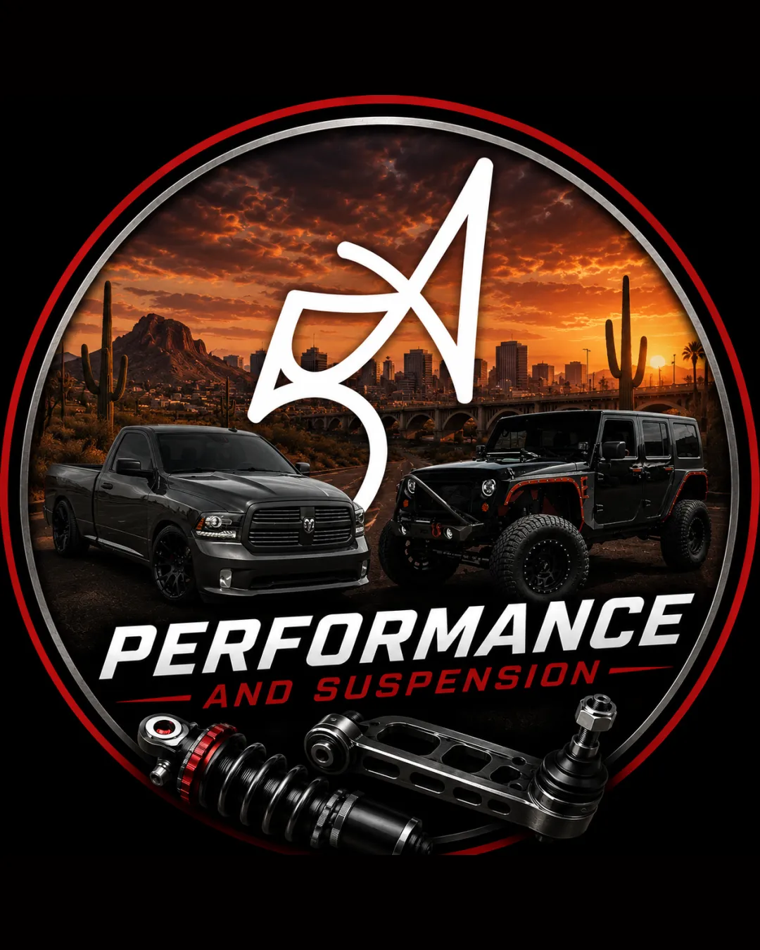
Creative and bold in theme, but excessive detail and unclear monogram significantly weaken utility at Instagram scale; a simpler, bolder approach is recommended for brand visibility.
This emblem has a workable foundation; improving text readability is the clearest next step.
Focus on the changes that matter. Keep what makes the logo work.
The emblem combines automotive imagery, desert landscape, and suspension parts to express a performance automotive theme, but is visually complex for a logo.
overall emblem
Photo background, detailed vehicles, cityscape, and mechanical parts create a high-density design; intricate detail is likely to be lost or become indistinct at Instagram avatar or small scale.
See the category reviewToo visually dense and intricate for effective Instagram logo use; complex elements compromise impact and recognizability at small size.
Estimated colors. Use the original design file for exact values.
Create a full color palette using these colors
Create new paletteThe wordmark and suspension components overlap slightly and visually compete for attention, reducing focus on the brand name.

Inspect spacing with the guide. Optical balance may differ from geometric centering.
The stylized '5A' monogram is not clearly distinguishable at a glance, potentially impacting recognizability and brand recall.
Photo background, detailed vehicles, cityscape, and mechanical parts create a high-density design; intricate detail is likely to be lost or become indistinct at Instagram avatar or small scale.
Try: Simplify the design for small-scale readability.
Get a clear logo score, key risks, and priority fix ideas before your client or audience sees it.
More credits needed
Add credits to continue without losing your work.
Then $7/month. Cancel anytime.
Essential logo review with AI
Estimated progress