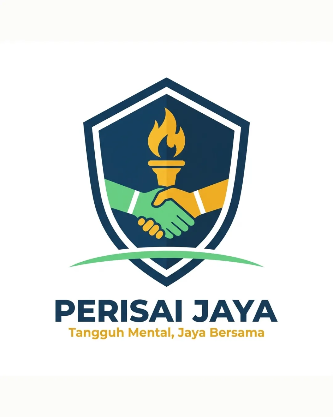
PERISAI JAYA Tangguh Mental, Jaya Bersama logo review
3.7 / 5
Logo score
Logo review of

Perisai Jaya Tangguh Mental, Jaya Bersama

Solid, context-appropriate logo but should pursue stronger originality for long-term brand value.

Combination Mark Modern Emblem Education
5/5
Legibility
3/5
Originality
5/5
Misread
4/5
Balance
4/5
Scale
Action plan

What to fix first

The most important fixes to handle before polishing the full presentation.

1

Develop a simplified version for small-scale uses to maintain tagline legibility.

Medium priority

Tagline may be illegible at small sizes.

Impact: Improves Versatility And Clarity In Various Applications. · Effort: Medium

2

Explore custom or less generic iconography for the handshake or torch to boost distinctiveness.

Medium priority

Motif is contextually correct but widely used.

Impact: Enhances Brand Memorability And Reduces Generic Appearance. · Effort: Medium

Detailed review

Logo performance breakdown

5/5

Legibility

Checkmark icon All text is highly readable and clear.

3/5

Originality

Checkmark icon Combination of handshake, torch, and shield is contextually relevant.

Warning icon Motif is common for educational and community organizations; not unique.

4/5

Color harmony

Checkmark icon Color palette is well-coordinated and communicates trust and energy.

Warning icon Three main colors create some complexity; may need a one/two-color version for simplicity.

Catalina Blue
#113651

Mantis
#50B763

Gold
#FFC838

White
#F7F7F7

Your palette is close. Refine the color roles and combinations before updating the logo.

Build brand colors
4/5

Balance alignment

Checkmark icon Shield, icons, and text are well-centered and visually stable.

Warning icon Slight imbalance in color weighting between hands gives a minor visual tilt.

logo 200x250 pixels scalability test alignment grid overlay
4/5

Scalability

Checkmark icon Bold shapes and solid lines aid visibility at small sizes.

Warning icon Secondary tagline may lose clarity if scaled very small.

logo 200x250 pixels scalability test

200x250 px

logo 100x125 pixels scalability test

100×125 px

logo 50x62 pixels scalability test

50×62 px

5/5

Misinterpretations

Checkmark icon No inappropriate or confusing dual meanings detected.

Beta

No AI design signals found

Likely designed by a human

Design appears coherent and professionally constructed with deliberate details.

  • Consistent geometry and clear, logical symbol integration.

Visual assessment; not definitive proof of authorship.

5 / 5

Logo structure & brief match

Checkmark icon Mark and wordmark pair cohesively by color and style.

Checkmark icon Detected Industry: Visual language is a good fit for an educational or team-building context, signaling unity, aspiration, and protection.

Try your own review

Wondering how your logo performs?

Get a clear logo score, key risks, and priority fix ideas before your client or audience sees it.

Review my logo