PHAOS logo review
3.5/5
Logo score Monogram category Possible misinterpretation

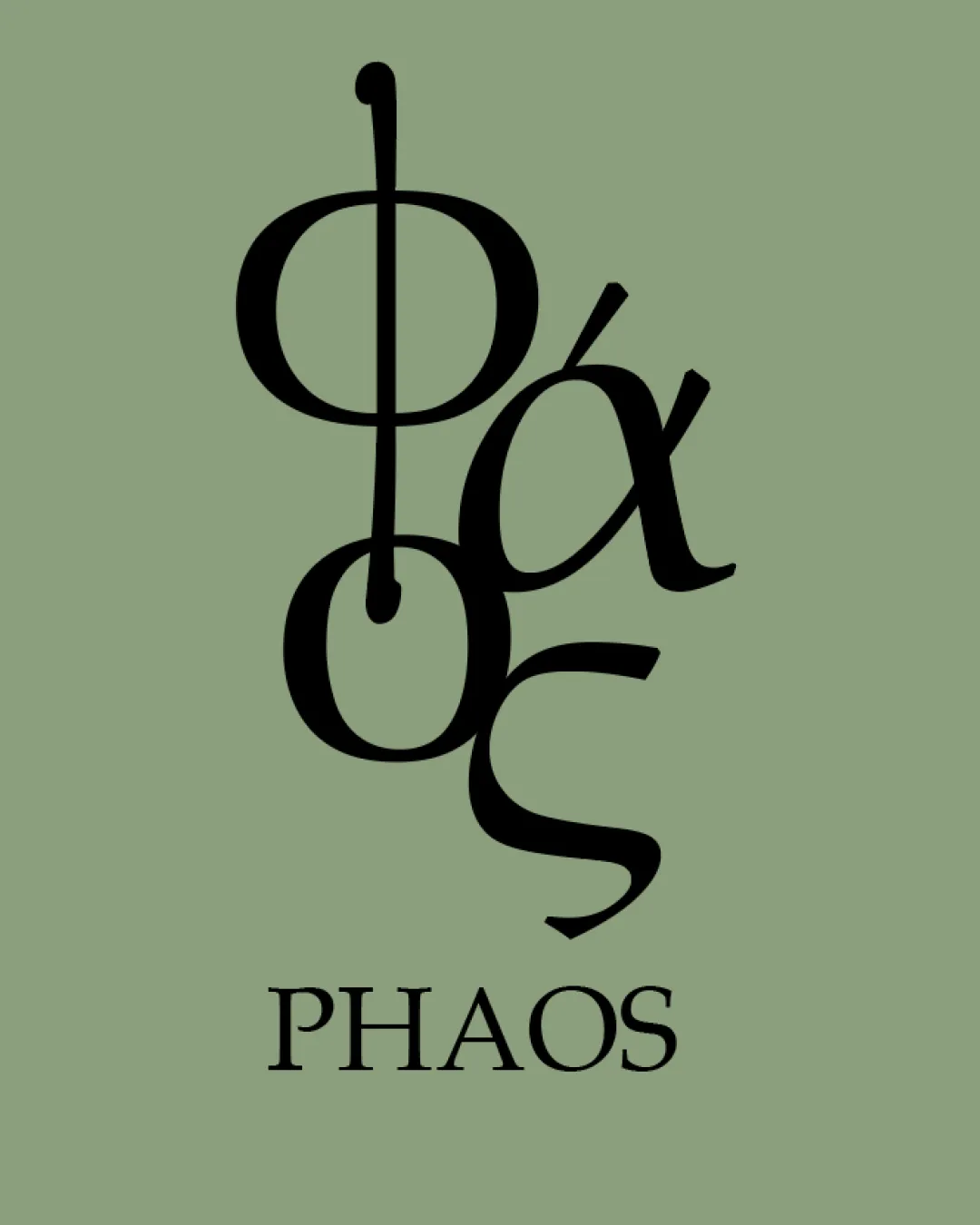
PHAOS

cristina-sampaol Essential logo review

Unique style with industry-appropriate palette, but needs a clearer, simpler monogram to be viable for a professional pharmaceutical/olive oil brand.

Symbols recognized:
Overlapping stylized Greek letters forming a vertical monogram
Legible text:
PHAOS
Monogram Serif Abstract Minimalism Pharmaceutical
2/5
Legibility
4/5
Originality
3/5
Balance
3/5
Scale
Your next steps

What to fix first

Focus on the changes that matter. Keep what makes the logo work.

1

Check the possible misinterpretation

Visual complexity could confuse meaning at a glance.
2

Redesign the monogram for improved legibility and less letter overlap—keep Greek character inspiration but prioritize quick readability.

High priority Medium effort

Difficult to read immediately, may harm brand recognition and trust.

Major

3

Adjust proportional relationship between monogram and wordmark to achieve better overall balance and reduce visual density of top mark.

Medium priority Low effort

Top-heavy stack can appear awkward and crowd the design.

Moderate

Detailed review

Logo performance breakdown

Not scored

Brief & logo match

Greek monogram alludes to tradition and substance, and the palette fits a premium, natural health product. The lack of clarity in the logomark might hinder trust or memorability for a medical or premium oil product.

2/5

Legibility

  • The 'PHAOS' wordmark at the bottom is clear.
  • Stacked monogram above is difficult to read and interpret quickly.
  • Overlapping shapes reduce textual clarity.
4/5

Originality

  • Distinctive use of Greek-inspired typography and vertical arrangement.
  • Visual complexity may resemble generic academic/Greek motifs.
5/5

Color harmony

  • Olive green and black palette is well-balanced, premium and pharmaceutical appropriate.
Olive Green#8A9A79
Black#222222

Estimated colors. Use the original design file for exact values.

Create a full color palette using these colors

Create new palette

3/5

Balance alignment

  • Centered alignment of the vertical stack.
  • Stacked monogram creates top-heavy composition and feels visually dense.
Uploaded logoAlignment guide overlay

Inspect spacing with the guide. Optical balance may differ from geometric centering.

3/5

Scalability

  • Simple color palette enhances versatility.
  • Heavy overlapping detail in the monogram could visually collapse or become unreadable at small sizes.
4/5

Misinterpretations

  • No overtly inappropriate or embarrassing shapes apparent.
  • Visual complexity could confuse meaning at a glance.
4/5

Symbol & text fit

  • 'PHAOS' wordmark style matches the monogram's serif approach.
  • Disconnect in clarity: wordmark is readable, mark is not.
Try your own review

Wondering how your logo performs?

Get a clear logo score, key risks, and priority fix ideas before your client or audience sees it.

Review my logo