Check the possible misinterpretation
Repetition of 'PI PI' could be read as childish slang or inappropriate in some languages/contexts
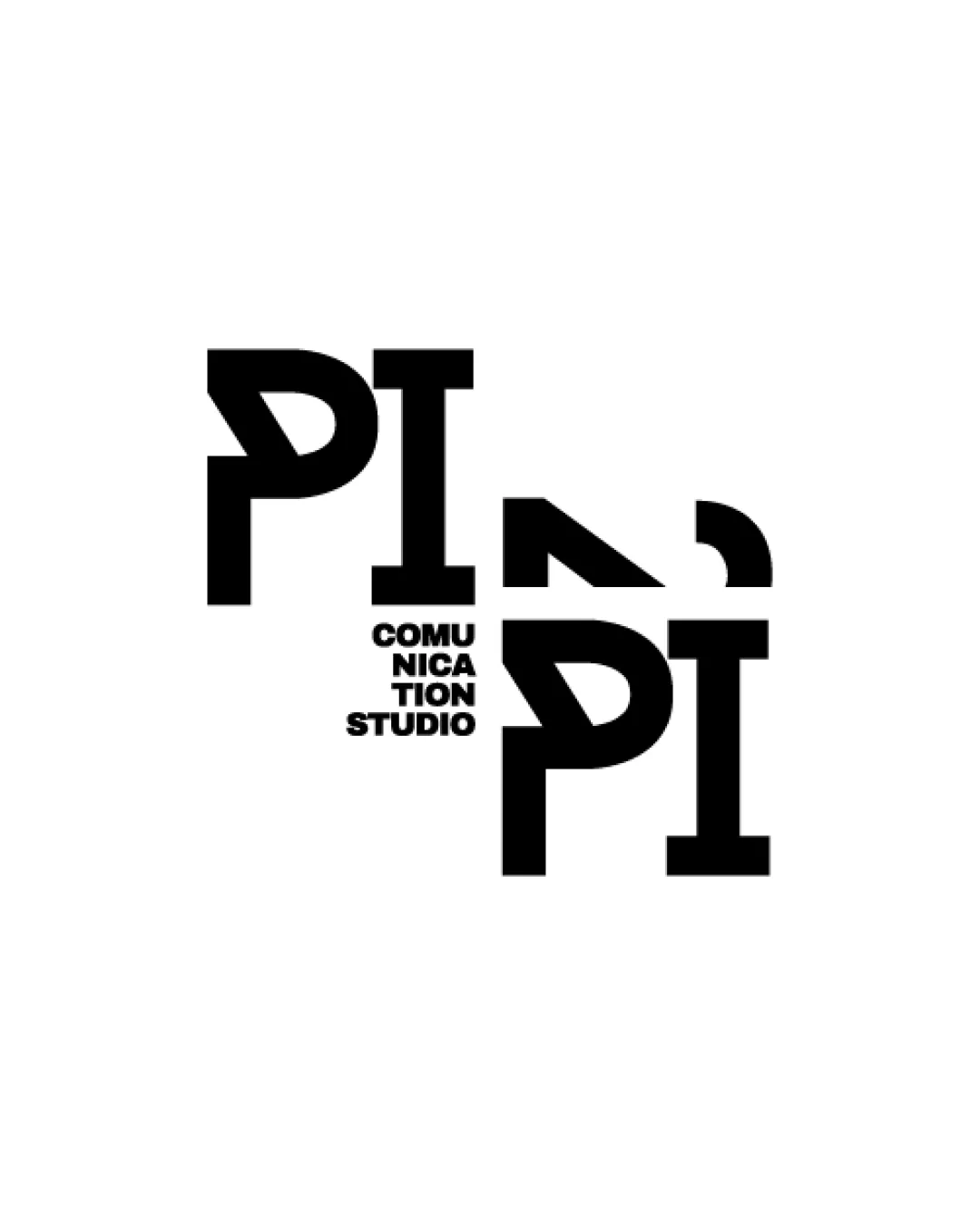
High-risk visual misinterpretation detected. Resolve this before presenting the logo.
Focus on the changes that matter. Keep what makes the logo work.
Repetition of 'PI PI' could be read as childish slang or inappropriate in some languages/contexts
Tiny text block impairs balance and legibility, especially at small sizes.
medium
Bold typographic approach suggests creativity and communication focus, but legibility issues may undermine clarity for studio branding
Estimated colors. Use the original design file for exact values.
Create a full color palette using these colors
Create new palette
Inspect spacing with the guide. Optical balance may differ from geometric centering.
Get a clear logo score, key risks, and priority fix ideas before your client or audience sees it.
More credits needed
Add credits to continue without losing your work.
Then $7/month. Cancel anytime.
Essential logo review with AI
Estimated progress