PISGAH BROTHERS logo review
4.5/5
Logo score
Logo review of

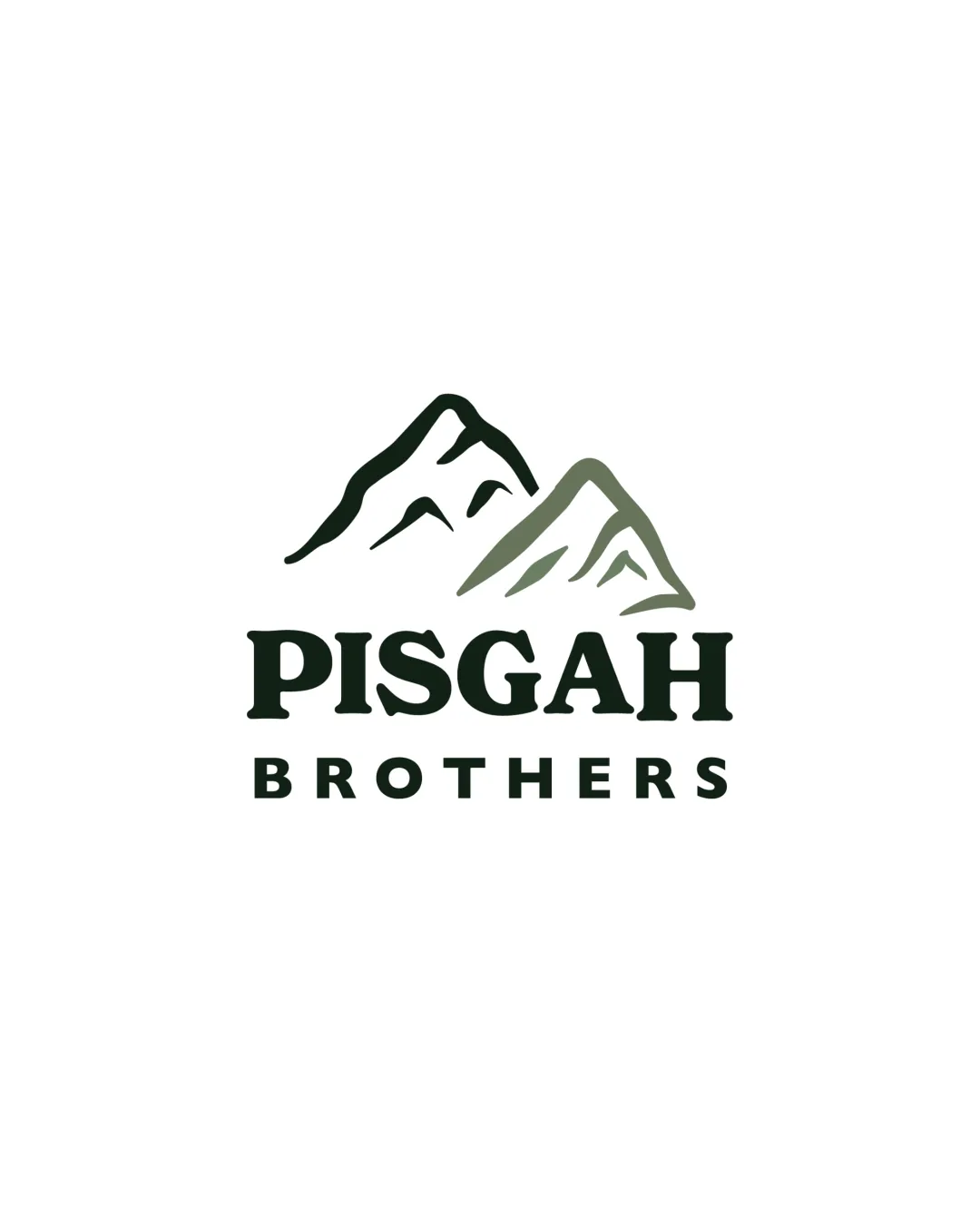
Pisgah Brothers

A distinctive, well-constructed logo that clearly reflects brand values, with only minor refinements needed for maximum scalability.

Combination Rustic Modern Housing/construction
5/5
Legibility
4/5
Originality
5/5
Misread
4/5
Balance
4/5
Scale
Your next steps

What to fix first

Focus on the changes that matter. Keep what makes the logo work.

1

mountain mark (upper band)

Test mark visibility and simplify inner details if needed.

Worth testing Medium priority Low effort
Area to inspectApproximate location

Fine inner lines in the mountain mark may lose clarity at reduced sizes.

How to check

Assess visibility at business card and favicon scale.

See the category review
2

wordmark (lower band)

Reduce vertical gap for tighter visual integration.

Optional refinement Low priority Low effort
Area to inspectApproximate location

The spacing between 'PISGAH' and 'BROTHERS' feels slightly wide, disrupting wordmark cohesion.

How to check

Test alternate spacing for better unity.

See the category review
Detailed review

Logo performance breakdown

5/5

Brief & logo match

Based on your brief
Compared with

Pisgah Brothers creates thoughtfully designed, attainable homes for workforce housing, grounded in family and mountain heritage.

Logo strongly expresses mountainous heritage, craftsmanship, and approachability as described in the brief.

  • Mountainous Inspiration

    Mountain mark directly references Western North Carolina inspiration.

  • Attainable, Quality Homes

    Strong, approachable typography reflects accessibility and reliability.

5/5

Legibility

  • Text is highly readable in all caps, sturdy font.
4/5

Originality

  • Distinct mountain illustration, name-based differentiation.
4/5

Color harmony

  • Subtle green palette reinforces natural theme.
Dark Olive#212C1C
Sage Green#7D8873

Estimated colors. Use the original design file for exact values.

Create a full color palette using these colors

Create new palette
4/5

Balance alignment

  • Strong vertical stacking and alignment.
  • The spacing between 'PISGAH' and 'BROTHERS' feels slightly wide, disrupting wordmark cohesion.

    Optional refinement wordmark (lower band)

    Try: Reduce vertical gap for tighter visual integration.

    Check: Test alternate spacing for better unity.

    Area to inspectApproximate location
Uploaded logoAlignment guide overlay

Inspect spacing with the guide. Optical balance may differ from geometric centering.

4/5

Scalability

  • Bold mark and text scale well for most uses.
  • Fine inner lines in the mountain mark may lose clarity at reduced sizes.

    Worth testing mountain mark (upper band)

    Try: Test mark visibility and simplify inner details if needed.

    Check: Assess visibility at business card and favicon scale.
    Area to inspectApproximate location
Uploaded logo at 200 pixels wide
200 × 250 px
Uploaded logo at 100 pixels wide
100 × 125 px
Uploaded logo at 50 pixels wide
50 × 63 px

Compare the detail at different sizes. Labels show the full image dimensions.

5/5

Misinterpretations

  • No unintended or confusing shapes.
5/5

Symbol & text fit

  • Mark and wordmark are visually cohesive and thematically aligned.

Black & white

Does the shape still work without color?

These tests are available only for logos uploaded in vector (SVG) format.

Background contrast

Find the surfaces where your logo stays clear.

These tests are available only for logos uploaded in vector (SVG) format.

Blur & silhouette

A 3px blur softens fine details so you can check whether the overall shape stays recognizable. If key gaps close or elements merge, the logo may rely too heavily on detail.

These tests are available only for logos uploaded in vector (SVG) format.

Try your own review

Wondering how your logo performs?

Get a clear logo score, key risks, and priority fix ideas before your client or audience sees it.

Review my logo