What to preserve
The logo cleverly combines the letter 'P' and a heart in a geometric, memorable mark that reflects digital creativity and care.
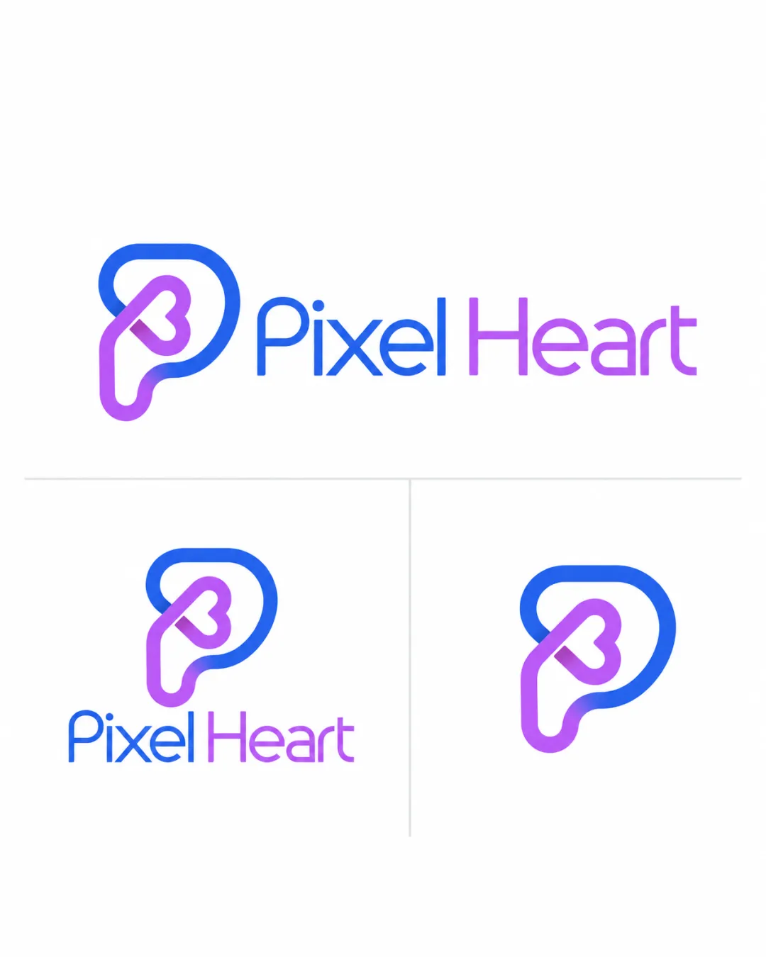
A modern, inventive, and well-constructed logo that effectively combines the 'P' and heart motifs, with only minor balance and scalability issues to address.
This logo set shows strong execution, supported by visual balance and text readability; improving distinctiveness is the clearest next step.
Focus on the changes that matter. Keep what makes the logo work.
The logo cleverly combines the letter 'P' and a heart in a geometric, memorable mark that reflects digital creativity and care.
Logo preview unavailable. The written feedback is still available on this card.
Standalone mark
The thin inner lines of the heart might merge or lose clarity at small sizes, especially in the standalone mark.
See the category reviewThe mark fuses 'P' and a heart in a digital-geometric style, closely aligning with the 'Pixel Heart' name and clear industry fit, with excellent legibility and distinctiveness.
Wordmark 5/5 · Layout 5/5
Symbol 4/5 · Wordmark 5/5 · Layout 4/5
The thin inner lines of the heart might merge or lose clarity at small sizes, especially in the standalone mark.
Try: Test the logo at small icon sizes and increase inner line thickness if details are lost.
Logo preview unavailable. The written feedback is still available on this card.
Symbol 4/5 · Wordmark 4/5 · Layout 5/5
The heart shape within the 'P' is slightly off-center within the overall outline, creating some tension in the negative space.

Inspect spacing with the guide. Optical balance may differ from geometric centering.
Symbol 4/5 · Wordmark 4/5
Gradient transition (blue to purple) between 'Pixel' and 'Heart' is visually appealing, but the shift is abrupt and may benefit from a smoother or subtler gradient blend.
Estimated colors. Use the original design file for exact values.
Create a full color palette using these colors
Create new paletteSymbol 4/5 · Wordmark 3/5
Get a clear logo score, key risks, and priority fix ideas before your client or audience sees it.
More credits needed
Add credits to continue without losing your work.
Then $7/month. Cancel anytime.
Essential logo review with AI
Estimated progress