Concept & direction
The logo integrates the initials 'SP' to form a monogram with a pencil graphic, referencing creativity and paper goods, suitable for an art or stationery brand.
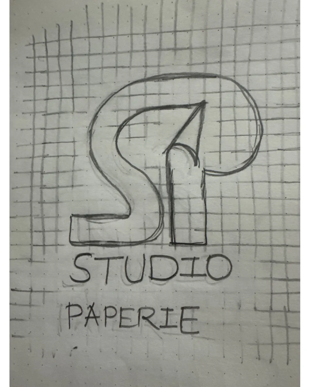
The logo concept is relevant and functional for a stationery or creative studio, but compromised legibility, hand-drawn construction, and balance must be improved for professional presentation.
This logo lockup has a workable foundation; improving visual balance is the clearest next step.
Focus on the changes that matter. Keep what makes the logo work.
The logo integrates the initials 'SP' to form a monogram with a pencil graphic, referencing creativity and paper goods, suitable for an art or stationery brand.
monogram
The 'S' and 'P' merge, with part of the pencil silhouette making the 'P' less clear and the interior counter crowded.
See the category reviewThe SP monogram with an integrated pencil conveys a stationery/creative field but requires higher legibility and digital polish to truly fit the category.
Monogram 3/5 · Wordmark 4/5 · Layout 3/5
Fine intersections and thin lines within the pencil counter could disappear at small sizes.
This review includes a score but no supporting explanation for this category.
Monogram 2/5 · Wordmark 3/5 · Layout 3/5
The 'S' and 'P' merge, with part of the pencil silhouette making the 'P' less clear and the interior counter crowded.
Try: Separate the S and P slightly or refine the counter of P for clarity.
Monogram 3/5 · Wordmark 2/5
The pencil integrated in 'P' is a familiar, though logical, motif in creative fields. The overall SP monogram arrangement is clear but not highly distinctive.
Monogram 2/5 · Wordmark 2/5 · Layout 2/5
The handwritten wordmark and sketched grid show irregular baseline, inconsistent stroke weights, and loose spacing, reducing professionalism and visual stability.

Inspect spacing with the guide. Optical balance may differ from geometric centering.
Get a clear logo score, key risks, and priority fix ideas before your client or audience sees it.
More credits needed
Add credits to continue without losing your work.
Then $7/month. Cancel anytime.
Essential logo review with AI
Estimated progress