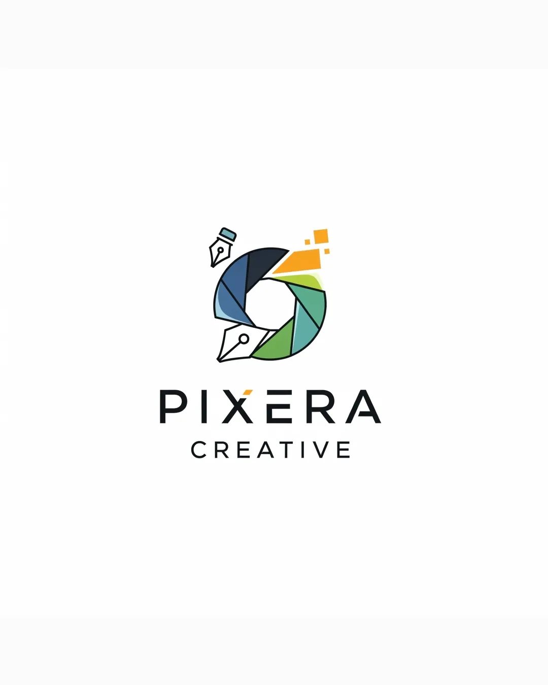
PIXERA CREATIVE logo review
4.3 / 5
Logo score
Logo review of

Pixera Creative

A visually striking, conceptually relevant logo with robust execution. Only small refinements suggested for optimal scalability and distinction.

Objective AI feedback. Your creative decision.

Combination Mark Modern, Geometric, Creative Agency Creative Services
5/5
Legibility
4/5
Originality
5/5
Misread
4/5
Balance
4/5
Scale
Action plan

What to fix first

The most important fixes to handle before polishing the full presentation.

1

Slightly refine pen nib and pixel sizes for optimal legibility at very small scales.

Medium priority

Ensures consistent appearance and technical quality at icon size.

Impact: Improves Reproduction And Clarity Across All Applications. · Effort: Low

2

Consider exploring minor alternative colorways or accent tweaks to further differentiate within the creative industry.

Low priority

Increases logo’s uniqueness among competitors.

Impact: Could Enhance Memorability And Distinction. · Effort: Medium

Detailed review

Logo performance breakdown

5/5

Legibility

Checkmark icon Clear, modern sans-serif wordmark
Checkmark icon All text is easily readable at multiple sizes

4/5

Originality

Checkmark icon Distinctive and clever merging of icons (shutter, pen, pixels)

Warning icon Shutter/camera aperture is a semi-common mark in creative industries

4/5

Color harmony

Checkmark icon Fresh, lively palette with good contrast

Warning icon Might lack distinctiveness among digital/creative agency brands

Black
#212529

Green
#107c41

Blue
#5982a9

Orange
#fbb52d

White
#ffffff

Your palette is close. Refine the color roles and combinations before updating the logo.

Build brand colors
4/5

Balance alignment

Checkmark icon Mark and wordmark are visually balanced
Checkmark icon Cohesive vertical alignment

Warning icon Mark could feel visually heavier on top-left due to extra pen nib and pixel details

logo 200x250 pixels scalability test alignment grid overlay
4/5

Scalability

Checkmark icon Strong, simple geometric forms aid scalability
Checkmark icon Symbol legible at small sizes

Warning icon Some loss of detail/pixel elements at extreme reductions

logo 200x250 pixels scalability test

200x250 px

logo 100x125 pixels scalability test

100×125 px

logo 50x62 pixels scalability test

50×62 px

5/5

Misinterpretations

Checkmark icon No obvious unintended forms or offensive shapes

5 / 5

Logo structure & brief match

Checkmark icon Visual relation between mark and the 'X' with orange pixel matches overall concept

Checkmark icon Industry Relevance: Excellent use of visual metaphors for creative and digital fields.
Checkmark icon Brand Personality: Conveys creativity, modernity, and versatility.

Try your own review

Wondering how your logo performs?

Get a clear logo score, key risks, and priority fix ideas before your client or audience sees it.

Review my logo