 View review
Logo score
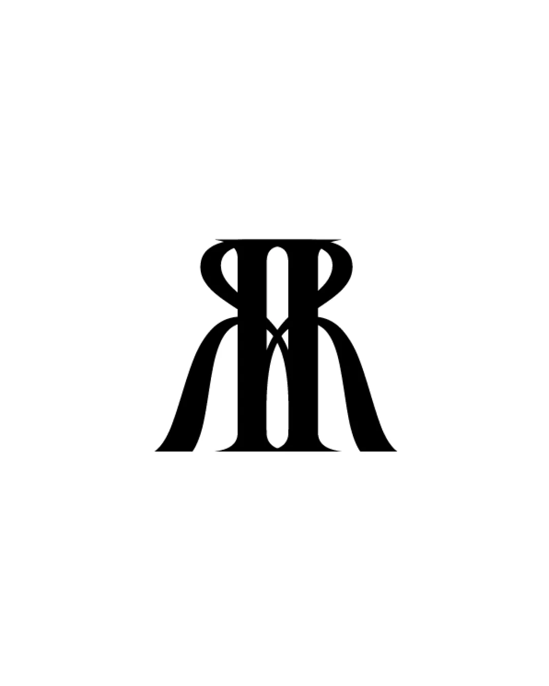
Logo review ofR M
Review the detailed scores below to see what is working and what should be refined first.
Legibility
Originality
Misread
Balance
Scale
Detailed review
Logo performance breakdown
Legibility
![]() Distinct high-contrast shapes help some letter recognition.
Distinct high-contrast shapes help some letter recognition.![]() Monogram approach adds sophistication.
Monogram approach adds sophistication.
![]() Letterforms are stylized to the point that 'M' and 'R' merge, reducing instant readability.
Letterforms are stylized to the point that 'M' and 'R' merge, reducing instant readability.![]() Risk of visual confusion for viewers unfamiliar with the intended letters.
Risk of visual confusion for viewers unfamiliar with the intended letters.
Originality
![]() Elegant twist on the classic monogram, not overly generic.
Elegant twist on the classic monogram, not overly generic.![]() Creative integration of both letterforms and negative space.
Creative integration of both letterforms and negative space.
![]() Monogram formats are fairly common in luxury/fashion sectors, reducing uniqueness slightly.
Monogram formats are fairly common in luxury/fashion sectors, reducing uniqueness slightly.
Color harmony
![]() Restrained use of black & white guarantees strong harmony and contrast.
Restrained use of black & white guarantees strong harmony and contrast.![]() No jarring or unnecessary color variation.
No jarring or unnecessary color variation.
Black
#000000
White
#FFFFFF
Balance alignment
![]() Symmetrical layout creates visual balance, mirroring is executed cleanly.
Symmetrical layout creates visual balance, mirroring is executed cleanly.![]() Consistent weight and negative space distribution.
Consistent weight and negative space distribution.
![]() The heavy, extended terminals at the bottom could make the logo feel bottom-heavy depending on context.
The heavy, extended terminals at the bottom could make the logo feel bottom-heavy depending on context.

Scalability
![]() Simple, bold shapes scale well for print, embroidery, or small icons.
Simple, bold shapes scale well for print, embroidery, or small icons.![]() Monochrome palette ensures adaptability across media.
Monochrome palette ensures adaptability across media.
![]() Fine inner overlaps might blur or fill in when scaled down to small sizes like favicons or pens.
Fine inner overlaps might blur or fill in when scaled down to small sizes like favicons or pens.
200x250 px
100×125 px
50×62 px
Misinterpretations
![]() No suggestive or inappropriate secondary imagery detected.
No suggestive or inappropriate secondary imagery detected.![]() Composition remains abstract and professional.
Composition remains abstract and professional.
Try your own review
Review my logo
Wondering how your logo performs?
Get a clear logo score, key risks, and priority fix ideas before your client or audience sees it.
Keep exploring


