R logo review
2.6/5
Logo score
Logo review of

R

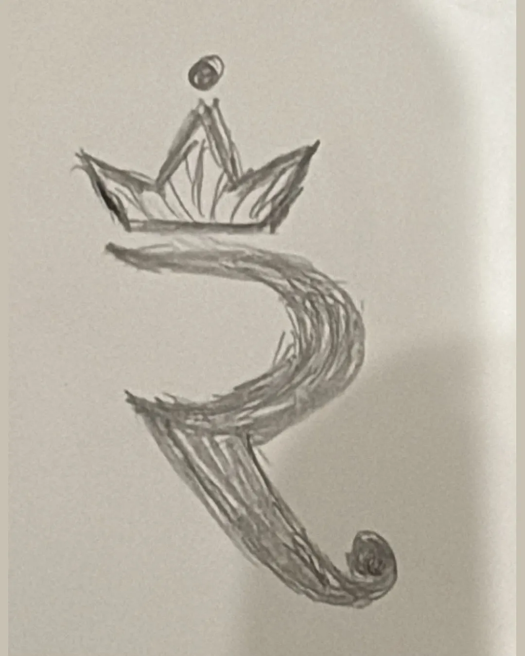
Concept is sound for a monogram with prestige cues, but needs digital refinement, balancing, and simplification for practical application.

Monogram Sketched, Hand-drawn, Ornamental
3/5
Legibility
3/5
Originality
4/5
Misread
2.5/5
Balance
2.5/5
Scale
Action plan

What to fix first

The most important fixes to handle before polishing the full presentation.

1

Refine the hand-drawn logo into a cleaner vector version to improve clarity and scalability.

High priority

Hand-drawn lines restrict use in digital and print applications.

Impact: Essential For Professional Use And Reproduction At Different Sizes. · Effort: Medium

2

Balance the weight of the crown and main letter to achieve better overall harmony.

Medium priority

Top-heavy arrangement and inconsistent line weight currently disrupt visual balance.

Impact: Improves Both Aesthetics And Recognizability. · Effort: Medium

Detailed review

Logo performance breakdown

3/5

Legibility

Checkmark icon The 'R' shape is generally recognizable.

Warning icon Hand-drawn quality reduces clarity.
Warning icon Ornamental crown can obscure initial recognizability.

3/5

Originality

Checkmark icon Crown addition is a unique flourish.

Warning icon Use of a crown on a letter monogram is a common trope.
Warning icon No distinguishing feature beyond the crown and hand-drawn style.

2.5/5

Balance alignment

Checkmark icon Central axis is roughly maintained.

Warning icon Crown and dot add top-heaviness.
Warning icon Inconsistent stroke weights create imbalance.

logo 200x250 pixels scalability test alignment grid overlay
2.5/5

Scalability

Checkmark icon Simple monochrome can work in single color.

Warning icon Sketch lines and crown details will not scale well to small sizes.
Warning icon Line thickness and density create potential legibility loss when reduced.

logo 200x250 pixels scalability test

200x250 px

logo 100x125 pixels scalability test

100×125 px

logo 50x62 pixels scalability test

50×62 px

4/5

Misinterpretations

Checkmark icon No obvious misinterpretations detected.

Try your own review

Wondering how your logo performs?

Get a clear logo score, key risks, and priority fix ideas before your client or audience sees it.

Review my logo