Wondering how your logo performs? 🧐
Get professional logo reviews in seconds and catch design issues in time.
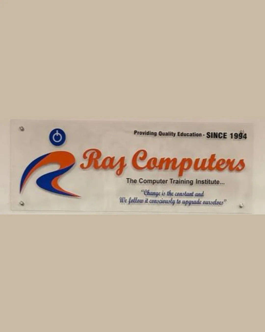
Try it Now!Logo review of Ras Computers, The Computer Training Institute…,..
 Logo analysis by AI
Logo type:
Style:
Detected symbol:
Detected text:
Business industry:
Review requested by Hashme
**If AI can recognize or misinterpret it, so can people.
Structured logo review
Legibility
![]() The main business name 'Ras Computers' is prominent in a large, contrasting script font.
The main business name 'Ras Computers' is prominent in a large, contrasting script font.![]() Supporting text is not overly decorative.
Supporting text is not overly decorative.
![]() The orange-red script font can be difficult to read at a distance or in small formats.
The orange-red script font can be difficult to read at a distance or in small formats.![]() Supporting text under the business name becomes very crowded and loses hierarchy, especially the tagline and details.
Supporting text under the business name becomes very crowded and loses hierarchy, especially the tagline and details.![]() Light blue tagline has low contrast on white background, hurting readability.
Light blue tagline has low contrast on white background, hurting readability.
Scalability versatility
![]() Main 'R' symbol and power icon could work in larger formats such as shop signage or banners.
Main 'R' symbol and power icon could work in larger formats such as shop signage or banners.
![]() Thin script letters, tagline, and small details will not be legible at reduced scales (e.g. business cards, app icons).
Thin script letters, tagline, and small details will not be legible at reduced scales (e.g. business cards, app icons).![]() Excessive text and intricate layout does not scale well for digital or embroidery use.
Excessive text and intricate layout does not scale well for digital or embroidery use.![]() Gradients and color transitions won't translate to monochrome or low-resolution applications.
Gradients and color transitions won't translate to monochrome or low-resolution applications.
200x250 px
100×125 px
50×62 px
Balance alignment
![]() The large 'R' symbol anchors the design on the left, and the core business name balances on the right.
The large 'R' symbol anchors the design on the left, and the core business name balances on the right.
![]() Text blocks are uneven in density and alignment below the logo, creating a cluttered effect.
Text blocks are uneven in density and alignment below the logo, creating a cluttered effect.![]() The alignment between symbol, wordmark, and taglines lacks cohesion, leading to a visually fragmented appearance.
The alignment between symbol, wordmark, and taglines lacks cohesion, leading to a visually fragmented appearance.

Originality
![]() Abstract 'R' integration attempts to provide a unique touch relevant to the business name.
Abstract 'R' integration attempts to provide a unique touch relevant to the business name.![]() Power symbol incorporated in the blue circle is industry-appropriate.
Power symbol incorporated in the blue circle is industry-appropriate.
![]() Elements like the 'R' swoosh and power button are standard motifs commonly used in tech/education logos.
Elements like the 'R' swoosh and power button are standard motifs commonly used in tech/education logos.![]() Overall composition feels generic and lacks innovative visual storytelling or memorable uniqueness.
Overall composition feels generic and lacks innovative visual storytelling or memorable uniqueness.
Logomark wordmark fit
![]() Both logomark and wordmark relate in color palette and are placed side by side, supporting brand recall.
Both logomark and wordmark relate in color palette and are placed side by side, supporting brand recall.
![]() Stylistic mismatch: the brush-stroke, energetic 'R' contrasts with the classical script type, lacking harmony.
Stylistic mismatch: the brush-stroke, energetic 'R' contrasts with the classical script type, lacking harmony.![]() Sizings feel slightly off, with the logomark drawing more attention than the core wordmark.
Sizings feel slightly off, with the logomark drawing more attention than the core wordmark.
Aesthetic look
![]() The color palette is energetic and suits an education/technology brand.
The color palette is energetic and suits an education/technology brand.![]() Power icon is clearly digital-themed.
Power icon is clearly digital-themed.
![]() Overdecorated design with multiple typefaces and redundant taglines beneath the core name feels busy and visually overwhelming.
Overdecorated design with multiple typefaces and redundant taglines beneath the core name feels busy and visually overwhelming.![]() Cluttered composition, lack of modern simplification, and dated aesthetic do not appeal to contemporary tastes.
Cluttered composition, lack of modern simplification, and dated aesthetic do not appeal to contemporary tastes.
Dual meaning and misinterpretations
![]() No offensive or inappropriate visual confusion detected.
No offensive or inappropriate visual confusion detected.
Color harmony
![]() Limited to two main accent colors (orange, blue) with neutral white, offering some consistency.
Limited to two main accent colors (orange, blue) with neutral white, offering some consistency.
![]() Color palette feels a bit harsh and old-fashioned; the red-orange and blue combination can be jarring if not modernized.
Color palette feels a bit harsh and old-fashioned; the red-orange and blue combination can be jarring if not modernized.![]() Supporting text in lighter blue reduces visual harmony and makes certain parts hard to read.
Supporting text in lighter blue reduces visual harmony and makes certain parts hard to read.
Flame
#E24E2A
Denim
#0147A9
Ebony
#212121
White
#FFFFFF