Concept & direction
The logo combines a botanical illustration with a rustic serif wordmark to evoke a flower farm identity, with clear reference to botany and agriculture.
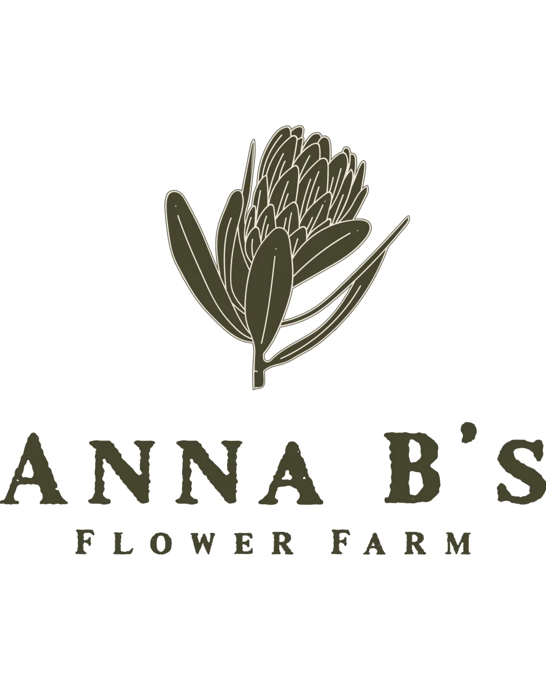
A functional and aligned logo for a rural flower farm, balancing botanical authenticity with approachable character.
This logo lockup shows solid execution, supported by text readability and text hierarchy; improving distinctiveness is the clearest next step.
Focus on the changes that matter. Keep what makes the logo work.
The logo combines a botanical illustration with a rustic serif wordmark to evoke a flower farm identity, with clear reference to botany and agriculture.
Logo preview unavailable. The written feedback is still available on this card.
horizontal_bands[2] (lower tagline line)
The word spacing in 'FLOWER FARM' is somewhat loose compared to the tighter main name, leading to a less cohesive visual connection.
See the category reviewLogo preview unavailable. The written feedback is still available on this card.
horizontal_bands[0] (flower mark)
The floral mark uses thin internal detail and closely spaced lines, which may lose clarity at small sizes or in embroidery.
See the category reviewThe logo embraces botanical and agricultural cues expected for a flower farm brand focused on science and community, but the symbolism is visually familiar rather than distinct.
Wordmark 5/5 · Layout 5/5
Symbol 3/5 · Wordmark 3/5
Symbol 4/5 · Wordmark 3/5 · Layout 3/5
The word spacing in 'FLOWER FARM' is somewhat loose compared to the tighter main name, leading to a less cohesive visual connection.
Try: Adjust the tracking in the tagline line so the spacing feels visually connected to the main wordmark.
Logo preview unavailable. The written feedback is still available on this card.

Inspect spacing with the guide. Optical balance may differ from geometric centering.
Symbol 3/5 · Wordmark 4/5 · Layout 3/5
The floral mark uses thin internal detail and closely spaced lines, which may lose clarity at small sizes or in embroidery.
Try: Test mark fidelity at small sizes and on fabric, refining if needed for clarity.
Logo preview unavailable. The written feedback is still available on this card.
Well-suited to floral/agricultural category; moderate risk of visual similarity to other botanical brands.
The flower illustration and rustic type directly reference the flower farm space, making the category instantly clear.
The botanical illustration approach is common for flower farms; some risk of blending in without further distinctive features.
The impression your logo creates.
A natural, grounded, and reliable logo with a subtle rustic charm and current, welcoming style.
AI interpretation of the visible design. These describe personality, not quality.
How strongly it attracts attention.
The large, centered flower mark and bold uppercase name ensure the logo stands out confidently.
How serious or lighthearted it feels.
The serif typography and botanical illustration lean toward a reserved and serious presentation.
How relaxed or formal it appears.
While the serif type is rustic and somewhat formal, the hand-drawn mark balances it with an approachable touch.
Heritage cues versus a current look.
The monoline illustration style and crisp execution add a contemporary feel to traditional imagery.
Its emotional feel, beyond colour temperature.
Earthy coloring and organic forms give a warm, inviting emotional character.
Everyday appeal versus luxury cues.
Unpretentious style and familiar motifs suggest artisanal everyday appeal rather than exclusive luxury.
See your logo in context, then check what needs attention before production. Settings use the colors detected in your logo where available.
Thoughtful work for people who expect more.
Could not load this preview. The written review is still available.
ANNA B'S FLOWER FARM logo
Could not load this preview. The written review is still available.
Mark may lose intricate detail when reduced to small icon size; simplify for clarity if needed.
Discover the latest products, services, stories, and updates from ANNA B'S FLOWER FARM logo.
Could not load this preview. The written review is still available.
Mark may lose intricate detail when reduced to small icon size; simplify for clarity if needed.
Could not load this preview. The written review is still available.
Could not load this preview. The written review is still available.
Thin lines and close detail in the flower mark may not reproduce well in embroidery; test and adjust for thread limitations.
A mark and wordmark are both visible in the uploaded asset.
A monochrome version is visible. Test its detail and contrast at the intended size before production.
Export the wordmark separately, without the symbol or tagline, for narrow placements and smaller sizes.
Export the existing symbol, mascot, or monogram on its own for avatars, favicons, and compact placements. Check its clarity at small sizes.
Prepare a separate wordmark with the existing tagline for larger placements. Keep the tagline-free wordmark for small sizes.
Define the intended brand colors separately without changing this monochrome review score.
Use a responsive variant where fine details become fragile at small sizes.
Get a clear logo score, key risks, and priority fix ideas before your client or audience sees it.
More credits needed
Add credits to continue without losing your work.
Then $7/month. Cancel anytime.
Essential logo review with AI
Estimated progress