 View review
Logo score
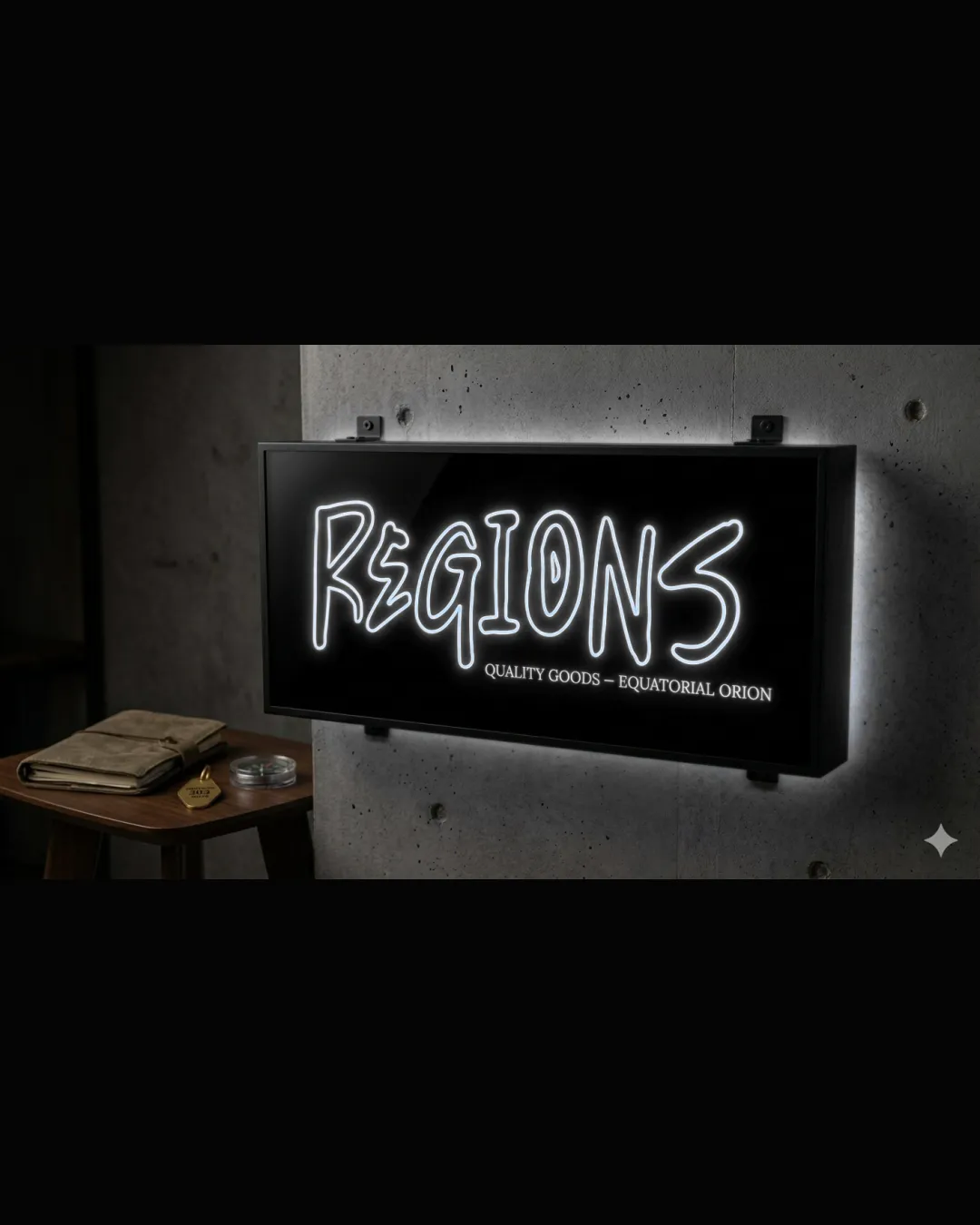
Logo review ofRegions Quality Goods – Equatorial Orion
Review the detailed scores below to see what is working and what should be refined first.
Legibility
Originality
Misread
Balance
Scale
Detailed review
Logo performance breakdown
Legibility
![]() Main word 'REGIONS' is large and highly visible due to the neon style.
Main word 'REGIONS' is large and highly visible due to the neon style.![]() Strong contrast between the white text and the black background improves readability.
Strong contrast between the white text and the black background improves readability.
![]() Handwritten style could be slightly harder to read from a distance for some viewers.
Handwritten style could be slightly harder to read from a distance for some viewers.![]() The subtext 'QUALITY GOODS – EQUATORIAL ORION' is small and may be hard to read in smaller sizes or from afar.
The subtext 'QUALITY GOODS – EQUATORIAL ORION' is small and may be hard to read in smaller sizes or from afar.
Originality
![]() Neon handwritten approach provides a non-generic, casual, urban vibe.
Neon handwritten approach provides a non-generic, casual, urban vibe.![]() The distinct style differentiates from typical minimal sans-serif or slab wordmarks.
The distinct style differentiates from typical minimal sans-serif or slab wordmarks.
![]() Handwritten neon effects are increasingly common in retail and hospitality; the execution is not highly unique.
Handwritten neon effects are increasingly common in retail and hospitality; the execution is not highly unique.![]() No symbol or unique twist beyond the handwritten font limits memorability.
No symbol or unique twist beyond the handwritten font limits memorability.
Color harmony
![]() Limited to monochrome with a subtle neon glow, making the palette harmonious and visually cohesive.
Limited to monochrome with a subtle neon glow, making the palette harmonious and visually cohesive.
White
#FFFFFF
Black
#000000
Balance alignment
![]() Good visual weight and clear horizontal alignment of the main word.
Good visual weight and clear horizontal alignment of the main word.![]() Overall composition feels centered on the signage.
Overall composition feels centered on the signage.
![]() Handwritten inconsistencies give the logo a slightly informal and unbalanced rhythm, which may appear less intentional on formal materials.
Handwritten inconsistencies give the logo a slightly informal and unbalanced rhythm, which may appear less intentional on formal materials.![]() Subtext alignment with the main word is not consistent and looks somewhat like an afterthought.
Subtext alignment with the main word is not consistent and looks somewhat like an afterthought.

Scalability
![]() The bold and simplistic wordmark lends itself well to large neon signage and illuminated signs.
The bold and simplistic wordmark lends itself well to large neon signage and illuminated signs.
![]() Intricate, uneven handwritten lines will likely lose clarity at very small sizes or on merchandise like pens or embroidered patches.
Intricate, uneven handwritten lines will likely lose clarity at very small sizes or on merchandise like pens or embroidered patches.![]() Detailed neon effect is impractical for many print applications; the glowing feature is difficult to reproduce without backlighting.
Detailed neon effect is impractical for many print applications; the glowing feature is difficult to reproduce without backlighting.![]() Thin linework of the font weakens visibility in miniature formats like social media avatars or favicons.
Thin linework of the font weakens visibility in miniature formats like social media avatars or favicons.
200x250 px
100×125 px
50×62 px
Misinterpretations
![]() No inappropriate or suggestive shapes present. The design is safe and clear.
No inappropriate or suggestive shapes present. The design is safe and clear.
Try your own review
Review my logo
Wondering how your logo performs?
Get a clear logo score, key risks, and priority fix ideas before your client or audience sees it.
Keep exploring


