View review
Reir Fragrance
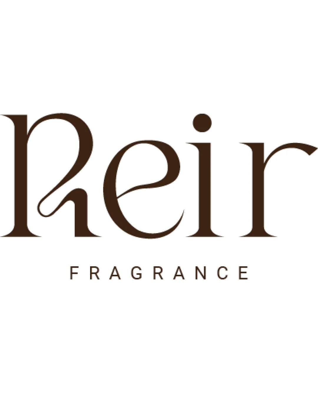
Refined and professional, appropriate for fragrance, but would benefit from subtle swash adjustment for optimal clarity and balance.
What to fix first
The most important fixes to handle before polishing the full presentation.
Refine the swash on the 'R' to improve optical balance and avoid minor legibility pause.
Medium priorityThe decorative swash is slightly oversized compared to other letters, creating mild imbalance and legibility question.
Impact: Refines Elegance And Usability At All Sizes. · Effort: Medium
Logo performance breakdown
Legibility
Primary text 'Reir' is easily readable despite stylistic flourishes.
Subtext 'FRAGRANCE' is clear and simple.
The stylized 'R' and joining swash may create a momentary pause for quick readers.
Originality
Custom serif letterforms add unique personality.
Swash usage and serif style are on-trend, not highly distinctive from modern luxury brands.
Color harmony
Monochromatic brown delivers a refined, elegant feel suited for fragrance category.
Excellent contrast on white.
Saddle Brown
#432918
White
#FFFFFF
Balance alignment
Good vertical centering between elements.
Letter spacing provides a sense of refinement.
Slight balance shift due to oversized decorative swash on 'R'.
Scalability
Logo remains readable at smaller sizes with legible spacing.
Thin serifs and hairlines could be lost at tiny scales or in single-color use.
200x250 px
100×125 px
50×62 px
Misinterpretations
No inappropriate or confusing shapes evident in letterforms.
No AI design signals found
Likely designed by a human
Letterforms, swash logic, and steady geometry look carefully constructed and intentional.
- Serif structure and swash construction are coherent and consistent.
- No visible generative artifacts or malformed letterforms.
Visual assessment; not definitive proof of authorship.
Brief match
Fragrance Logo: Elegant serif style and subtlety align well with fragrance branding; conveys sophistication and sensorial appeal.
Wondering how your logo performs?
Get a clear logo score, key risks, and priority fix ideas before your client or audience sees it.