Check the possible misinterpretation
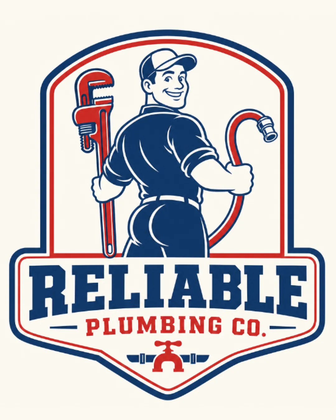
Mascot's rotated pose with accentuated rear could unintentionally draw humorous or distracting attention, risking unintended interpretation.
Workable for concept stage but needs pose adjustment and minor tweaks before client presentation.
Focus on the changes that matter. Keep what makes the logo work.
Mascot's rotated pose with accentuated rear could unintentionally draw humorous or distracting attention, risking unintended interpretation.
Detailed illustration may not reproduce well at small sizes.
medium
Current format is recognizable but borders on generic within the industry.
medium
Imagery (plumber, wrench, hose, tap) and type fit the plumbing trade well.
Estimated colors. Use the original design file for exact values.
Create a full color palette using these colors
Create new palette
Inspect spacing with the guide. Optical balance may differ from geometric centering.
Compare the detail at different sizes. Labels show the full image dimensions.
Does the shape still work without color?
Find the surfaces where your logo stays clear.
A 3px blur softens fine details so you can check whether the overall shape stays recognizable. If key gaps close or elements merge, the logo may rely too heavily on detail.
Category-typical but not distinctive.
Logo format and style fit plumbing but lack standout uniqueness; minor risks from generic badge trope and mascot pose.
Easily recognized as a plumbing business; meets category cues.
Mascot adds some distinction, but design feels familiar in sector.
Could blend in with similar local competitors.
Signals reliability but risks lightheartedness due to mascot's pose.
May undermine professional perception if pose is misread.
How the logo may work in practice, and what to check before production.
Strong brand presence at standard sizes.
Needs simplification for clarity at small scale.
Current detail will collapse; needs a minimal version.
Bold form works well in larger formats.
Detailed mascot may require a simplified embroidery version.
A practical checklist of the logo versions to prepare before sending the final files to a client or team.
Core brand asset is present.
Essential for production versatility.
Needed for small/low-res contexts.
Useful for wide format applications.
Clarifies color/usage/spacing rules.
A retro-styled badge features a smiling, confident plumber mascot holding a pipe wrench and hose, framed by bold shield outlines with a classic color palette.
'RELIABLE' in a bold, blocky serif, with 'PLUMBING CO.' in smaller red slab serif beneath.
Mascot illustration with a side stance, cap, and classic tools, anchoring the visual identity with approachability.
A bold, approachable retro badge that visually communicates reliability and plumbing expertise.
Mascot illustration builds personality and approachability.
Color palette and shield form project trust and professionalism.
Get a clear logo score, key risks, and priority fix ideas before your client or audience sees it.
More credits needed
Add credits to continue without losing your work.
Then $7/month. Cancel anytime.