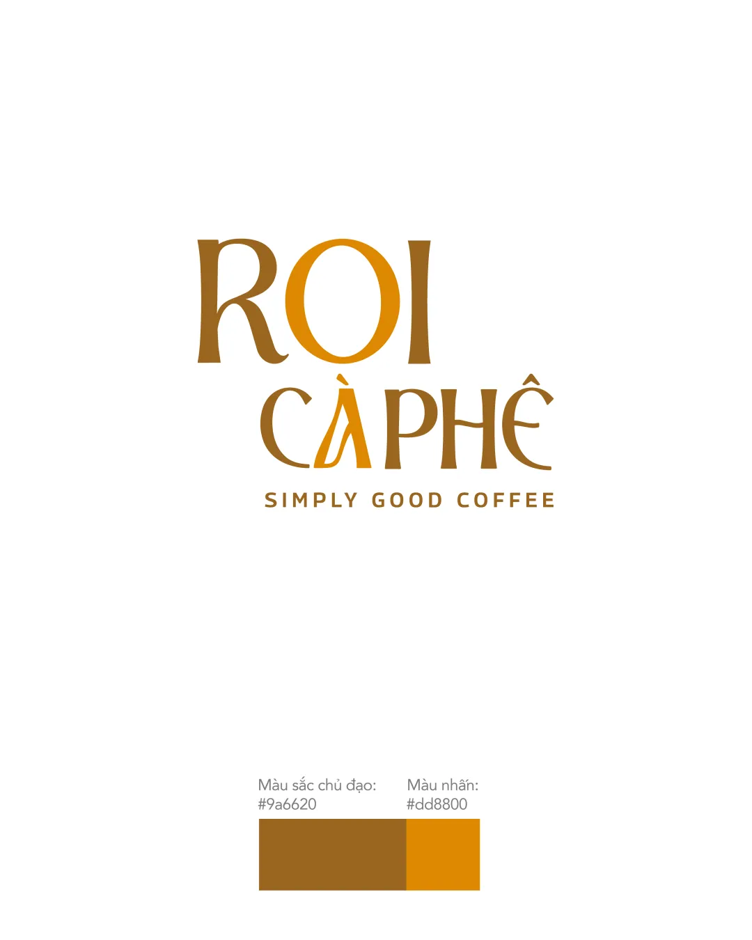
ROI CAPHE SIMPLY GOOD COFFEE logo review
4/5
Logo score
Logo review of

Roi Caphe Simply Good Coffee

Distinctive and inviting wordmark that effectively leverages typographic cues for a coffee identity, needing only minor polish.

Wordmark Contemporary Serif, Artisanal Cafés Or Coffee
4.5/5
Legibility
3.5/5
Originality
5/5
Misread
4/5
Balance
4/5
Scale
Action plan

What to fix first

The most important fixes to handle before polishing the full presentation.

1

Refine the 'A' in 'CAPHE' for slightly better legibility without losing character.

Medium priority

Letter styling presents a minor risk of misreading.

Impact: Improves Instantaneous Readability For All Audiences. · Effort: Low

Detailed review

Logo performance breakdown

4.5/5

Legibility

Checkmark icon All words are clearly readable.
Checkmark icon Distinct diacritical marks do not hinder identification.

Warning icon The 'A' in 'CAPHE' may be briefly misread due to its stylization.

3.5/5

Originality

Checkmark icon Custom letterforms and accents set it apart.
Checkmark icon Reference to Vietnamese language in type.

Warning icon No unique symbol or icon—relies solely on typographic treatment.

4.5/5

Color harmony

Checkmark icon Rich browns and amber are coffee-appropriate and appealing.
Checkmark icon Good contrast between palette elements.

Brown
#9a6620

Orange
#dd8800

Your palette is close. Refine the color roles and combinations before updating the logo.

Build brand colors
4/5

Balance alignment

Checkmark icon Strong vertical alignment and consistent spacing.
Checkmark icon Tagline is centered and unobtrusive.

Warning icon The emphasis on 'A' slightly disrupts uniform weight.

logo 200x250 pixels scalability test alignment grid overlay
4/5

Scalability

Checkmark icon Simple, solid forms with clear lines support reproduction at various sizes.

Warning icon Thin serifs might lose sharpness at very small scales.

logo 200x250 pixels scalability test

200x250 px

logo 100x125 pixels scalability test

100×125 px

logo 50x62 pixels scalability test

50×62 px

5/5

Misinterpretations

Checkmark icon No negative or confusing visual associations.

Brief match

Checkmark icon Coffee Brand: Typography and warm color palette are a strong fit for a café or coffee product, especially evoking premium or artisanal qualities.

Try your own review

Wondering how your logo performs?

Get a clear logo score, key risks, and priority fix ideas before your client or audience sees it.

Review my logo