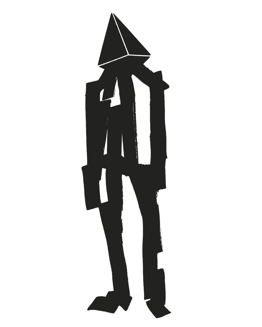
abstract geometric humanoid with pyramid head logo review
3.5/5
Logo score
Logo review of

Abstract Geometric Humanoid With Pyramid Head

Striking concept with high originality, but uneven craft limits application. Polish the execution for wide usability.

Abstract Mark Rough Hand-drawn, Minimalist, Geometric, Abstract Creative Arts
5/5
Originality
4/5
Misread
3/5
Balance
3/5
Scale
Action plan

What to fix first

The most important fixes to handle before polishing the full presentation.

1

Refine stroke consistency and silhouette.

High priority

Brings the rough style closer to a usable, scalable mark.

Impact: Improves Clarity, Scalability, And Professional Polish Without Sacrificing Originality. · Effort: Medium

Detailed review

Logo performance breakdown

5/5

Originality

Checkmark icon Highly original representation; memorable and unique approach.

3/5

Balance alignment

Checkmark icon Central axis gives some visual stability.

Warning icon Loose linework creates awkward negative space and uneven optical weight.

logo 200x250 pixels scalability test alignment grid overlay
3/5

Scalability

Checkmark icon Simple forms, limited detail suit reproduction at various sizes.

Warning icon Thin, rough lines may lose clarity at very small sizes.

logo 200x250 pixels scalability test

200x250 px

logo 100x125 pixels scalability test

100×125 px

logo 50x62 pixels scalability test

50×62 px

4/5

Misinterpretations

Checkmark icon No obvious negative or inappropriate secondary interpretation.

Brief match

Checkmark icon Distinctiveness: Very strong—guaranteed originality in most sectors.

Checkmark icon Creative/Artistic Appeal: Fits well for creative, arts-related, or avant-garde brands.

Try your own review

Wondering how your logo performs?

Get a clear logo score, key risks, and priority fix ideas before your client or audience sees it.

Review my logo