RU, 2U logo review
4.3/5
Logo score Monogram category

RU, 2U

shankardesigns Essential logo review

Review the detailed scores below to see what is working and what should be refined first.

Symbols recognized:
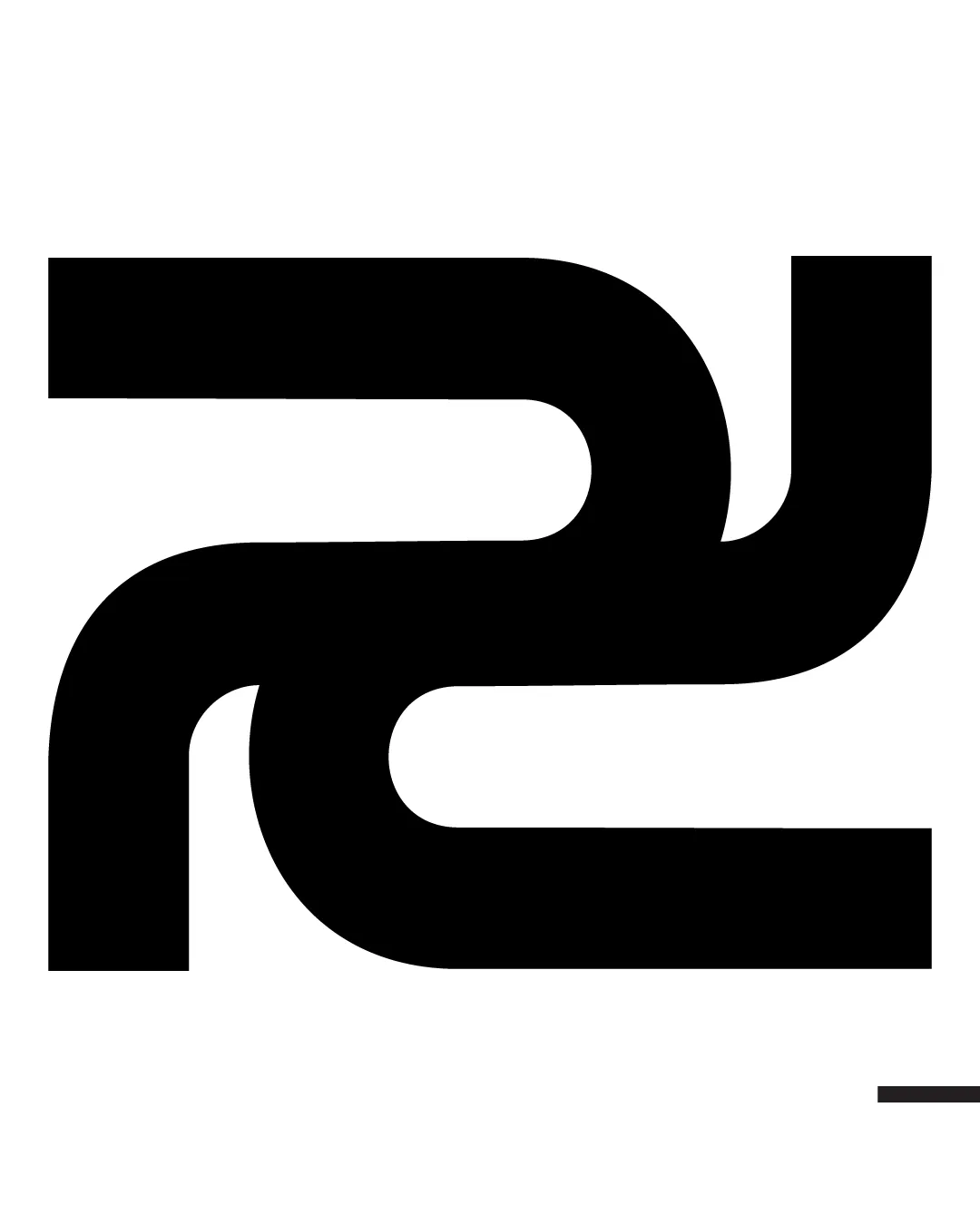
Abstract monogram formed by interlocking geometric strokes, suggests letters 'R' and 'U' or '2U'
Legible text:
RU, 2U
Monogram Modern, Geometric, Minimal Technology
3/5
Originality
4/5
Balance
5/5
Scale
Detailed review

Logo performance breakdown

3/5

Originality

  • Interlocking monogram approach provides a modern appearance.
  • Stylized letter manipulation demonstrates effort to create distinction.
  • Geometric, interlocking monogram is a common trope in technology branding.
  • No highly distinctive or memorable characteristic setting it apart from similar marks.

5/5

Color harmony

  • Black and white contrast offers maximum impact and legibility.
  • Professional and versatile palette supports a wide range of applications.
Black#000000
White#FFFFFF

Estimated colors. Use the original design file for exact values.

Create a full color palette using these colors

Create new palette
4/5

Balance alignment

  • Overall shape is visually stable and symmetrical.
  • Negative space is distributed consistently throughout.
  • The optical weight of the lower curve feels fractionally heavier, causing a slight imbalance.
Uploaded logoAlignment guide overlay

Inspect spacing with the guide. Optical balance may differ from geometric centering.

5/5

Scalability

  • Bold lines and minimal design ensure strong visibility at all sizes.
  • Logo remains clear and recognizable on business cards, websites, and in app icons.
  • No intricate details to lose clarity when used in small-scale applications.
5/5

Misinterpretations

  • No inappropriate or accidental symbolism detected.
  • Abstraction reduces risk of misinterpretation.
Try your own review

Wondering how your logo performs?

Get a clear logo score, key risks, and priority fix ideas before your client or audience sees it.

Review my logo