S logo review
4.3/5
Logo score Combination mark category

S

ankonroylr Essential logo review

Review the detailed scores below to see what is working and what should be refined first.

Symbols recognized:
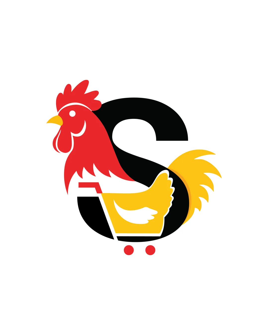
rooster and shopping cart forming letter S
Legible text:
S
Combination Mark Modern, Illustrative, Flat Retail
5/5
Legibility
4/5
Originality
4/5
Balance
3/5
Scale
Detailed review

Logo performance breakdown

5/5

Legibility

  • The letter 'S' is clear and easily readable.
  • No overdecorated or cluttered elements obscure the core textual mark.
4/5

Originality

  • Creative synthesis of rooster, shopping cart, and the letter 'S'.
  • Distinct visual metaphor not commonly seen in retail logos.
  • Combination of animal and cart symbols is not groundbreaking in concept.
  • Retail logos often use animals or carts, so the idea is not wholly original.
5/5

Color harmony

  • Three-color palette is bold and balanced, with strong contrast.
  • Colors are well chosen for readability and brand visibility.
Red#E30B17
Yellow#FFD20A
Black#000000
White#FFFFFF

Estimated colors. Use the original design file for exact values.

Create a full color palette using these colors

Create new palette

4/5

Balance alignment

  • Centralized composition creates strong visual cohesion.
  • Elements are well integrated, avoiding a disjointed look.
  • Rooster's head visually outweighs the right side, creating slight asymmetry.
Uploaded logoAlignment guide overlay

Inspect spacing with the guide. Optical balance may differ from geometric centering.

3/5

Scalability

  • Bold shapes and limited color palette support moderate scalability.
  • Clean forms will reproduce well in larger formats like signage or packaging.
  • Fine details in the rooster's feathers and head may be lost at smaller sizes, such as app icons or embroidery.
  • Three-color requirement could be challenging for single-color applications without loss of recognizability.
5/5

Misinterpretations

  • No inappropriate or misleading visual connotations detected.
  • Clear representation of retail and poultry themes.
4/5

Symbol & text fit

  • The letter 'S' is harmoniously merged with both symbol and cart, suggesting thoughtful integration.
  • Color continuity between elements enhances unity.
  • Rooster's vibrant colors draw more attention than the 'S', potentially overshadowing the text element.
Try your own review

Wondering how your logo performs?

Get a clear logo score, key risks, and priority fix ideas before your client or audience sees it.

Review my logo