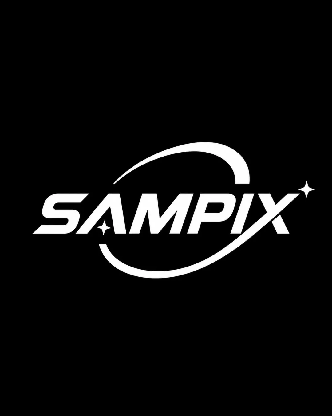
SAMPIX logo review
4.3 / 5
Logo score

Logo review ofSampix

Distinctive and suitable for content platforms; minor balance and versatility tweaks recommended before final use.

Wordmark With Illustrative Elements Bold Minimalist Tech Content Creation
5/5
Legibility
3/5
Originality
5/5
Misread
4/5
Balance
4/5
Scale
Review next
Action plan

What to fix first

The most important fixes to handle before polishing the full presentation.

1

Refine the star element on the 'A' to reduce crowding and improve optical spacing.

Medium priority

Minor spacing adjustment will elevate overall harmony.

Impact: Improves Visual Balance And Professional Polish. · Effort: Low

2

Test logo clarity at very small sizes; consider a version with a simpler or shorter orbit for micro-uses.

Medium priority

Preserves brand legibility across all social media icons and thumbnails.

Impact: Ensures Logo Usability As A Small Icon Or Profile Badge. · Effort: Medium

Detailed review

Logo performance breakdown

5/5

Legibility

Checkmark icon All letters are highly readable
Checkmark icon Bold, clean type enhances clarity

3/5

Originality

Checkmark icon Space motif with orbit is visually distinctive

Warning icon Orbit/swoosh with star is a common visual trope in tech/media; risks generic feel

5/5

Color harmony

Checkmark icon High contrast and clean monochrome palette

White
#FFFFFF

Black
#000000

4/5

Balance alignment

Checkmark icon Orbit/swoosh is well integrated and frames the word
Checkmark icon Letter spacing is mostly even

Warning icon Star on the 'A' slightly crowds the letterform

logo 200x250 pixels scalability test alignment grid overlay
4/5

Scalability

Checkmark icon Thick lines and simple elements scale well

Warning icon Swoosh detail may lose sharpness at very small sizes

logo 200x250 pixels scalability test

200x250 px

logo 100x125 pixels scalability test

100×125 px

logo 50x62 pixels scalability test

50×62 px

5/5

Misinterpretations

Checkmark icon No inappropriate or confusing visual interpretations

Brief match

Checkmark icon Social Media Platforms As A Page For Content Creation And Brand Building: The futuristic and dynamic style supports content creation and media branding, projecting a modern and innovative tone.

Try your own review

Wondering how your logo performs?

Get a clear logo score, key risks, and priority fix ideas before your client or audience sees it.

Review my logo