Wondering how your logo performs? 🧐
Get professional logo reviews in seconds and catch design issues in time.
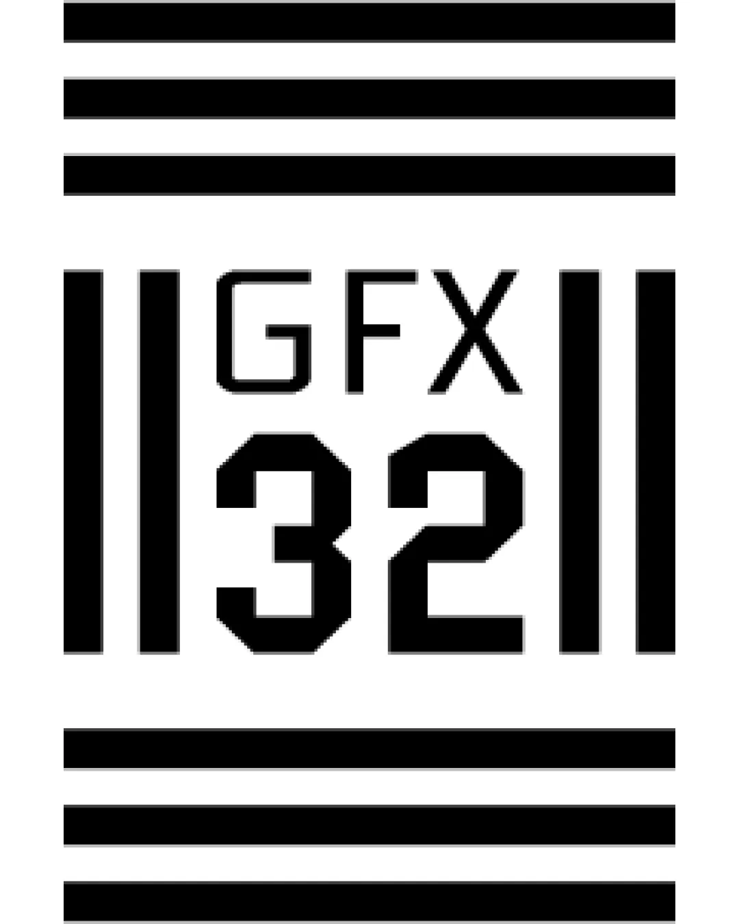
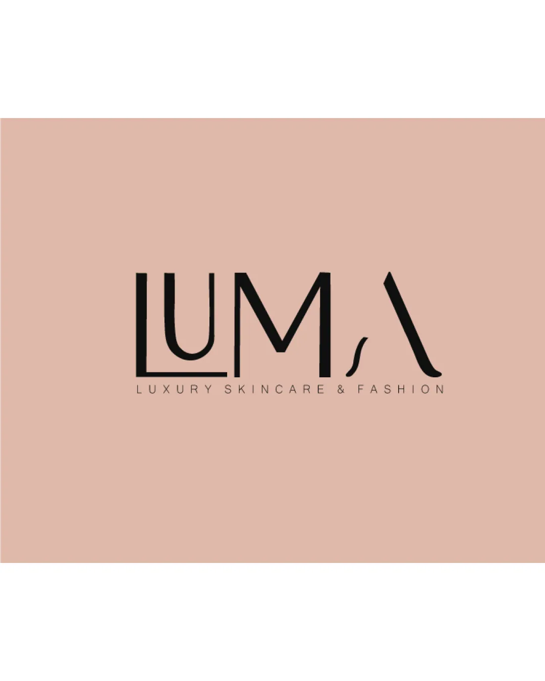
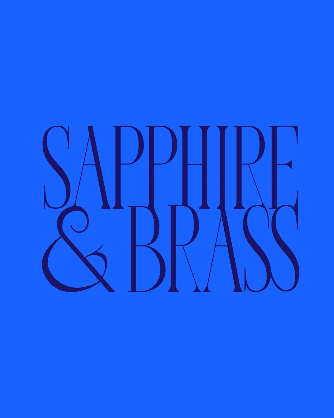
Try it Now!Logo review of SAPPHIRE & BRASS
 Logo analysis by AI
Recognized style:
Logo type:
Detected text:
Review requested by Wena
**If AI can recognize or misinterpret it, so can people.
Structured logo review
Legibility
![]() Distinctive typeface provides character.
Distinctive typeface provides character.
![]() Thin and elongated letterforms affect readability.
Thin and elongated letterforms affect readability.
Scalability versatility
![]() Versatile for larger formats due to boldness.
Versatile for larger formats due to boldness.
![]() Thin lines may not reproduce well at smaller sizes.
Thin lines may not reproduce well at smaller sizes.
200x250 px
100×125 px
50×62 px
Balance alignment
![]() Consistent alignment and spacing.
Consistent alignment and spacing.

Originality
![]() Stylish and uncommon typeface choice.
Stylish and uncommon typeface choice.
Aesthetic look
![]() Aesthetic and appeals to a high-end audience.
Aesthetic and appeals to a high-end audience.
Cultural sensitivity dual meaning
![]() No cultural sensitivity issues detected.
No cultural sensitivity issues detected.
Color harmony
![]() The color combination is appealing and coherent.
The color combination is appealing and coherent.
![]() Might be too subdued for certain industries.
Might be too subdued for certain industries.