Wondering how your logo performs? 🧐
Get professional logo reviews in seconds and catch design issues in time.
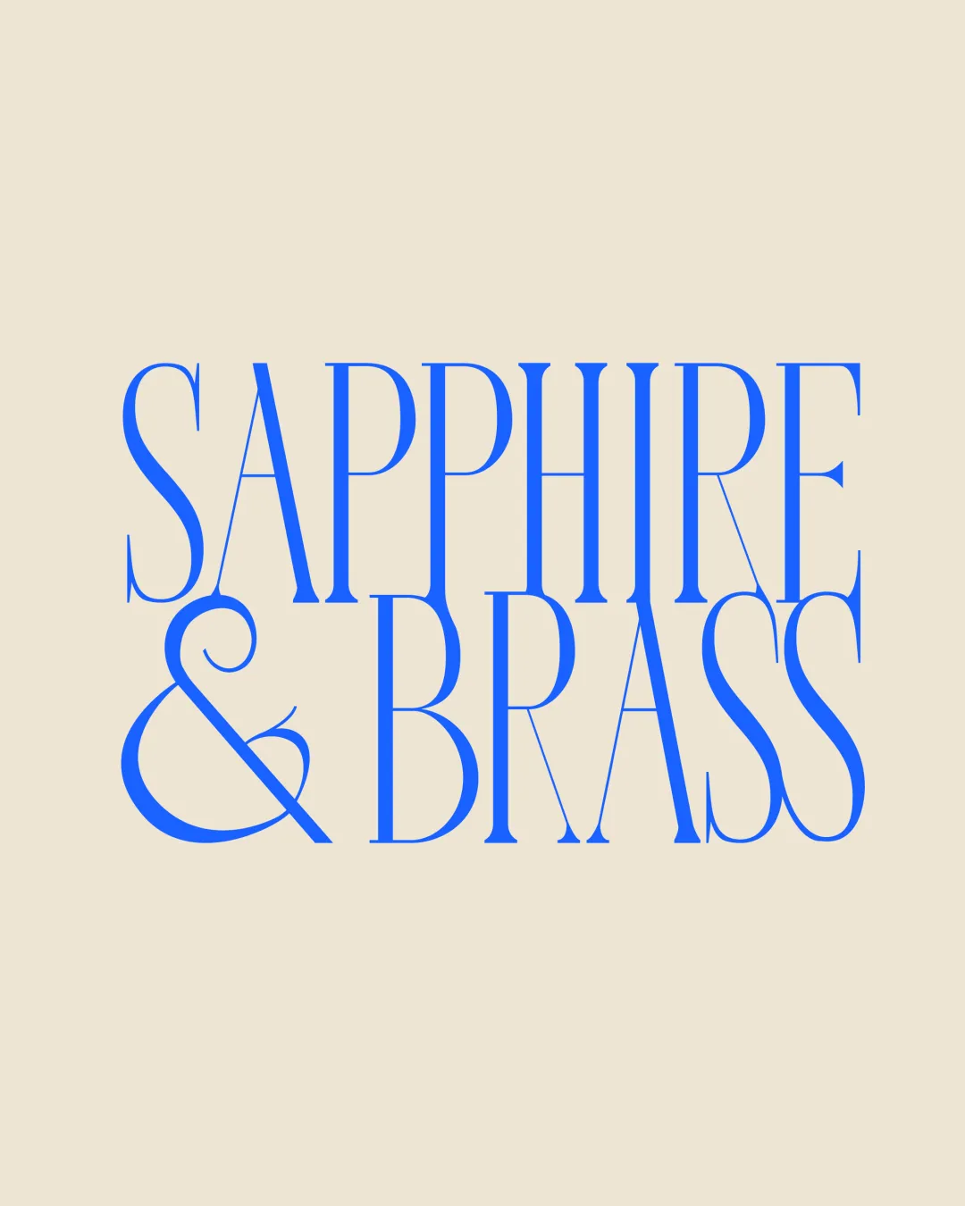
Try it Now!Logo review of SAPPHIRE & BRASS
 Logo analysis by AI
Recognized style:
Logo type:
Detected text:
Business industry:
Review requested by Wena
**If AI can recognize or misinterpret it, so can people.
Structured logo review
Legibility
![]() The text is clear and stylish.
The text is clear and stylish.
![]() The thin and tall font might reduce readability in smaller sizes.
The thin and tall font might reduce readability in smaller sizes.
Scalability versatility
![]() The bold font is versatile for various applications.
The bold font is versatile for various applications.
![]() The thin aspects may not reproduce well at smaller sizes.
The thin aspects may not reproduce well at smaller sizes.
200x250 px
100×125 px
50×62 px
Balance alignment
![]() The text alignment is well balanced and aesthetically pleasing.
The text alignment is well balanced and aesthetically pleasing.

Originality
![]() Unique font style enhances originality.
Unique font style enhances originality.
![]() Wordmark format is inherently less unique.
Wordmark format is inherently less unique.
Aesthetic look
![]() The logo looks contemporary and elegant.
The logo looks contemporary and elegant.
Cultural sensitivity dual meaning
![]() No cultural sensitivity issues detected.
No cultural sensitivity issues detected.
Color harmony
![]() The blue color adds a touch of luxury and contrast.
The blue color adds a touch of luxury and contrast.
![]() May not stand out against all backgrounds.
May not stand out against all backgrounds.