 View review
Logo score
Logo review of
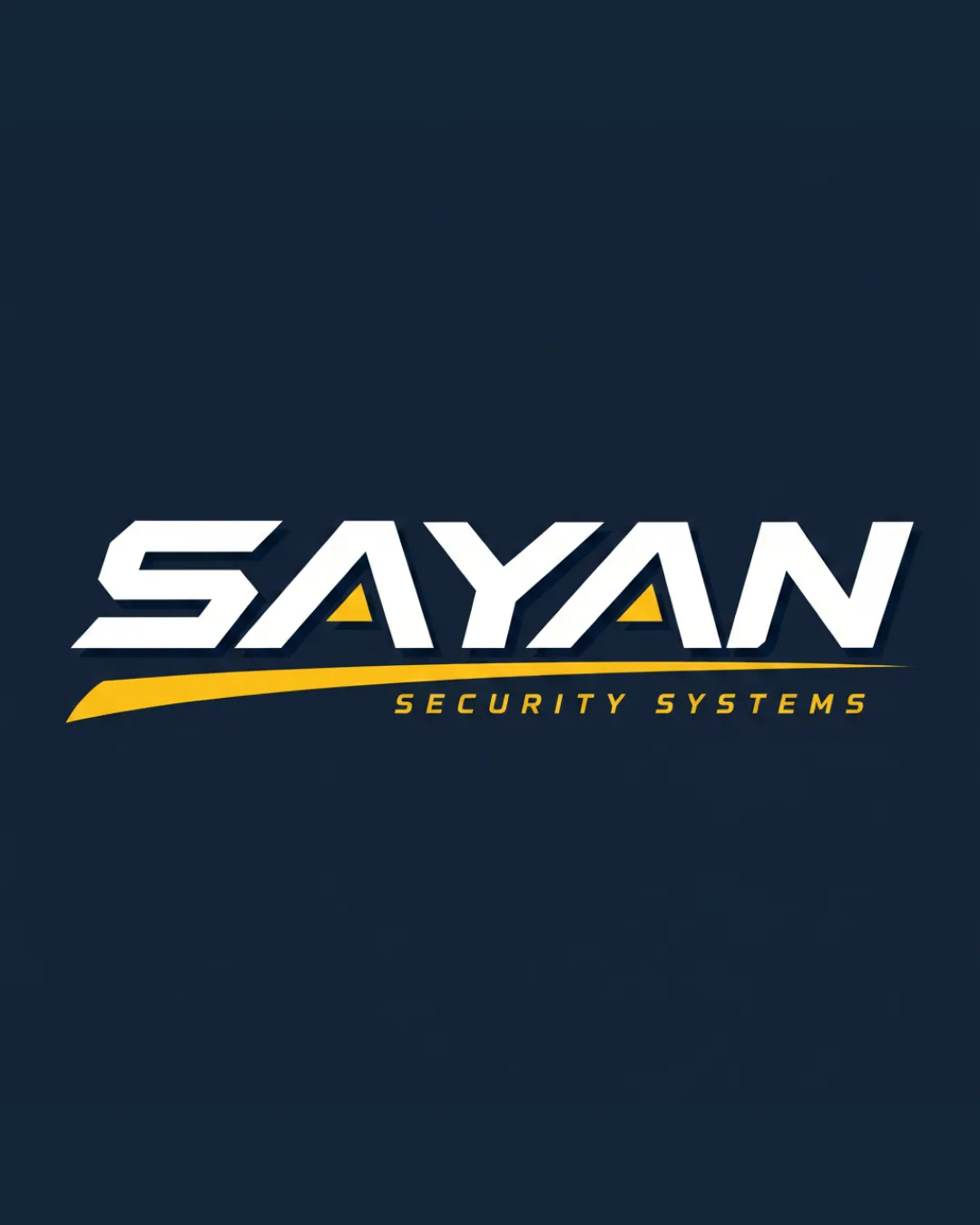
Sayan Security Systems
Good for use, but optimize secondary text and underline for maximal functional clarity.
Legibility
Originality
Misread
Balance
Scale
Action plan
What to fix first
The most important fixes to handle before polishing the full presentation.
1
Increase secondary text (SECURITY SYSTEMS) size/weight for better legibility at small scales.
High priorityCurrent small size is easily lost in scaled-down or low-resolution formats.
Impact: Improves Clarity In All Uses, Especially Print And Icons · Effort: Low
2
Refine underline thickness for balance with main text weight.
Medium priorityUnderline is visually light compared to bold text, affecting hierarchy.
Impact: Improves Visual Coherence And Scalability. · Effort: Low
Detailed review
Logo performance breakdown
Legibility
 Primary name 'SAYAN' is bold and readable Secondary text 'SECURITY SYSTEMS' is spaced and clear
 Small secondary text may lose clarity at tiny sizes
Originality
Custom angular letterforms add distinction
Wordmark treatment is somewhat common in tech/security sector
Color harmony
Yellow and blue provide strong, high-contrast pairing
Three-color palette could be further simplified for minimalism
Midnight Blue
#223045
White
#FFFFFF
Gold
#F2C013
Your palette is close. Refine the color roles and combinations before updating the logo.
Build brand colorsBalance alignment
Strong horizontal balance with underline Text is well spaced overall
Underline curve is slightly unbalanced compared to text weight

Scalability
Mark is mostly bold with few small details Logo works well on dark backgrounds
Very thin underline may disappear at small scale
200x250 px
100×125 px
50×62 px
Misinterpretations
No inappropriate or confusing shapes detected
Logo structure & brief match
Underline and font style unite wordmark and descriptor
Separation between mark and tagline could be stronger
الجمهور: Tech-inspired, bold aesthetics and clear security-focused palette fit an audience seeking security solutions.
Try your own review
Review my logo
Wondering how your logo performs?
Get a clear logo score, key risks, and priority fix ideas before your client or audience sees it.
Keep exploring