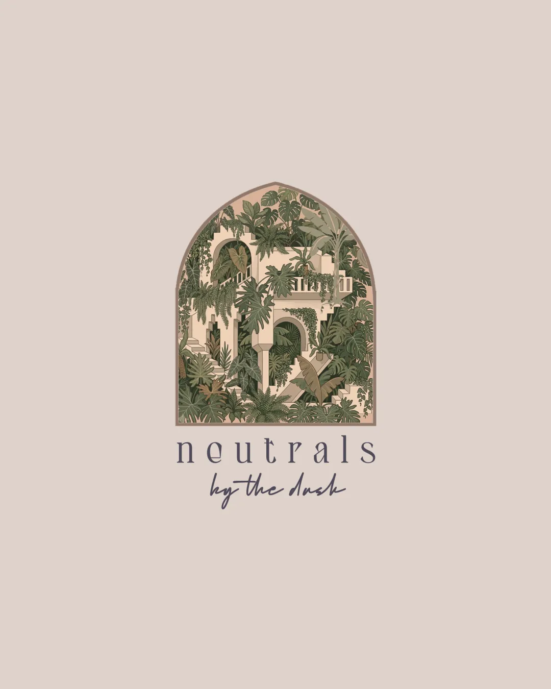
neutrals by the dash logo review
4.4 / 5
Logo score
Logo review of

Neutrals By The Dash

Excellent for large- and medium-format wall art or branding, but must address scalability before professional rollout across all touchpoints.

Combination Mark Earthy Illustrative Home Decor
4/5
Legibility
5/5
Originality
5/5
Misread
5/5
Balance
2/5
Scale
Action plan

What to fix first

The most important fixes to handle before polishing the full presentation.

1

Simplify the architectural and plant illustration for scalability—reduce detail and use larger, clearer shapes.

High priority

Current level of detail risks logo collapse and illegibility when scaled down.

Impact: Ensures The Logo Remains Functional On Small Prints, Merchandise, And Digital Use. · Effort: Medium

2

Refine script text to further boost legibility at small sizes if the secondary mark will often be reproduced small.

Medium priority

Script could break up at reduced sizes, especially in print applications.

Impact: Maintains Brand Message Clarity Across All Uses. · Effort: Low

Detailed review

Logo performance breakdown

4/5

Legibility

Checkmark icon Primary wordmark is clear and readable
Checkmark icon Script subheading is legible with adequate contrast

Warning icon Slightly reduced clarity in script text at small sizes

5/5

Originality

Checkmark icon Unique use of Mediterranean architecture and foliage illustration
Checkmark icon Distinctive arched composition sets it apart from generic decor marks

5/5

Color harmony

Checkmark icon Earthy palette perfectly supports the mood and theme
Checkmark icon Colors are harmonious and on-brand

Almond
#E1D3C9

Teak
#B7996E

Rifle Green
#7D7A6B

Putty
#CDB99A

5/5

Balance alignment

Checkmark icon Excellent centering of mark and typography
Checkmark icon Well-considered spacing between symbol and text

logo 200x250 pixels scalability test alignment grid overlay
2/5

Scalability

Checkmark icon Strong arched frame supports overall mark

Warning icon Highly detailed illustration becomes unclear and messy at small sizes
Warning icon Fine lines and intricate foliage compromise reduction and monochrome use

logo 200x250 pixels scalability test

200x250 px

logo 100x125 pixels scalability test

100×125 px

logo 50x62 pixels scalability test

50×62 px

5/5

Misinterpretations

Checkmark icon No inappropriate or unintended visual readings identified

5 / 5

Logo structure & brief match

Checkmark icon Mark and typography stylistically reinforce the same aesthetic vision

Checkmark icon Mediterranean Architecture, Earthy Palettes: Logo directly echoes Mediterranean architectural forms and uses earthy, calming colors.
Checkmark icon Printable Wall Art, Quiet Interiors, Timeless Storytelling: Illustrative complexity and serene color set enhance the print and storytelling feel; mark evokes a timeless atmosphere suitable for interior art.

Try your own review

Wondering how your logo performs?

Get a clear logo score, key risks, and priority fix ideas before your client or audience sees it.

Review my logo