Wondering how your logo performs? 🧐
Get professional logo reviews in seconds and catch design issues in time.
Try it Now!Logo review of Sep.flips3, Next generation
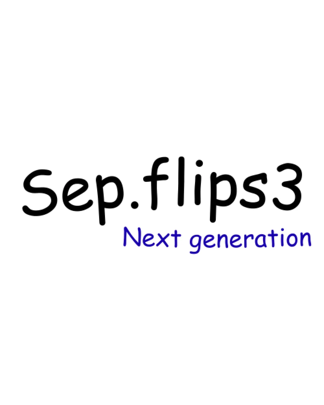
 Logo analysis by AI
Logo type:
Style:
Detected text:
Business industry:
Review requested by Sepflips3
**If AI can recognize or misinterpret it, so can people.
Structured logo review
Legibility
Text is clear and easy to read due to friendly, informal typeface.
Distinct color separation between the main and secondary text enhances clarity.
Playful font style may not be appropriate for all professional settings.
Difference in font size between main and tagline affects visual flow.
Scalability versatility
Simple structure allows for reasonable scaling.
No intricate details; suitable for straightforward uses such as social avatars.
Handwritten font may lose clarity at very small sizes (e.g., on business cards, app icons).
Lacks a distinct symbol, reducing impact in single-color or small-format applications.
Tagline may become unreadable on small digital assets, such as favicons.

200x250 px

100×125 px

50×62 px
Balance alignment
Text is visually centered, giving some balance to the overall structure.
Secondary tagline appears misaligned under the main wordmark, reducing cohesion.
The difference in font weight and color creates a disjointed look.
No unifying elements to tie the two lines together visually.


Originality
Unique brand name offers some distinctiveness.
Relies entirely on generic fonts, lacking any graphic or inventive symbol.
Wordmark approach is not unique in its execution.
Absence of any creative elements or logo twist makes it easy to overlook.
Aesthetic look
Clean and minimalistic approach avoids clutter.
Font choice feels unprofessional and too casual.
Insufficient visual interest for a technology brand; lacks memorability.
Typeface feels out-of-place within most modern tech design standards.
Dual meaning and misinterpretations
No inappropriate or confusing symbols present.
Color harmony
Minimal use of color maintains harmony between elements.
Sufficient contrast between black and blue.
Color differentiation between tagline and main text feels slightly disconnected.
Relying on different colors for hierarchy rather than typography or layout.
Black
#000000
Blue
#24148F
White
#FFFFFF

