SHAHABA FOOD HUB logo review
4.3 / 5
Logo score
Logo review of

Shahaba Food Hub

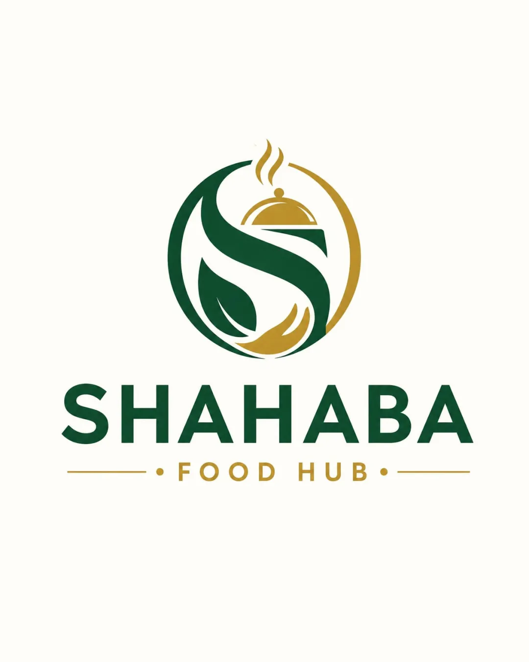
A distinctive, well-composed food-sector logo with only minor detail refinements needed to maximize clarity in all applications.

Objective AI feedback. Your creative decision.

Combination Mark Modern, Clean, Semi-abstract, Food Industry Food
5/5
Legibility
4/5
Originality
5/5
Misread
4/5
Balance
4/5
Scale
Action plan

What to fix first

The most important fixes to handle before polishing the full presentation.

1

Increase thickness of fine details in the monogram (steam lines, dome) for improved clarity at small sizes.

Medium priority

Protects the distinctive details across scales.

Impact: Enhances Legibility In Smaller Or Low-resolution Formats. · Effort: Low

Detailed review

Logo performance breakdown

5/5

Legibility

Checkmark icon Wordmark is large, clear, and very readable.
Checkmark icon Subline 'FOOD HUB' is legible with high contrast.

4/5

Originality

Checkmark icon Monogram with integrated food imagery is distinctive for the segment.
Checkmark icon Effective dual usage of S and serving dish.

Warning icon Concept is familiar in food branding; not highly unique.

4/5

Color harmony

Checkmark icon Dark green and gold evoke quality and freshness, resonant with food.
Checkmark icon Color contrast offers good clarity.

Warning icon Could explore more vibrant or appetizing food palette if desired.

DarkGreen
#265836

Gold
#c09d4f

Your palette is close. Refine the color roles and combinations before updating the logo.

Build brand colors
4/5

Balance alignment

Checkmark icon Strong vertical symmetry between mark and wordmark.
Checkmark icon Good spacing and visual alignment.

Warning icon Slight imbalance in monogram (gold arc) could be refined.

logo 200x250 pixels scalability test alignment grid overlay
4/5

Scalability

Checkmark icon Primary elements remain identifiable at small sizes.
Checkmark icon Simple color palette aids reproduction.

Warning icon Monogram detail (steam lines and dome) could blur at tiny sizes.

logo 200x250 pixels scalability test

200x250 px

logo 100x125 pixels scalability test

100×125 px

logo 50x62 pixels scalability test

50×62 px

5/5

Misinterpretations

Checkmark icon No plausible negative or confusing secondary readings.

5 / 5

Logo structure & brief match

Checkmark icon Monogram and wordmark are visually and conceptually cohesive.

Checkmark icon Industry: Strongly relevant visuals and colors for the food industry.

Try your own review

Wondering how your logo performs?

Get a clear logo score, key risks, and priority fix ideas before your client or audience sees it.

Review my logo