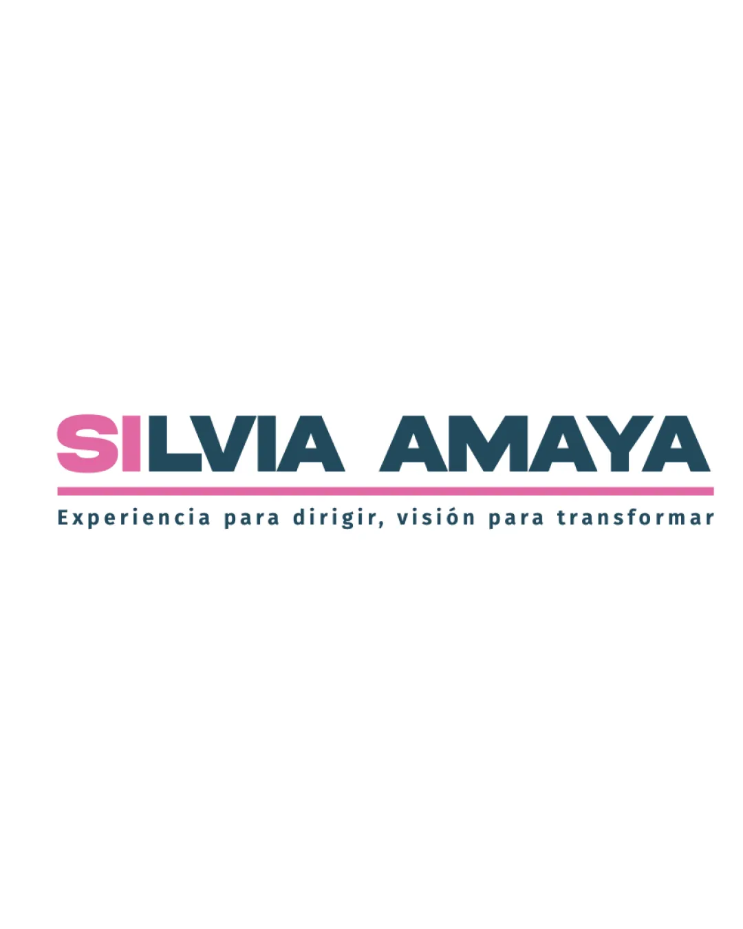
SILVIA AMAYA Experiencia para dirigir, visión par.. logo review
3.7 / 5
Logo score
Logo review of

Silvia Amaya Experiencia Para Dirigir, Visión Par..

Solid, functional campaign logo; color and hierarchy refinement recommended before broad deployment.

Wordmark Modern Sans-serif Education
5/5
Legibility
3/5
Originality
5/5
Misread
4/5
Balance
4/5
Scale
Action plan

What to fix first

The most important fixes to handle before polishing the full presentation.

1

Rebalance color emphasis to ensure the pink 'SI' does not dominate the visual hierarchy and distract from the full name.

High priority

Current left-weighted color emphasis pulls attention away from the full name and may hinder name association.

Impact: Creates A More Balanced And Unified Wordmark, Supporting Stronger Brand Recall. · Effort: Low

2

Refine tagline size or spacing for clarity at reduced scales.

Medium priority

Tagline risks becoming illegible at smaller sizes, limiting versatility.

Impact: Increases Readability And Usability On Multiple Platforms. · Effort: Low

Detailed review

Logo performance breakdown

5/5

Legibility

Checkmark icon All text is clear and large; high contrast ensures readability.

3/5

Originality

Checkmark icon Use of colored initials adds some differentiation.

Warning icon Overall approach is conventional; typical wordmark structure.

4/5

Color harmony

Checkmark icon Limited color palette is professional and appealing.

Warning icon Color contrast between pink and blue could be refined for greater cohesion.

Light Pink
#EC8CB9

Blue Black
#22434F

Your palette is close. Refine the color roles and combinations before updating the logo.

Build brand colors
4/5

Balance alignment

Checkmark icon Strong left alignment; consistent spacing between elements.

Warning icon Weight of the pink 'SI' draws attention leftward, causing slight imbalance.

logo 200x250 pixels scalability test alignment grid overlay
4/5

Scalability

Checkmark icon Bold font preserves legibility at smaller sizes.

Warning icon Tagline may become unreadable at very small scales.

logo 200x250 pixels scalability test

200x250 px

logo 100x125 pixels scalability test

100×125 px

logo 50x62 pixels scalability test

50×62 px

5/5

Misinterpretations

Checkmark icon No unintended or inappropriate visual interpretations.

Beta

No AI design signals found

Likely designed by a human

Clean construction, deliberate text emphasis, and conventional font use suggest human-driven design.

  • No visible generative artifacts or malformed details.
  • Consistent typographic hierarchy and color logic.

Visual assessment; not definitive proof of authorship.

Brief match

Checkmark icon University Rector Campaign: The bold, modern wordmark and clear tagline communicate authority, experience, and progressive values, fitting for an academic leadership campaign.

Try your own review

Wondering how your logo performs?

Get a clear logo score, key risks, and priority fix ideas before your client or audience sees it.

Review my logo