Increase legibility of 'SMASH BURGERS' at small sizes (consider bolder type or spacing tweak).
Ensures descriptor doesn't fade out in avatar or print settings.
Improves clarity in small-scale and digital uses.
A playful, original, and polished logo with strong mascot identity and broad versatility.
Focus on the changes that matter. Keep what makes the logo work.
Ensures descriptor doesn't fade out in avatar or print settings.
Improves clarity in small-scale and digital uses.
Reduces risk of detail loss in embroidery, tiny web uses, and mono-color outputs.
Boosts flexibility across all applications.
Could further harmonize the typographic lockup.
Coordinates lower descriptor with main logo for optical balance.
Strong use of a whimsical mascot and bold wordmark suggests a friendly, approachable eatery.
'Smash Burgers' line and the round, robust theme visually and verbally communicate burgers.
Estimated colors. Use the original design file for exact values.
Create a full color palette using these colors
Create new palette
Inspect spacing with the guide. Optical balance may differ from geometric centering.
Compare the detail at different sizes. Labels show the full image dimensions.
Does the shape still work without color?
Find the surfaces where your logo stays clear.
A 3px blur softens fine details so you can check whether the overall shape stays recognizable. If key gaps close or elements merge, the logo may rely too heavily on detail.
Distinctive with strong category signaling and personality.
This mascot-driven logo stands out against generic burger marks, though playful tone may lean young/family-friendly.
Burger/food cues are strong through color, name, and robust shapes.
No risk of miscategoriztion.
Mascot and knight theme create unique branding assets.
Low generic risk except among other highly themed mascots.
Signals approachability, fun, and a potential family audience.
May repel more upscale or adult-only burger market.
How the logo may work in practice, and what to check before production.
Mascot and full wordmark lockup work well in digital banners.
Mascot is distinctive at standard avatar sizes.
Mascot requires simplification at very small scale for clear recognition.
Bold colors and shapes translate effectively to signage.
Line work/face detail need tightening for crisp embroidery.
A practical checklist of the logo versions to prepare before sending the final files to a client or team.
Main brand version, core for all main uses.
Key for recognition in tiny digital spaces.
Ensures reproduction on packaging, print, embroidery.
May aid in narrow or banner formats.
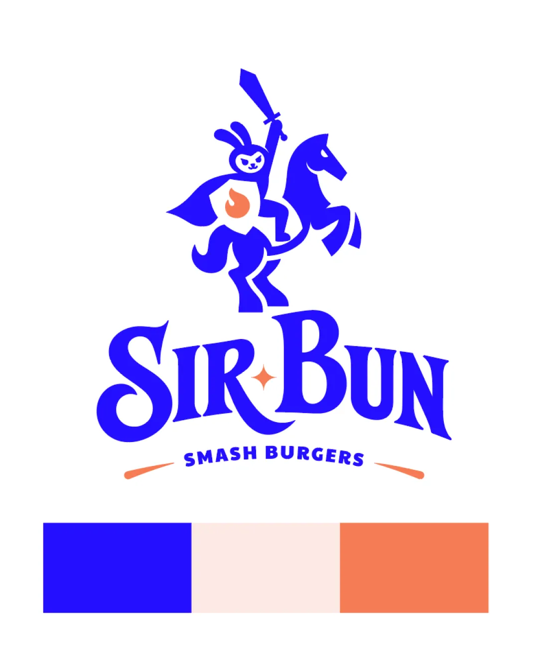
A playful cartoon knighted rabbit rides a horse, sword aloft, above the bold 'Sir Bun' wordmark, with a bright color palette and a supporting 'Smash Burgers' descriptor.
'Sir Bun' is set in a custom, energetic serif with a dynamic, arched baseline and a playful star dotting the 'i'.
The logomark is an illustrated mascot: a smiling rabbit knight in cape and shield, riding a rearing horse and wielding a raised sword.
The palette features royal blue, pale apricot, and vivid coral for a fresh, youthful, and appetizing look.
A bold, whimsical, and memorable identity for a burger brand with personality.
A knighted rabbit riding a horse evokes fun, courage, and the 'Sir' theme, connecting to the brand name.
Vivid colors and strong wordmark ensure standout recognition in crowded food markets.
Get a clear logo score, key risks, and priority fix ideas before your client or audience sees it.
More credits needed
Add credits to continue without losing your work.
Then $7/month. Cancel anytime.