 View review
Logo score
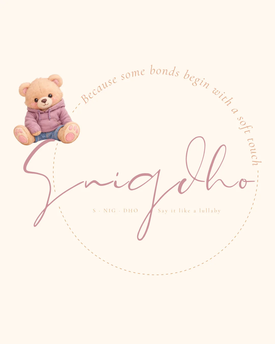
Logo review ofSnigdho, S · Nig · Dho, Because Some Bonds Begin..
Review the detailed scores below to see what is working and what should be refined first.
Legibility
Originality
Misread
Balance
Scale
Detailed review
Logo performance breakdown
Legibility
![]() Secondary tagline and pronunciation guide are clear and readable.
Secondary tagline and pronunciation guide are clear and readable.
![]() Main handwritten script 'Snigdho' is difficult to read, especially at smaller sizes or for audiences unfamiliar with the word.
Main handwritten script 'Snigdho' is difficult to read, especially at smaller sizes or for audiences unfamiliar with the word.![]() The playful style sacrifices clarity for personality.
The playful style sacrifices clarity for personality.![]() Serif subtext is legible but very small, which can be an issue when scaled down.
Serif subtext is legible but very small, which can be an issue when scaled down.
Originality
![]() Child-friendly handwritten style is somewhat unique in approach.
Child-friendly handwritten style is somewhat unique in approach.![]() Using a teddy bear as mascot aligns with the softness theme.
Using a teddy bear as mascot aligns with the softness theme.
![]() Teddy bear is a generic toy industry symbol.
Teddy bear is a generic toy industry symbol.![]() Handwritten script is not customized enough to be distinctive.
Handwritten script is not customized enough to be distinctive.![]() Circular dotted outline is a common decorative motif, lacking inventive use of elements.
Circular dotted outline is a common decorative motif, lacking inventive use of elements.
Color harmony
![]() Soft, pastel color scheme fits the gentle toy industry theme.
Soft, pastel color scheme fits the gentle toy industry theme.![]() All colors complement each other and enhance the emotional tone.
All colors complement each other and enhance the emotional tone.
Seashell
#F6EFE6
Orient Pink
#C4A7A3
Pale Pink
#EBCFB6
Mountbatten Pink
#91787E
Pale Chestnut
#DCAFA3
Balance alignment
![]() Circular layout attempts to create a gentle, holistic feel.
Circular layout attempts to create a gentle, holistic feel.![]() Bear's placement leads the eye into the logo.
Bear's placement leads the eye into the logo.
![]() The teddy bear feels disconnected from the rest of the design, sitting awkwardly above the text.
The teddy bear feels disconnected from the rest of the design, sitting awkwardly above the text.![]() The script wordmark's oversized initial 'S' disrupts the balance between symbol and type.
The script wordmark's oversized initial 'S' disrupts the balance between symbol and type.![]() Curved tagline around the circle creates imbalance due to inconsistent spacing.
Curved tagline around the circle creates imbalance due to inconsistent spacing.

Scalability
![]() Logo and text are set up in a circular form which provides some versatility for round labels or tags.
Logo and text are set up in a circular form which provides some versatility for round labels or tags.![]() Soft aesthetic works well for packaging or print where size is not restricted.
Soft aesthetic works well for packaging or print where size is not restricted.
![]() Highly detailed teddy bear illustration does not scale down well; facial features and hoodie details would be lost on small applications like embroidery, favicon, or business cards.
Highly detailed teddy bear illustration does not scale down well; facial features and hoodie details would be lost on small applications like embroidery, favicon, or business cards.![]() Dotted circle, small type, and tagline would disappear or become unreadable at small scales.
Dotted circle, small type, and tagline would disappear or become unreadable at small scales.![]() Logo would struggle on small merchandise like pens or as a digital profile icon.
Logo would struggle on small merchandise like pens or as a digital profile icon.
200x250 px
100×125 px
50×62 px
Misinterpretations
![]() No inappropriate or ambiguous symbolism detected.
No inappropriate or ambiguous symbolism detected.
Symbol & text fit
![]() Both bear and script attempt a soft, childlike tone.
Both bear and script attempt a soft, childlike tone.
![]() Soft, cartoonish teddy bear illustration does not match the more elegant, grown-up script font.
Soft, cartoonish teddy bear illustration does not match the more elegant, grown-up script font.
![]() Mismatch in execution: digital illustration vs. delicate typography.
Mismatch in execution: digital illustration vs. delicate typography.
![]() Teddy bear's shading and detail contrast with the simplicity of the wordmark.
Teddy bear's shading and detail contrast with the simplicity of the wordmark.
Try your own review
Review my logo
Wondering how your logo performs?
Get a clear logo score, key risks, and priority fix ideas before your client or audience sees it.
Keep exploring


