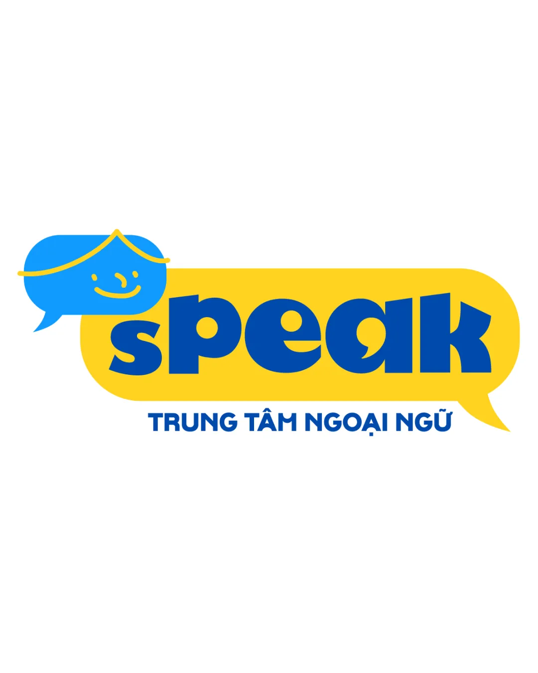
speak TRUNG TÂM NGOẠI NGỮ logo review
3.7 / 5
Logo score
Logo review of

Speak Trung Tâm Ngoại Ngữ

Functional, appealing, and suitable for a language school; needs some finesse for polish.

Combination Mark Playful Geometric Education
4/5
Legibility
3/5
Originality
5/5
Misread
4/5
Balance
3/5
Scale
Action plan

What to fix first

The most important fixes to handle before polishing the full presentation.

1

Increase the cohesion between the speech bubble with the face and the main yellow bubble to unify the elements more strongly.

High priority

Current separation slightly weakens brand unity.

Impact: Improves Visual Flow And Brand Recognition. · Effort: Medium

2

Slightly optimize secondary text sizing and contrast for reduced-scale use.

Medium priority

Small text may become illegible in some applications.

Impact: Increases Readability At Small Sizes For Digital And Print. · Effort: Low

Detailed review

Logo performance breakdown

4/5

Legibility

Checkmark icon Main text 'speak' is bold and clear.
Checkmark icon Secondary text is readable though small.

Warning icon Secondary text may lose clarity at very small sizes.

3/5

Originality

Checkmark icon Speech bubble as face creates a playful twist.

Warning icon Speech bubble as a concept is common in communication/education logos.

4/5

Color harmony

Checkmark icon Blue and yellow provide good contrast and energy.

Warning icon Color palette is basic; could benefit from depth or accent.

Vivid Yellow
#FFD600

Denim Blue
#1976D2

Your palette is close. Refine the color roles and combinations before updating the logo.

Build brand colors
4/5

Balance alignment

Checkmark icon Overall well-aligned, word and symbol weights are visually balanced.

Warning icon Face bubble feels slightly disconnected from main bubble.

logo 200x250 pixels scalability test alignment grid overlay
3/5

Scalability

Checkmark icon Simple shapes and bold lines facilitate resizing.

Warning icon Facial details in the speech bubble and small subtext may not scale well at small sizes.

logo 200x250 pixels scalability test

200x250 px

logo 100x125 pixels scalability test

100×125 px

logo 50x62 pixels scalability test

50×62 px

5/5

Misinterpretations

Checkmark icon No inappropriate or confusing visual readings detected.

Beta

No AI design signals found

Likely designed by a human

Logo elements feel purposefully composed, with consistent geometric shapes and human-like facial illustration.

  • Consistent, intentional text and icon construction.
  • No major generative artifacts or geometry breakdown.

Visual assessment; not definitive proof of authorship.

4 / 5

Logo structure & brief match

Checkmark icon Mark and wordmark are thematically and visually unified.

Warning icon Slight visual separation between the two bubbles.

Checkmark icon Education / Language Center: Appropriate use of speech bubble and friendly visual presentation matches an educational language center audience.

Try your own review

Wondering how your logo performs?

Get a clear logo score, key risks, and priority fix ideas before your client or audience sees it.

Review my logo