spinach labs logo review
4.5/5
Logo score
Logo review of

Spinach Labs

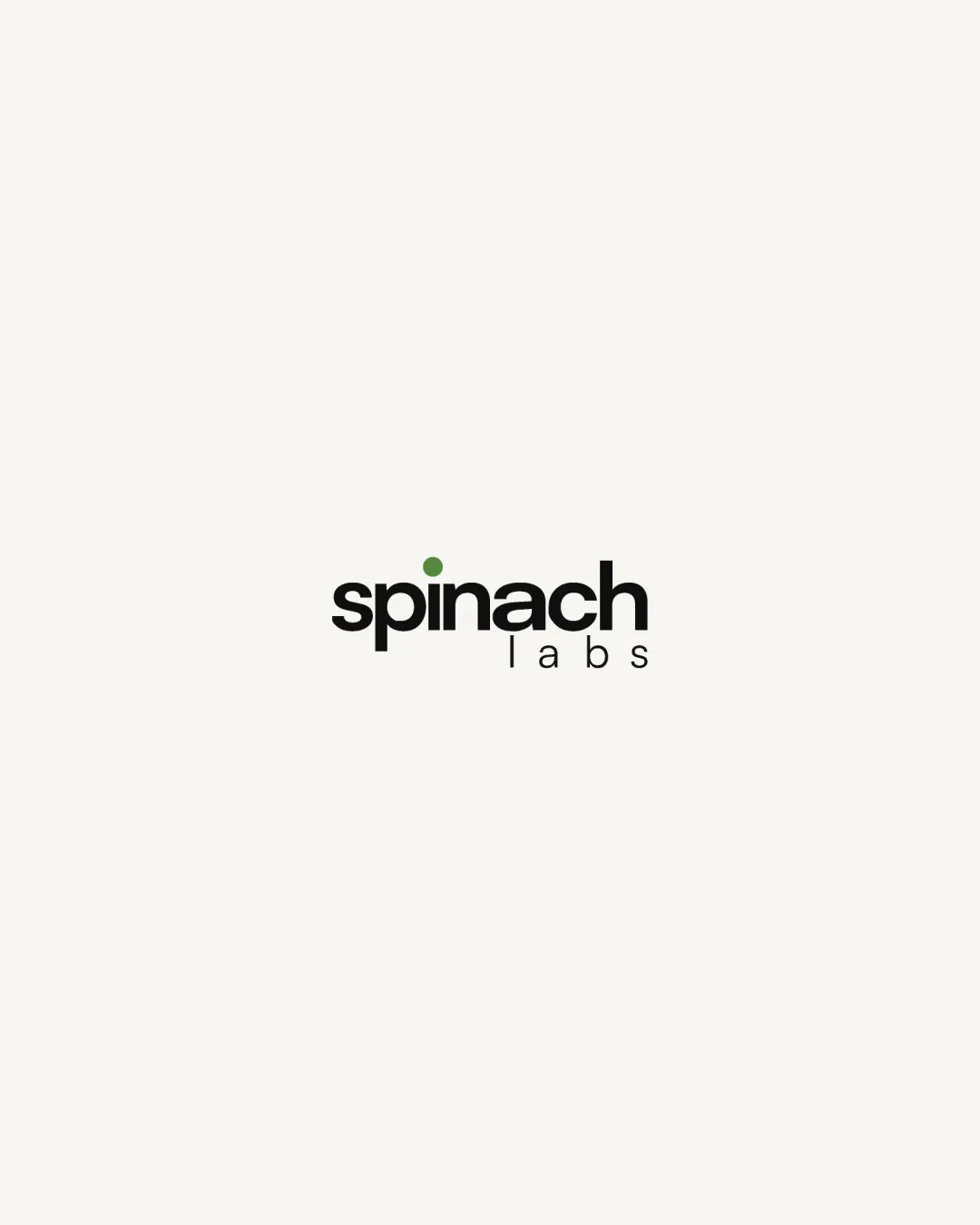
A strong, versatile wordmark that subtly integrates a brand-relevant accent; only minor alignment refinement is recommended.

Combination Mark Clean Geometric Minimalism
5/5
Legibility
4/5
Originality
5/5
Misread
4/5
Balance
4/5
Scale
Your next steps

What to fix first

Focus on the changes that matter. Keep what makes the logo work.

1

tagline 'labs' positioning

Adjust 'labs' to achieve more optical centering or explore subtle spacing tweaks.

Optional refinement Medium priority Low effort
Area to inspectApproximate location

The word 'labs' is slightly misaligned to the right relative to the main wordmark, giving a mild imbalance.

How to check

Compare optical centering and alignment of the tagline below 'spinach'.

See the category review
Detailed review

Logo performance breakdown

4/5

Brief & logo match

Based on an inferred industry
Compared with

Company/brand named 'spinach labs', likely in a modern, tech or science-adjacent field.

The logo visually reinforces both brand name and a clean, experimental attitude suitable for labs or tech startups.

  • Freshness Signal

    Green dot on the 'i' cleverly references spinach, fitting freshness/food-related connotations.

  • Contemporary Look

    Typography and layout convey modernity and precision, supporting a lab/tech-forward image.

5/5

Legibility

  • Very clear and readable sans-serif typography.
  • High contrast between text and background.
4/5

Originality

  • Green dot on the 'i' ties the concept to 'spinach'.
4/5

Color harmony

  • Green accent adds character without overwhelming the composition.
Black#191A15
Green#609142

Estimated colors. Use the original design file for exact values.

Create a full color palette using these colors

Create new palette
4/5

Balance alignment

  • Generally harmonious with balanced letter weights.
  • The word 'labs' is slightly misaligned to the right relative to the main wordmark, giving a mild imbalance.

    Optional refinement tagline 'labs' positioning

    Try: Adjust 'labs' to achieve more optical centering or explore subtle spacing tweaks.

    Check: Compare optical centering and alignment of the tagline below 'spinach'.

    Area to inspectApproximate location
Uploaded logoAlignment guide overlay

Inspect spacing with the guide. Optical balance may differ from geometric centering.

4/5

Scalability

  • Simple forms remain legible at small sizes.
Uploaded logo at 200 pixels wide
200 × 250 px
Uploaded logo at 100 pixels wide
100 × 125 px
Uploaded logo at 50 pixels wide
50 × 63 px

Compare the detail at different sizes. Labels show the full image dimensions.

5/5

Misinterpretations

  • No evidence of unintended shapes or negative space concerns.

Black & white

Does the shape still work without color?

These tests are available only for logos uploaded in vector (SVG) format.

Background contrast

Find the surfaces where your logo stays clear.

These tests are available only for logos uploaded in vector (SVG) format.

Blur & silhouette

A 3px blur softens fine details so you can check whether the overall shape stays recognizable. If key gaps close or elements merge, the logo may rely too heavily on detail.

These tests are available only for logos uploaded in vector (SVG) format.

Try your own review

Wondering how your logo performs?

Get a clear logo score, key risks, and priority fix ideas before your client or audience sees it.

Review my logo