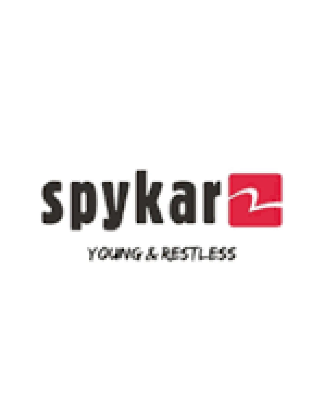
spykar YOUNG & RESTLESS logo review
3.8 / 5
Logo score
Logo review of

Spykar Young & Restless

Serviceable logo for fashion/denim, but tagline adjustment and symbol distinctiveness would improve impact further.

Combination Mark Bold Sans-serif With Geometric Symbol Fashion
4/5
Legibility
3/5
Originality
5/5
Misread
4/5
Balance
3/5
Scale
Action plan

What to fix first

The most important fixes to handle before polishing the full presentation.

1

Increase tagline size or adjust placement to improve tagline readability at smaller scales.

High priority

Tagline is currently difficult to read, reducing effectiveness of the brand's message.

Impact: High · Effort: Low

2

Consider evolving the red square symbol for more distinctiveness or to better connect with the brand name/message.

Medium priority

Current symbol is generic and misses an opportunity for stronger brand recognition.

Impact: Medium · Effort: Medium

Detailed review

Logo performance breakdown

4/5

Legibility

Checkmark icon Main brand name is bold and highly readable.
Checkmark icon Contrast between text and background is strong.

Warning icon Tagline 'YOUNG & RESTLESS' is small and less legible, especially at small sizes.

3/5

Originality

Checkmark icon Custom wordmark with unique red mark.

Warning icon Symbol is generic and lacks distinctiveness.

4/5

Color harmony

Checkmark icon Simple, high-contrast palette.
Checkmark icon Red accent draws attention to the mark.

Warning icon Color system may lack flexibility for all backgrounds.

Black
#231F20

Crimson
#E94653

White
#FFFFFF

Your palette is close. Refine the color roles and combinations before updating the logo.

Build brand colors
4/5

Balance alignment

Checkmark icon Good alignment of mark and wordmark.
Checkmark icon Logo feels visually stable.

Warning icon Tagline alignment below main text can feel slightly disconnected.

logo 200x250 pixels scalability test alignment grid overlay
3/5

Scalability

Checkmark icon Bold text and simple shapes aid scalability.

Warning icon Tagline loses legibility at small sizes.
Warning icon Thin line in the red square can become unclear when scaled down.

logo 200x250 pixels scalability test

200x250 px

logo 100x125 pixels scalability test

100×125 px

logo 50x62 pixels scalability test

50×62 px

5/5

Misinterpretations

Checkmark icon No obvious inappropriate or confusing visual readings.

4 / 5

Logo structure & brief match

Checkmark icon Red square with white line pairs well visually with the bold text.

Warning icon Symbol does not clearly reinforce brand name or meaning.

Checkmark icon Industry: Logo's bold, youth-oriented design aligns well with fashion or denim brands.

Try your own review

Wondering how your logo performs?

Get a clear logo score, key risks, and priority fix ideas before your client or audience sees it.

Review my logo