STUDIO logo review
4/5
Logo score
Logo review of

Studio

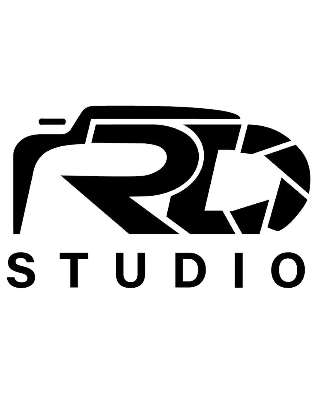
A distinctive and thematically strong photography studio logo that could benefit from minor adjustments to clarity at small sizes.

Combination Modern, Geometric, Negative Space Integration Photography
3.5/5
Legibility
4/5
Originality
5/5
Misread
4/5
Balance
3.5/5
Scale
Your next steps

What to fix first

Focus on the changes that matter. Keep what makes the logo work.

1

lettermark / Standalone mark (top band)

Test and refine the legibility of the initials, possibly by subtly adjusting the forms for clearer letter separation.

Optional refinement High priority Medium effort
Area to inspectApproximate location

The 'RL' can be challenging to decipher at first glance due to the abstract geometric construction, especially for unfamiliar viewers.

How to check

Gather feedback on initial legibility among new viewers.

See the category review
2

Standalone mark (top band)

Test the symbol at reduced sizes to ensure all critical details remain identifiable.

Worth testing Medium priority Medium effort
Area to inspectApproximate location

Some thin gaps and detailed segments in the camera/lens stylization might be lost at small sizes.

How to check

Review print and digital mockups at various sizes and backgrounds.

See the category review
Detailed review

Logo performance breakdown

4/5

Brief & logo match

Based on your brief
Compared with

Photography; logo should clearly link to the field and offer a custom look.

The camera-driven design fits photography well, with minor legibility limits for broader recognition.

  • Industry Relevance

    The camera shape and aperture details directly communicate photography.

  • Initial Integration

    The 'RL' initials are meaningfully combined with the camera symbolism, creating a custom mark.

3.5/5

Legibility

  • Clear 'STUDIO' text
  • Creative integration of letters and symbol
  • The 'RL' can be challenging to decipher at first glance due to the abstract geometric construction, especially for unfamiliar viewers.

    Optional refinement lettermark / Standalone mark (top band)

    Try: Test and refine the legibility of the initials, possibly by subtly adjusting the forms for clearer letter separation.

    Check: Gather feedback on initial legibility among new viewers.
    Area to inspectApproximate location
4/5

Originality

  • Distinctive treatment by merging initials with a camera concept
4/5

Balance alignment

  • Good proportional relationship between symbol and wordmark
  • Clean alignment of elements
Uploaded logoAlignment guide overlay

Inspect spacing with the guide. Optical balance may differ from geometric centering.

3.5/5

Scalability

  • Strong silhouette at moderate sizes
  • Some thin gaps and detailed segments in the camera/lens stylization might be lost at small sizes.

    Worth testing Standalone mark (top band)

    Try: Test the symbol at reduced sizes to ensure all critical details remain identifiable.

    Check: Review print and digital mockups at various sizes and backgrounds.

    Area to inspectApproximate location
Uploaded logo at 200 pixels wide
200 × 250 px
Uploaded logo at 100 pixels wide
100 × 125 px
Uploaded logo at 50 pixels wide
50 × 63 px

Compare the detail at different sizes. Labels show the full image dimensions.

5/5

Misinterpretations

  • No unintended readings apparent
4/5

Symbol & text fit

  • Harmonious relationship; type sits well beneath the mark

Black & white

Does the shape still work without color?

These tests are available only for logos uploaded in vector (SVG) format.

Background contrast

Find the surfaces where your logo stays clear.

These tests are available only for logos uploaded in vector (SVG) format.

Blur & silhouette

A 3px blur softens fine details so you can check whether the overall shape stays recognizable. If key gaps close or elements merge, the logo may rely too heavily on detail.

These tests are available only for logos uploaded in vector (SVG) format.

Try your own review

Wondering how your logo performs?

Get a clear logo score, key risks, and priority fix ideas before your client or audience sees it.

Review my logo