STUDIQSUBLIM AGENCIA BOUTIQUE DE PUBLICIDAD logo review
3.5/5
Logo score
Logo review of

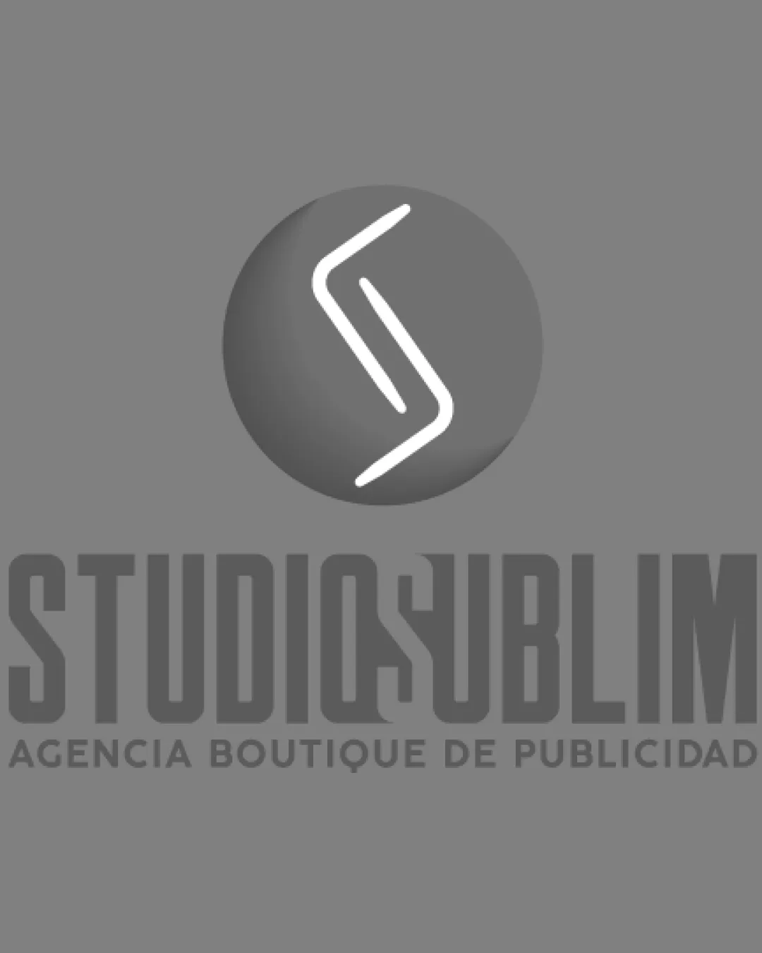
Studiqsublim Agencia Boutique De Publicidad

A visually engaging creative agency logo with strong brand cues, but the Q/S fusion in the wordmark needs refinement for best readability.

Combination Mark Geometric, Contemporary, Bold Advertising/creative Agency
3/5
Legibility
4/5
Originality
5/5
Misread
4/5
Balance
3/5
Scale
Your next steps

What to fix first

Focus on the changes that matter. Keep what makes the logo work.

1

wordmark center (U/S join)

Increase distinction and spacing between the 'Q' and 'S' to improve clarity.

Visible issue High priority Medium effort
Area to inspectApproximate location

The merging of the 'Q' and 'S' letterforms in the center of the wordmark reduces readability, especially at small sizes.

How to check

Preview at reduced sizes and verify both letters are clearly identifiable as 'Q' and 'S'.

See the category review
2

standalone mark (S inside circle)

Test the mark in flat, single-color and small-scale formats.

Worth testing Medium priority Low effort
Area to inspectApproximate location

The highlight/shadow shading on the sphere may lose subtlety in smaller or monochrome applications.

How to check

Render the symbol without gradients to confirm shape recognition at reduced sizes.

See the category review
Detailed review

Logo performance breakdown

4/5

Brief & logo match

Based on an inferred industry
Compared with

Advertising/creative agency with a focus on sophisticated, modern branding.

The logo demonstrates a creative and modern approach with strong industry alignment, though wordmark legibility should be addressed for best effect.

  • Brand Name Representation

    The logo visually reinforces the S in 'STUDIQSUBLIM' through both mark and central wordmark merger, though with some legibility tradeoff.

  • Industry Signaling

    Strong geometric style and abstract mark are aligned with creative/advertising industry expectations.

3/5

Legibility

  • Bold typographic construction
  • Large text is generally readable
  • The merging of the 'Q' and 'S' letterforms in the center of the wordmark reduces readability, especially at small sizes.

    Visible issue wordmark center (U/S join)

    Try: Increase distinction and spacing between the 'Q' and 'S' to improve clarity.

    Check: Preview at reduced sizes and verify both letters are clearly identifiable as 'Q' and 'S'.

    Area to inspectApproximate location
4/5

Originality

  • Distinct S-based concept
  • Geometric style less commonly seen for agencies
3/5

Color harmony

  • Monochrome palette is professional
  • High contrast between symbol and background
Gray#808080
White#FFFFFF
DarkGray#3D3D3D

Estimated colors. Use the original design file for exact values.

Create a full color palette using these colors

Create new palette
4/5

Balance alignment

  • Mark and wordmark are well-centered
  • Vertical axis creates strong presence
  • The mark's vertical orientation and central placement are visually strong, but there is slight visual heaviness at the top; text size could be reduced or mark downscaled for better equilibrium.

    Optional refinement overall composition (relationship between mark and text)

    Try: Test reducing the symbol size relative to the wordmark for visual balance.

    Check: Create mockups for web header and print to compare focal balance.

Uploaded logoAlignment guide overlay

Inspect spacing with the guide. Optical balance may differ from geometric centering.

3/5

Scalability

  • Mark is simple enough for small usage
  • Flat mark could work in single color
  • The highlight/shadow shading on the sphere may lose subtlety in smaller or monochrome applications.

    Worth testing standalone mark (S inside circle)

    Try: Test the mark in flat, single-color and small-scale formats.

    Check: Render the symbol without gradients to confirm shape recognition at reduced sizes.

    Area to inspectApproximate location
Uploaded logo at 200 pixels wide
200 × 250 px
Uploaded logo at 100 pixels wide
100 × 125 px
Uploaded logo at 50 pixels wide
50 × 63 px

Compare the detail at different sizes. Labels show the full image dimensions.

5/5

Misinterpretations

  • No plausible negative interpretations
  • Clear abstract S matches context
4/5

Symbol & text fit

  • Monogram echoes S in the brand name
  • Contemporary style matches wordmark

Black & white

Does the shape still work without color?

These tests are available only for logos uploaded in vector (SVG) format.

Background contrast

Find the surfaces where your logo stays clear.

These tests are available only for logos uploaded in vector (SVG) format.

Blur & silhouette

A 3px blur softens fine details so you can check whether the overall shape stays recognizable. If key gaps close or elements merge, the logo may rely too heavily on detail.

These tests are available only for logos uploaded in vector (SVG) format.

Try your own review

Wondering how your logo performs?

Get a clear logo score, key risks, and priority fix ideas before your client or audience sees it.

Review my logo