 View review
Logo score
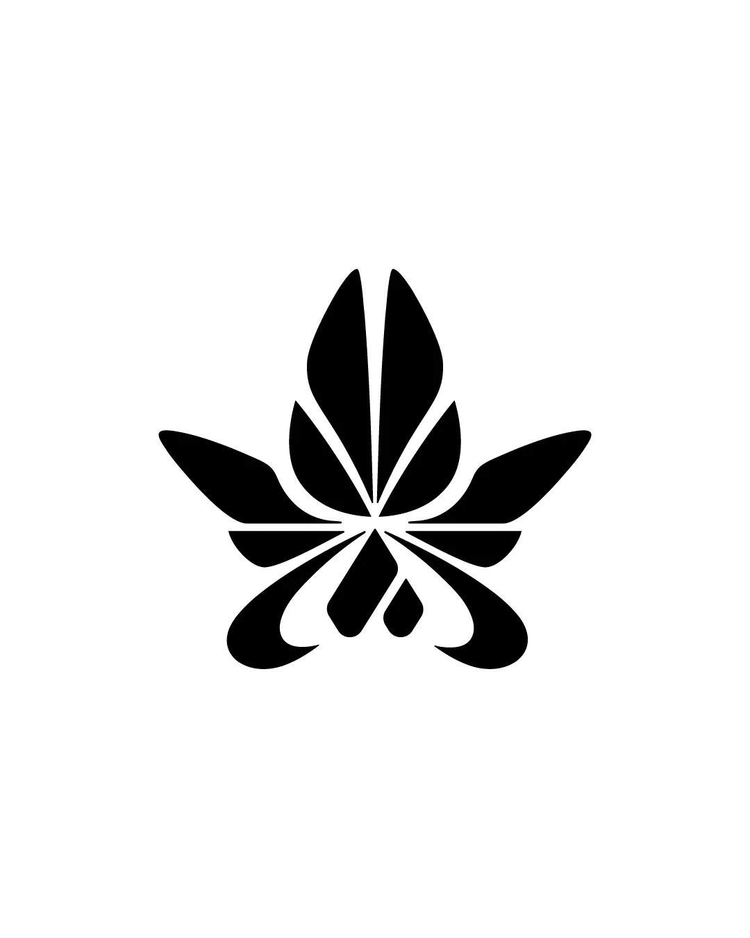
Logo review ofStylized Cannabis Or Lotus Like Leaf With Abstract..
Review the detailed scores below to see what is working and what should be refined first.
Originality
Misread
Balance
Scale
Detailed review
Logo performance breakdown
Originality
![]() The abstract execution and stylization add some uniqueness.
The abstract execution and stylization add some uniqueness.![]() Combination of leaf and drop/diamond motifs is less commonly seen.
Combination of leaf and drop/diamond motifs is less commonly seen.
![]() The overall leaf/lotus form is a very common industry symbol.
The overall leaf/lotus form is a very common industry symbol.![]() Abstracted but not groundbreaking; may blend in among similar competitors.
Abstracted but not groundbreaking; may blend in among similar competitors.
Color harmony
![]() Classic black and white palette maximizes contrast and branding flexibility.
Classic black and white palette maximizes contrast and branding flexibility.![]() Easy to apply and invert on various surfaces.
Easy to apply and invert on various surfaces.
Black
#000000
White
#FFFFFF
Balance alignment
![]() Highly symmetrical composition creates strong visual stability.
Highly symmetrical composition creates strong visual stability.![]() Even distribution of positive and negative space.
Even distribution of positive and negative space.![]() All 'petals' and bottom elements radiate from a central axis.
All 'petals' and bottom elements radiate from a central axis.

Scalability
![]() Simple shapes and thick lines ensure clarity at small sizes.
Simple shapes and thick lines ensure clarity at small sizes.![]() Works well as a favicon, icon, apparel embroidery, or product stamp.
Works well as a favicon, icon, apparel embroidery, or product stamp.![]() High contrast enables good visibility on various backgrounds.
High contrast enables good visibility on various backgrounds.
200x250 px
100×125 px
50×62 px
Misinterpretations
![]() No inappropriate or problematic connotations detected.
No inappropriate or problematic connotations detected.![]() Abstraction prevents misreading as offensive imagery.
Abstraction prevents misreading as offensive imagery.
Try your own review
Review my logo
Wondering how your logo performs?
Get a clear logo score, key risks, and priority fix ideas before your client or audience sees it.
Keep exploring


