Wondering how your logo performs? 🧐
Get professional logo reviews in seconds and catch design issues in time.
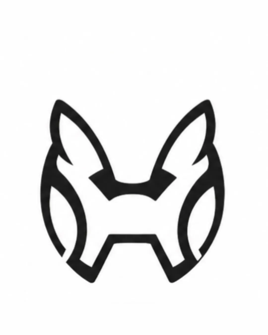
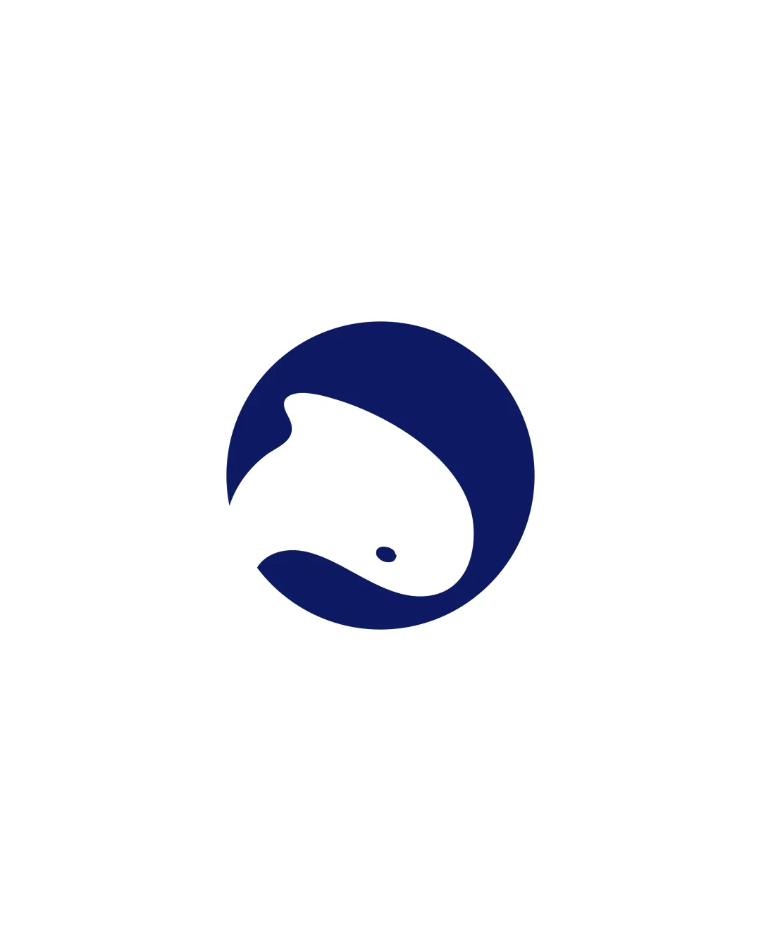
Try it Now!Logo review of stylized fish facing right inside a circle
 Logo analysis by AI
Logo type:
Style:
Detected symbol:
Negative space:
Business industry:
Review requested by Ryan_dynamite
**If AI can recognize or misinterpret it, so can people.
Structured logo review
Scalability versatility
![]() Bold, simple shapes make it highly scalable for everything from business cards to billboards.
Bold, simple shapes make it highly scalable for everything from business cards to billboards.![]() Strong contrast and solid fill will work well for embroidery, product packaging, and digital use.
Strong contrast and solid fill will work well for embroidery, product packaging, and digital use.
200x250 px
100×125 px
50×62 px
Balance alignment
![]() The fish is perfectly balanced inside the circle.
The fish is perfectly balanced inside the circle.![]() Symmetric composition with a stable visual weight.
Symmetric composition with a stable visual weight.

Originality
![]() Smart use of negative space for the fish body.
Smart use of negative space for the fish body.![]() Distinctive within its style and industry.
Distinctive within its style and industry.
![]() The circular fish motif is not uncommon in seafood and marine branding.
The circular fish motif is not uncommon in seafood and marine branding.
Aesthetic look
![]() Minimal and elegant design.
Minimal and elegant design.![]() Clean lines and no unnecessary details.
Clean lines and no unnecessary details.
Dual meaning and misinterpretations
![]() No accidental inappropriate or misleading imagery detected.
No accidental inappropriate or misleading imagery detected.
Color harmony
![]() Minimal color palette ensures clarity and professionalism.
Minimal color palette ensures clarity and professionalism.![]() Excellent contrast between dark blue and white.
Excellent contrast between dark blue and white.
Dark Blue
#0A1959
White
#FFFFFF