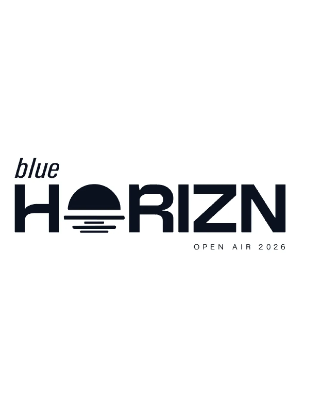
blue HORIZN OPEN AIR 2026 logo review
4.4 / 5
Logo score
Logo review of

Blue Horizn Open Air 2026

Well-designed, distinctive, and appropriate for a music festival. Make small refinements for maximum versatility and polish.

Combination Mark Modern Geometric Wordmark Music Festival
4.5/5
Legibility
4.5/5
Originality
5/5
Misread
4/5
Balance
4/5
Scale
Action plan

What to fix first

The most important fixes to handle before polishing the full presentation.

1

Increase the visual connection of 'blue' with the rest of the wordmark or experiment with position/size to ensure hierarchy and integration.

Medium priority

Currently, 'blue' appears slightly disconnected, reducing overall cohesion.

Impact: Improves First-glance Brand Coherence And Visual Unity · Effort: Low

2

Test the logo at small sizes and increase underline thickness if needed to prevent loss of detail in the horizon lines under the 'O'.

Medium priority

Thin lines risk dropping out when logo is reduced.

Impact: Ensures Logo Versatility Across Print And Digital Use-cases · Effort: Low

Detailed review

Logo performance breakdown

4.5/5

Legibility

Checkmark icon All main text is easily readable
Checkmark icon Distinct letterforms

Warning icon Sun/horizon graphic slightly complicates 'O' reading for some viewers

4.5/5

Originality

Checkmark icon Clever integration of the horizon/sunset into the letter 'O'
Checkmark icon Modern twist on a geometric wordmark

Warning icon Sunset/sun motif is reasonably common in event/festival branding

4.5/5

Color harmony

Checkmark icon Simple, effective color use
Checkmark icon High contrast for visibility

Warning icon Limited palette; could add a highlight for vibrancy but not required

Ebony
#12161B

White
#FFFFFF

Your palette is close. Explore sharper color combinations with Colorfly.design before updating the logo.

Explore palettes
4/5

Balance alignment

Checkmark icon Even letter spacing
Checkmark icon Consistent baseline and clear hierarchy

Warning icon 'blue' feels visually detached from the main wordmark

logo 200x250 pixels scalability test alignment grid overlay
4/5

Scalability

Checkmark icon Minimal detail enables good scalability
Checkmark icon Bold lines maintain clarity at smaller sizes

Warning icon Thin lines beneath the sun may disappear at small sizes

logo 200x250 pixels scalability test

200x250 px

logo 100x125 pixels scalability test

100×125 px

logo 50x62 pixels scalability test

50×62 px

5/5

Misinterpretations

Checkmark icon No inappropriate or unintended visual readings

5 / 5

Logo structure & brief match

Checkmark icon Integrated mark and wordmark offer a unified appearance

Checkmark icon Musik Festival: Logo is energetic and modern, with a sunrise/sunset motif signaling outdoor, musical, or open-air themes. Fits well for festival atmosphere.

Try your own review

Wondering how your logo performs?

Get a clear logo score, key risks, and priority fix ideas before your client or audience sees it.

Review my logo