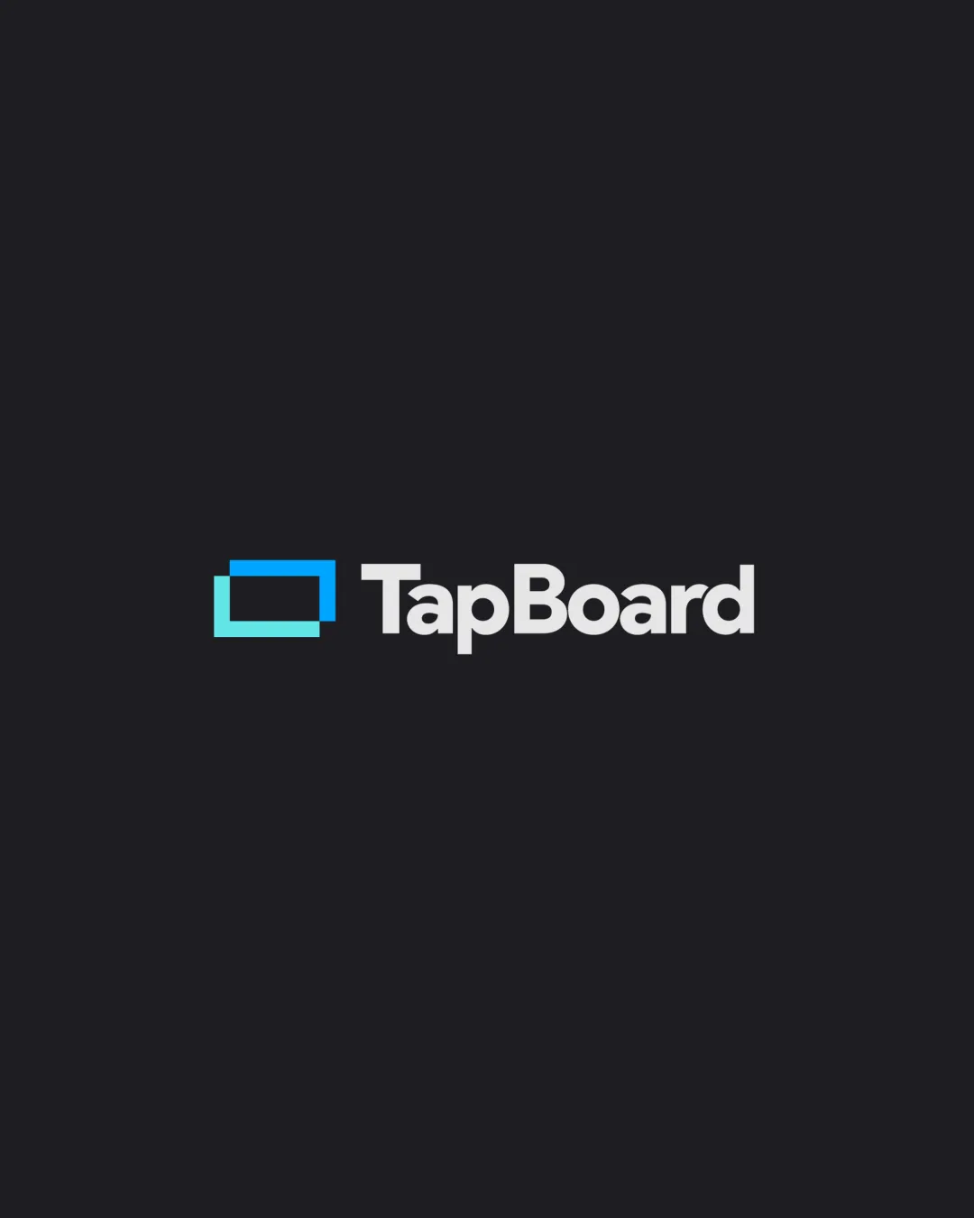
TapBoard logo review
3.5/5
Logo score
Logo review of

Tapboard

A clean and clear tech logo, but the symbol lacks hospitality-specific cues and could be more distinctive.

Combination Clean, Geometric, Modern Technology/hospitality
5/5
Legibility
2.5/5
Originality
5/5
Misread
4/5
Balance
4/5
Scale
Your next steps

What to fix first

Focus on the changes that matter. Keep what makes the logo work.

1

Standalone mark

Introduce a distinctive detail or motif tying the mark to bar/restaurant context or interactivity.

Visible issue High priority Medium effort
Area to inspectApproximate location

The open rectangle is a common, generic mark for screens, tablets, or boards and lacks unique brand cues.

How to check

Check if the mark stands out among SaaS/web/menu product logos.

See the category review
2

combination lockup

Consider integrating a subtle menu, drink, or interaction element into the mark.

Optional refinement Medium priority Medium effort

While the symbol and wordmark align visually, the standalone mark does not clearly connect to the 'TapBoard' name or its bar/restaurant niche.

How to check

Test if users can connect the symbol to both the industry and name.

See the category review
Detailed review

Logo performance breakdown

3.5/5

Brief & logo match

Based on your brief
Compared with

Saas for online web menu for bars and restaraunts

The logo fits the tech/platform aspect well but doesn't visually cue bars/restaurants, limiting niche memorability.

  • SaaS/web Menu Solution

    Screen/board mark and clean tech font support the SaaS/menu concept.

  • Bars/restaurants Niche

    Logo does not visually reference hospitality, drinks, or food directly.

5/5

Legibility

  • Excellent contrast and clear modern font.
2.5/5

Originality

  • The open rectangle is a common, generic mark for screens, tablets, or boards and lacks unique brand cues.

    Visible issue Standalone mark

    Try: Introduce a distinctive detail or motif tying the mark to bar/restaurant context or interactivity.

    Check: Check if the mark stands out among SaaS/web/menu product logos.
    Area to inspectApproximate location
4/5

Color harmony

  • Blue and white provide fresh, tech-forward feel.
Blue#00CFFF
White#FFFFFF
Charcoal#181820

Estimated colors. Use the original design file for exact values.

Create a full color palette using these colors

Create new palette
4/5

Balance alignment

  • Good mark-wordmark alignment and spacing.
Uploaded logoAlignment guide overlay

Inspect spacing with the guide. Optical balance may differ from geometric centering.

4/5

Scalability

  • Simple shapes and clear boundaries allow good scalability.
Uploaded logo at 200 pixels wide
200 × 250 px
Uploaded logo at 100 pixels wide
100 × 125 px
Uploaded logo at 50 pixels wide
50 × 63 px

Compare the detail at different sizes. Labels show the full image dimensions.

5/5

Misinterpretations

  • No misreadings or negative connotations.
3/5

Symbol & text fit

  • Uniform style and balance.
  • While the symbol and wordmark align visually, the standalone mark does not clearly connect to the 'TapBoard' name or its bar/restaurant niche.

    Optional refinement combination lockup

    Try: Consider integrating a subtle menu, drink, or interaction element into the mark.

    Check: Test if users can connect the symbol to both the industry and name.

Black & white

Does the shape still work without color?

These tests are available only for logos uploaded in vector (SVG) format.

Background contrast

Find the surfaces where your logo stays clear.

These tests are available only for logos uploaded in vector (SVG) format.

Blur & silhouette

A 3px blur softens fine details so you can check whether the overall shape stays recognizable. If key gaps close or elements merge, the logo may rely too heavily on detail.

These tests are available only for logos uploaded in vector (SVG) format.

Try your own review

Wondering how your logo performs?

Get a clear logo score, key risks, and priority fix ideas before your client or audience sees it.

Review my logo