 View review
Logo score
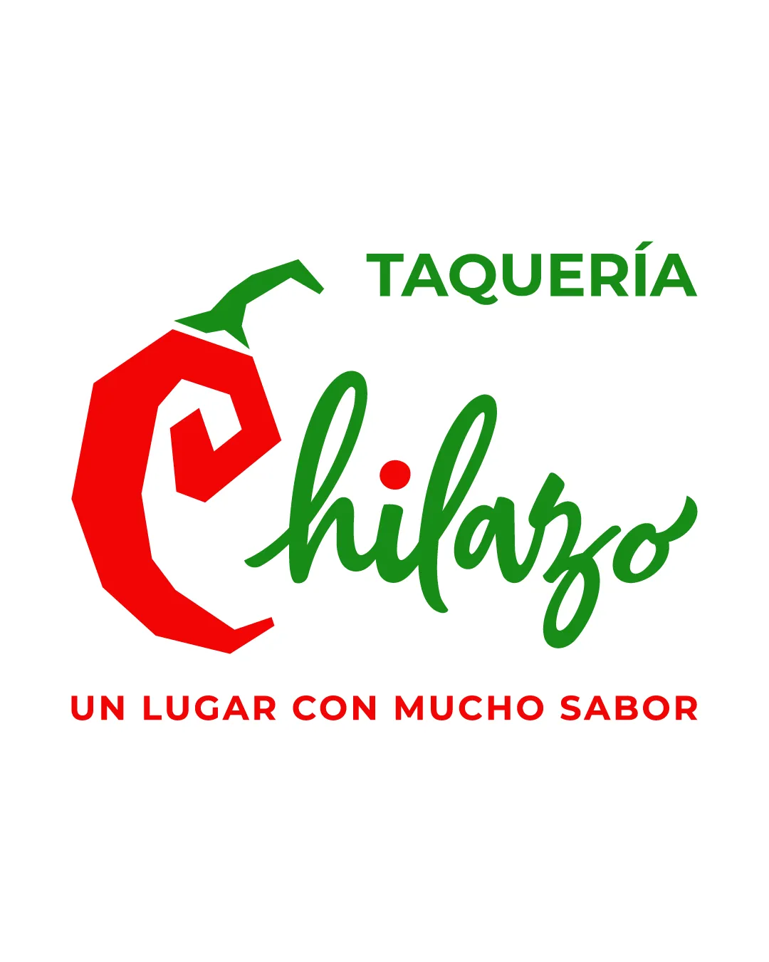
Logo review ofTaquería Chilazo Un Lugar Con Mucho Sabor
Review the detailed scores below to see what is working and what should be refined first.
Legibility
Originality
Misread
Balance
Scale
Detailed review
Logo performance breakdown
Legibility
![]() All text is clear and readable.
All text is clear and readable.![]() Good contrast between the vibrant red/green and the white background.
Good contrast between the vibrant red/green and the white background.![]() Different font weights and styles create a clear hierarchy.
Different font weights and styles create a clear hierarchy.
![]() The script font for 'chilazo' may have minor legibility issues at small sizes or from afar.
The script font for 'chilazo' may have minor legibility issues at small sizes or from afar.
Originality
![]() Chili pepper forming a 'C' shape is a recognizable nod to spiciness and the name.
Chili pepper forming a 'C' shape is a recognizable nod to spiciness and the name.![]() Custom script for 'chilazo' adds some distinctiveness.
Custom script for 'chilazo' adds some distinctiveness.
![]() Chili peppers are very common in food/restaurant logos, making the core concept generic.
Chili peppers are very common in food/restaurant logos, making the core concept generic.![]() No unique or unexpected twist on the chili iconography.
No unique or unexpected twist on the chili iconography.
Color harmony
![]() Consistent use of red and green fits the cuisine and theme.
Consistent use of red and green fits the cuisine and theme.
![]() Red and green pairing is somewhat predictable and lacks originality.
Red and green pairing is somewhat predictable and lacks originality.![]() Colors might clash slightly for colorblind users.
Colors might clash slightly for colorblind users.
Red
#EA1818
Green
#2F8A30
White
#FFFFFF
Color may be holding this logo back. Explore stronger palette options with Colorfly.design before updating the logo.
Explore palettesBalance alignment
![]() Chili mark and word interplay create energy and movement.
Chili mark and word interplay create energy and movement.![]() All elements are horizontally centered.
All elements are horizontally centered.
![]() Upper 'TAQUERÍA' feels visually disconnected and top-heavy compared to the rest of the design.
Upper 'TAQUERÍA' feels visually disconnected and top-heavy compared to the rest of the design.![]() 'chilazo' script is lower, making the overall stack feel imbalanced.
'chilazo' script is lower, making the overall stack feel imbalanced.![]() Chili mark on the left is bold, drawing most attention away from text.
Chili mark on the left is bold, drawing most attention away from text.

Scalability
![]() Bold lines and clear forms support moderate scalability.
Bold lines and clear forms support moderate scalability.![]() Simple color palette aids clean reproduction on various backgrounds.
Simple color palette aids clean reproduction on various backgrounds.
![]() The script font and the illustrative chili mark may lose detail on small formats, such as embroidery or small product labels.
The script font and the illustrative chili mark may lose detail on small formats, such as embroidery or small product labels.![]() Might not be as easily recognizable as a favicon or at tiny sizes.
Might not be as easily recognizable as a favicon or at tiny sizes.
200x250 px
100×125 px
50×62 px
Misinterpretations
![]() No inappropriate or unintended symbols detected.
No inappropriate or unintended symbols detected.
Symbol & text fit
![]() Chili pepper 'C' integrates into the wordmark fluidly.
Chili pepper 'C' integrates into the wordmark fluidly.
![]() Shared green from both mark and script links symbol and type.
Shared green from both mark and script links symbol and type.
![]() Size ratio between the symbol and wordmark is somewhat disproportionate, making the logomark dominant.
Size ratio between the symbol and wordmark is somewhat disproportionate, making the logomark dominant.
![]() Sans-serif above and script below create slight style dissonance.
Sans-serif above and script below create slight style dissonance.
Try your own review
Review my logo
Wondering how your logo performs?
Get a clear logo score, key risks, and priority fix ideas before your client or audience sees it.
Keep exploring


