Wondering how your logo performs? 🧐
Get professional logo reviews in seconds and catch design issues in time.
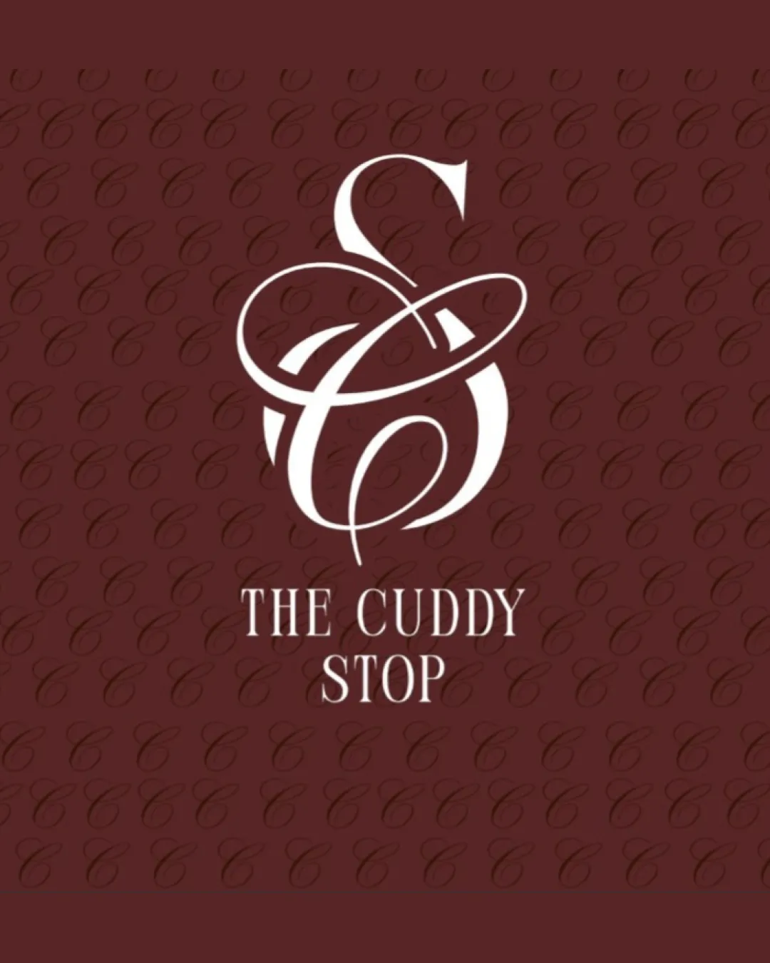
Try it Now!Logo review of THE CUDDY STOP
 Logo analysis by AI
Logo type:
Style:
Detected symbol:
Detected text:
Business industry:
Review requested by Tyra
**If AI can recognize or misinterpret it, so can people.
Structured logo review
Legibility
![]() The wordmark 'THE CUDDY STOP' is clear and uses a traditional serif font.
The wordmark 'THE CUDDY STOP' is clear and uses a traditional serif font.![]() Contrast between text and background supports readability.
Contrast between text and background supports readability.
![]() The script monogram's elaborate flourishes make the 'C' and 'S' difficult to decipher at first glance.
The script monogram's elaborate flourishes make the 'C' and 'S' difficult to decipher at first glance.![]() Monogram could cause confusion when scaled down or viewed from a distance.
Monogram could cause confusion when scaled down or viewed from a distance.
Scalability versatility
![]() Strong contrast ensures the logo stands out on dark backgrounds.
Strong contrast ensures the logo stands out on dark backgrounds.![]() Wordmark alone could work across simpler applications.
Wordmark alone could work across simpler applications.
![]() Highly detailed script monogram is likely to lose clarity at small sizes (business cards, embroidery, favicons).
Highly detailed script monogram is likely to lose clarity at small sizes (business cards, embroidery, favicons).![]() Complexity hinders legibility in single-color or compact applications such as stamps.
Complexity hinders legibility in single-color or compact applications such as stamps.
200x250 px
100×125 px
50×62 px
Balance alignment
![]() The monogram is centered above the wordmark for clear visual hierarchy.
The monogram is centered above the wordmark for clear visual hierarchy.![]() Wordmark is vertically aligned and spaced for readability.
Wordmark is vertically aligned and spaced for readability.
![]() Heavily flourished monogram draws disproportionate visual weight compared to the reserved wordmark.
Heavily flourished monogram draws disproportionate visual weight compared to the reserved wordmark.![]() Negative space around the monogram could be optimized for better compositional flow.
Negative space around the monogram could be optimized for better compositional flow.

Originality
![]() Custom, decorated monogram provides a sense of uniqueness and luxury.
Custom, decorated monogram provides a sense of uniqueness and luxury.![]() Stylized merging of letters is more distinctive than generic icons.
Stylized merging of letters is more distinctive than generic icons.
![]() Flourished initials are a popular motif in hospitality and boutique branding, which makes it less than truly original.
Flourished initials are a popular motif in hospitality and boutique branding, which makes it less than truly original.![]() No notable use of negative space for hidden meaning or added interest.
No notable use of negative space for hidden meaning or added interest.
Logomark wordmark fit
![]() Both components share an elegant, formal theme.
Both components share an elegant, formal theme.
![]() Script monogram is highly elaborate, contrasting with the restrained wordmark.
Script monogram is highly elaborate, contrasting with the restrained wordmark.![]() The style mismatch could be reduced by subtly integrating serif elements into the monogram or using a more refined serif for the wordmark.
The style mismatch could be reduced by subtly integrating serif elements into the monogram or using a more refined serif for the wordmark.
Aesthetic look
![]() Elegant color palette conveys sophistication.
Elegant color palette conveys sophistication.![]() Calligraphic strokes suggest a high-quality, inviting establishment.
Calligraphic strokes suggest a high-quality, inviting establishment.
![]() Complex flourishes risk appearing cluttered, especially in reduced formats.
Complex flourishes risk appearing cluttered, especially in reduced formats.![]() Background pattern may be distracting or dated in some applications.
Background pattern may be distracting or dated in some applications.
Dual meaning and misinterpretations
![]() No unintended shapes or inappropriate visual connotations detected in the logo composition.
No unintended shapes or inappropriate visual connotations detected in the logo composition.
Color harmony
![]() Limited, tasteful color palette feels unified and elegant.
Limited, tasteful color palette feels unified and elegant.![]() High-contrast pairing ensures legibility and visual appeal.
High-contrast pairing ensures legibility and visual appeal.
Dark Red
#642525
White
#FFFFFF