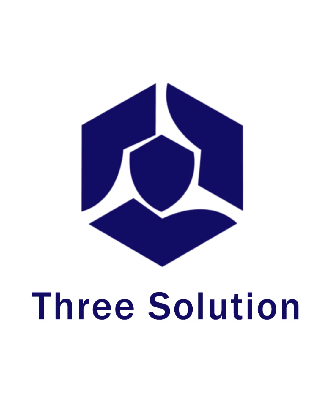
Three Solution logo review
4.4 / 5
Logo score

Logo review ofThree Solution

Solid, professional mark for a tech-focused business; can proceed with refinements.

Combination Mark Minimalist Geometric Technology
5/5
Legibility
3/5
Originality
5/5
Misread
5/5
Balance
4/5
Scale
Review next
Action plan

What to fix first

The most important fixes to handle before polishing the full presentation.

1

Enhance detail retention in the symbol for small-size use (e.g. simplify the inner elements or increase spacing).

Medium priority

Inner shield and curves may merge at small scale.

Impact: Improves Recognizability And Flexibility Across Digital/print Sizes. · Effort: Medium

2

Explore subtle secondary accent color options to add depth or hierarchy.

Low priority

Single-color style feels slightly stark and one-dimensional.

Impact: Could Introduce More Personality While Preserving Professional Look. · Effort: Low

Detailed review

Logo performance breakdown

5/5

Legibility

Checkmark icon Text is clear and easy to read
Checkmark icon Font choice maintains high legibility

3/5

Originality

Checkmark icon Central shield and segmented hexagon show some unique structuring

Warning icon Geometric hexagon is a common motif, somewhat generic look

4/5

Color harmony

Checkmark icon Strong contrast between navy blue and white
Checkmark icon Consistent use of a restrained color palette

Warning icon Single color may appear stark in some applications; lacks secondary accent

Navy Blue
#101675

White
#FFFFFF

Your palette is close. Explore sharper color combinations with Colorfly.design before updating the logo.

Explore palettes
5/5

Balance alignment

Checkmark icon Hexagon is well-centered over the text
Checkmark icon Consistent spacing between symbol and text

logo 200x250 pixels scalability test alignment grid overlay
4/5

Scalability

Checkmark icon Simple geometric shapes scale well
Checkmark icon Solid, single-color design aids versatility

Warning icon Small central shapes may lose detail at very small sizes

logo 200x250 pixels scalability test

200x250 px

logo 100x125 pixels scalability test

100×125 px

logo 50x62 pixels scalability test

50×62 px

5/5

Misinterpretations

Checkmark icon No unintended or inappropriate visual readings detected

5 / 5

Logo structure & brief match

Checkmark icon Mark and wordmark are visually compatible in weight and style

Checkmark icon Industry: Suitably modern and geometric for a technology or software solutions company.
Checkmark icon Name Fit: Three shapes and central element support 'Three Solution' theme.

Try your own review

Wondering how your logo performs?

Get a clear logo score, key risks, and priority fix ideas before your client or audience sees it.

Review my logo