View review
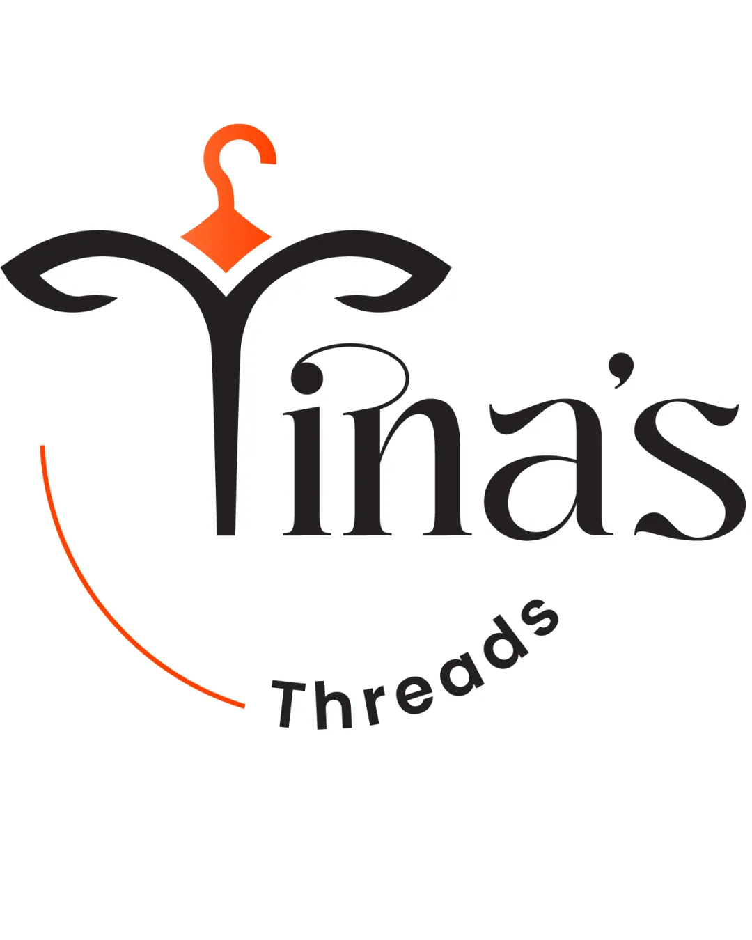
Logo review ofTina's Threads
Review the detailed scores below to see what is working and what should be refined first.
Logo performance breakdown
Legibility
Main text 'Tina's' is clear and uses a legible serif font
Contrast between text and background is strong
'Threads' is slightly less prominent and could be harder to read at very small sizes
Decorative swirls near top of 'T' may be slightly distracting for quick readability

Originality
Integrating a hanger into the 'T' is clever and relevant to fashion
Unique type treatment
Clothing hangers are a somewhat overused symbol in the fashion sector, though the execution here is more creative than average
Color harmony
Limited, harmonious palette of orange and black creates strong contrast and visual appeal
Orange
#FF4F18
Black
#181716
White
#FFFFFF
Balance alignment
Centralized alignment between symbol and wordmark
Arc of 'Threads' balances lower space
Decorative swoops in 'T' feel visually heavy compared to lower text elements
'Threads' arc feels slightly disconnected from core wordmark
Scalability
Simple color palette aids scaling
Distinct symbol could work well on apparel tags or store signage
Thin lines and detailed curves in the 'T' and hanger symbol may lose clarity at smaller sizes (e.g., favicons, embroidery)
'Threads' might disappear at tiny scales
200x250 px
100×125 px
50×62 px
Misinterpretations
No inappropriate or confusing double meanings detected
Symbol & text fit
Hanger symbol effectively references the industry and connects to the word 'Tina's'
The 'T' symbol is visually dominant and overshadows the rest of the wordmark, potentially creating imbalance
Wondering how your logo performs?
Get a clear logo score, key risks, and priority fix ideas before your client or audience sees it.