Simplify handshake detail or stylize further for clarity at small sizes.
The handshake may lose clarity or clutter the logo when used in smaller formats.
Improves legibility and scalability for varied platforms.
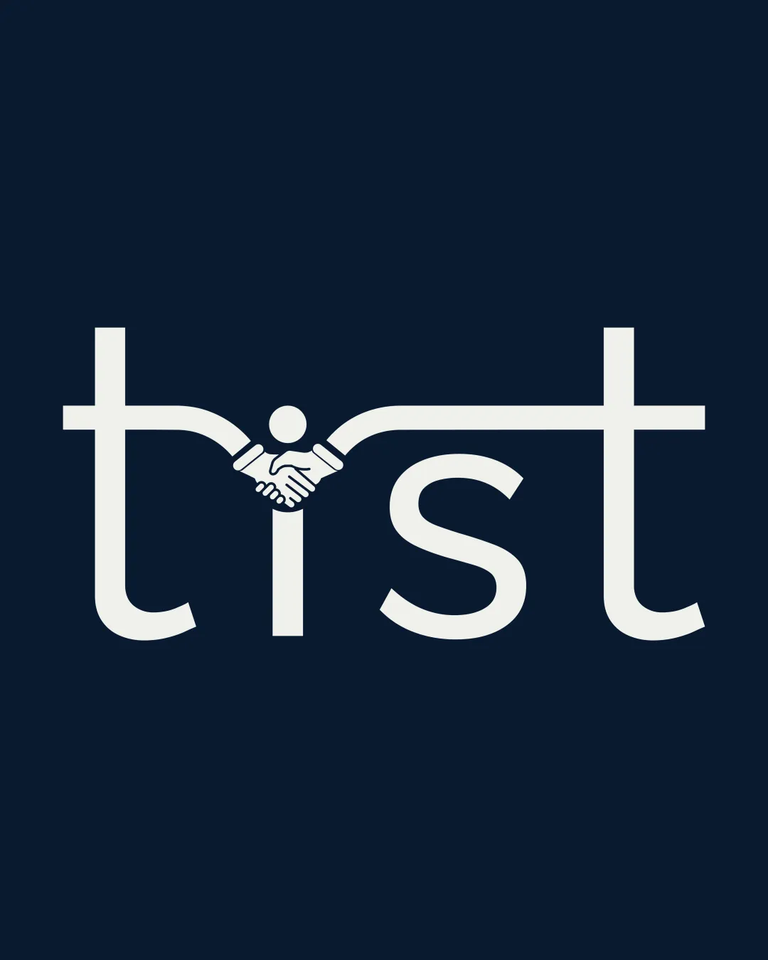
Distinctive and relevant, but needs minor adjustments for full professional use.
Focus on the changes that matter. Keep what makes the logo work.
The handshake may lose clarity or clutter the logo when used in smaller formats.
Improves legibility and scalability for varied platforms.
Slight asymmetry reduces overall refinement and could distract in certain applications.
Enhances balance and professional polish.
The handshake icon effectively communicates trust, authenticity, and partnership. The serif-like, slightly traditional type supports a sense of heritage.
Estimated colors. Use the original design file for exact values.
Create a full color palette using these colors
Create new palette
Inspect spacing with the guide. Optical balance may differ from geometric centering.
Get a clear logo score, key risks, and priority fix ideas before your client or audience sees it.
More credits needed
Add credits to continue without losing your work.
Then $7/month. Cancel anytime.
Essential logo review with AI
Estimated progress