View review
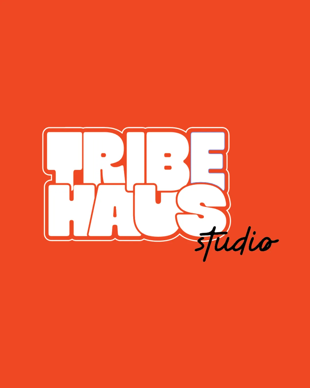
Tribe Haus Studio
Review the detailed scores below to see what is working and what should be refined first.
Logo performance breakdown
Legibility
Primary text is bold and high-contrast against the background for instant readability.
Secondary script 'studio' offers style contrast and is still readable.
Handwritten 'studio' is significantly thinner and might lose legibility at small sizes or on textured backgrounds.
Slight crowding in the bold block text may impact recognition at a glance.

Originality
Retro bubble block type with a contrasting handwritten script provides character and distinctiveness.
Good creative mix of geometric and personal styles.
Style combo has been seen in pop culture/retro-themed brands, so while playful, it's not groundbreaking.
Color harmony
Vivid orange backdrop is cohesive and energetic, paired with white and black for strong contrast.
Limit of three colors keeps palette efficient and brand-appropriate.
Bright orange may not reproduce consistently across all print methods and can be overwhelming in large applications.
Flame Orange
#F04E23
White
#FFFFFF
Black
#000000
Your palette is close. Refine the color roles and combinations before updating the logo.
Build brand colorsBalance alignment
Overall rectangular form provides a firm structure.
Script 'studio' intentionally breaks the block for emphasis and adds dynamism.
Script 'studio' is awkwardly placed, clashing stylistically and visually with the heavy block above.
Block wordmark overwhelms the lighter script, making the bottom feel asymmetrical.
Scalability
Block wordmark ensures the main brand name remains distinguishable at mid-to-large sizes.
Flat color approach is adaptable to print and web contexts.
Fine script for 'studio' will disappear or blur at small sizes, such as business cards, social icons, or embroidery.
The stacked, dense block format may be limiting for long, horizontal layouts.
200x250 px
100×125 px
50×62 px
Misinterpretations
No inappropriate or unintended meanings detected in form or negative space.
Symbol & text fit
Separation of primary and secondary text creates visual hierarchy.
The friendship between the thick block and fragile script feels forced rather than cohesive.
Difference in weight and style reduces overall unity.
Wondering how your logo performs?
Get a clear logo score, key risks, and priority fix ideas before your client or audience sees it.