What to preserve
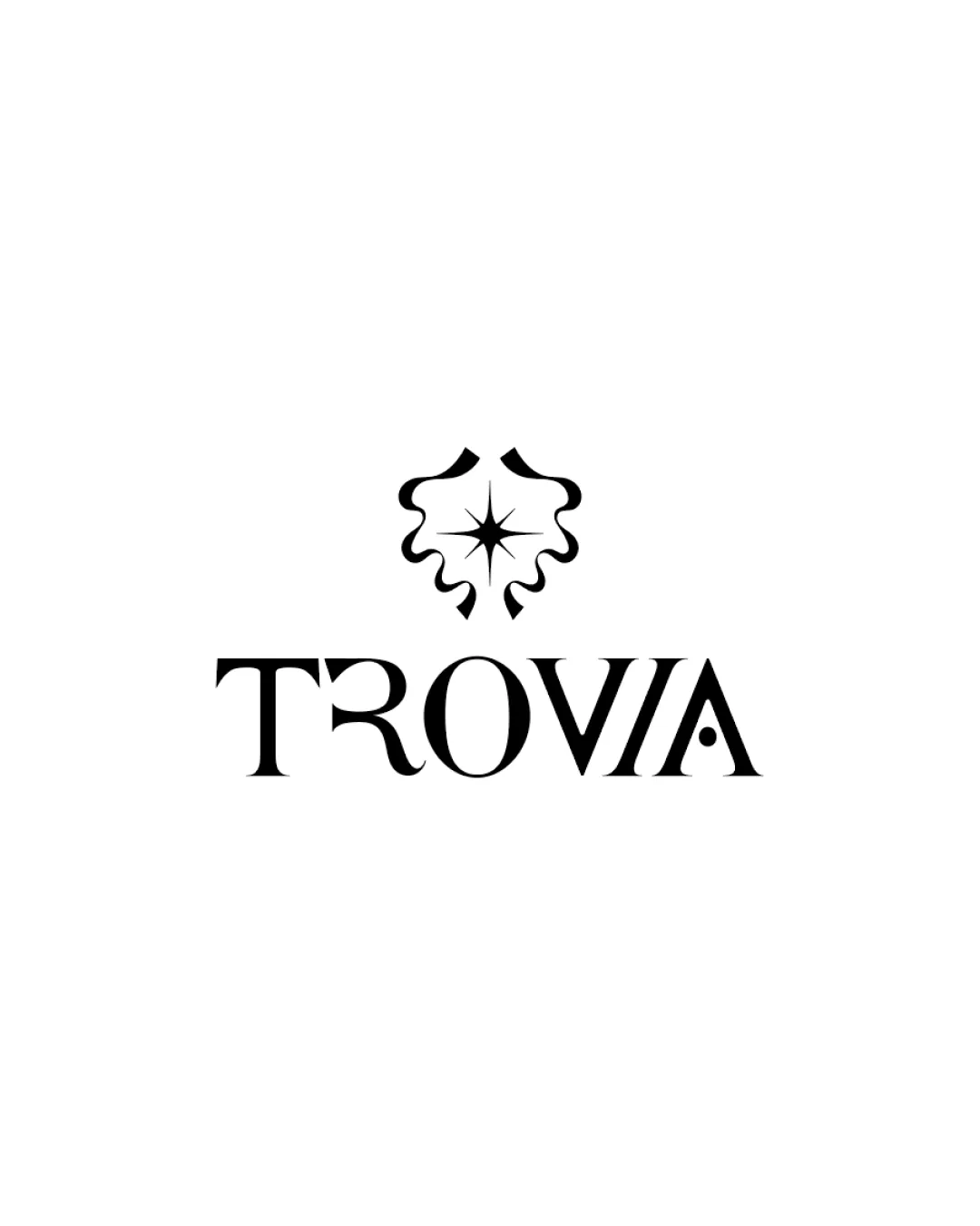
An elegant, ornamental motif paired with sophisticated serif typography evokes a sense of sophistication and style suited for a girl's fashion shop.
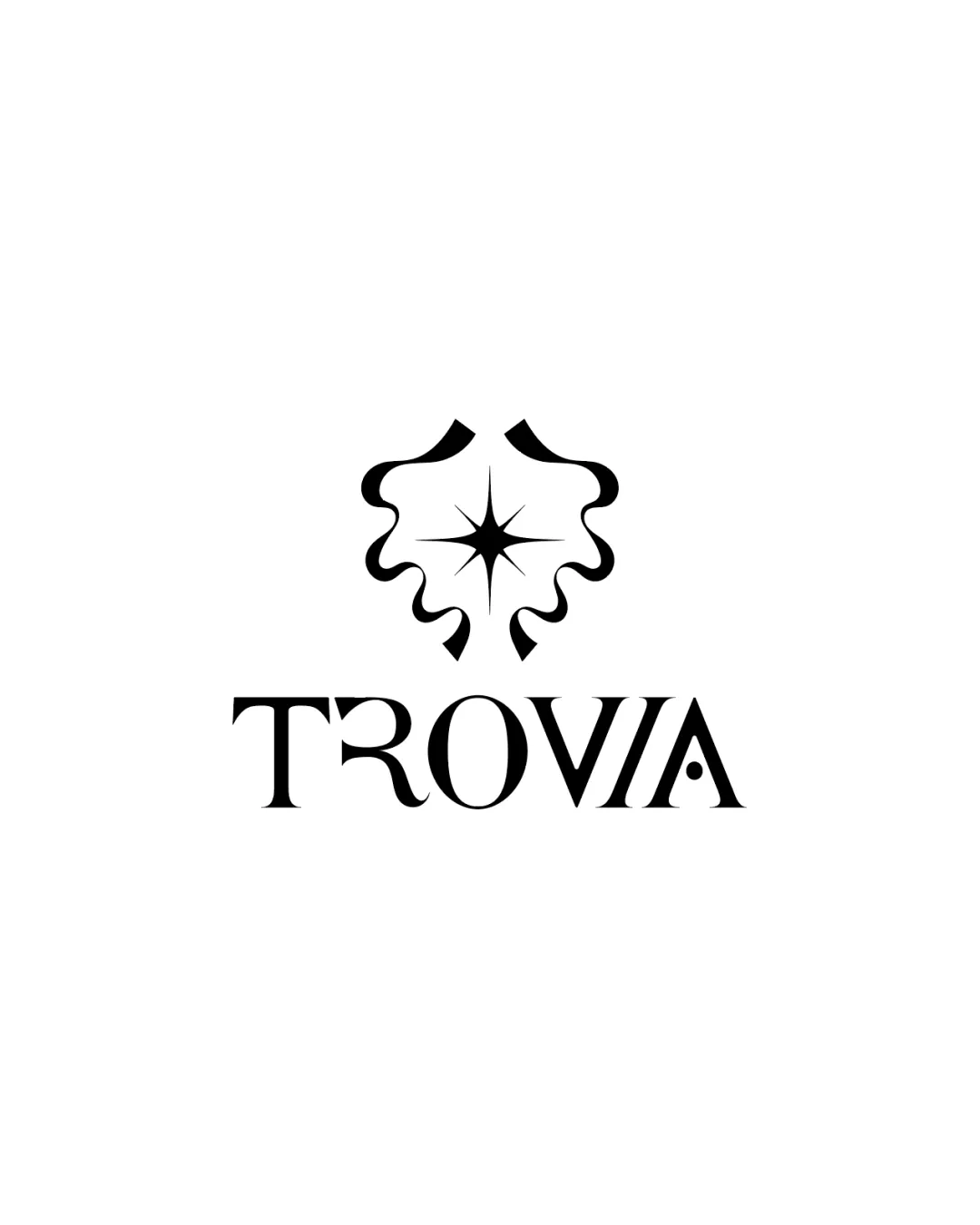
An elegant and appropriate logo for a girl's fashion shop, with a strong concept and style fit; consistent kerning is needed for a premier polish.
This logo lockup shows strong execution, supported by distinctive construction and text readability; improving visual balance is the clearest next step.
Focus on the changes that matter. Keep what makes the logo work.
An elegant, ornamental motif paired with sophisticated serif typography evokes a sense of sophistication and style suited for a girl's fashion shop.
Logo preview unavailable. The written feedback is still available on this card.
wordmark spacing and motif alignment
There is uneven spacing in the wordmark, especially between the 'T' and 'R', as well as between 'I' and 'A', which disrupts uniformity and visual flow needed in luxury/fashion logos.
See the category reviewThe elegant motif and upscale typography reflect the sophistication and stylistic appeal expected of a girl fashion shop, with only kerning requiring polish.
Wordmark 5/5 · Layout 5/5
Symbol 4/5 · Wordmark 4/5
Symbol 4/5 · Wordmark 4/5 · Layout 4/5
The ornate, swirling standalone motif complements the sophisticated type, but the geometric sharpness of the star shape is a slight style contrast with the softer type curves.
Symbol 4/5 · Wordmark 3/5 · Layout 4/5
There is uneven spacing in the wordmark, especially between the 'T' and 'R', as well as between 'I' and 'A', which disrupts uniformity and visual flow needed in luxury/fashion logos.
Try: Adjust kerning for more consistent letter spacing.
Logo preview unavailable. The written feedback is still available on this card.

Inspect spacing with the guide. Optical balance may differ from geometric centering.
Get a clear logo score, key risks, and priority fix ideas before your client or audience sees it.
More credits needed
Add credits to continue without losing your work.
Then $7/month. Cancel anytime.
Essential logo review with AI
Estimated progress