View review
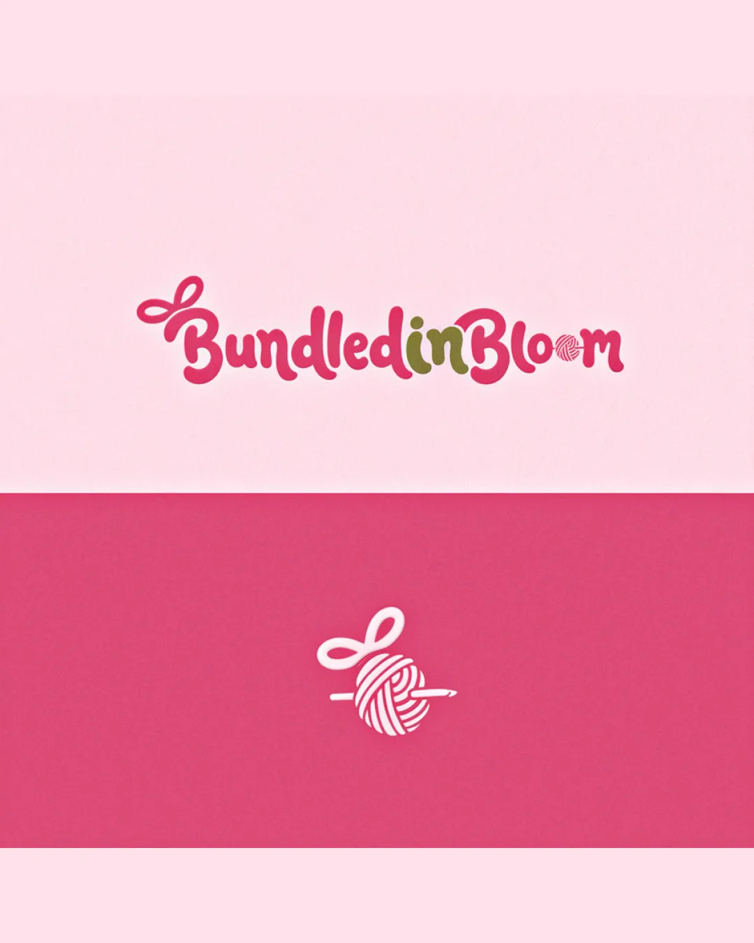
Bundled In Bloom
Polished, playful, effective for a craft/nursery business; minor tweaks will bring it to a fully professional level.
What to fix first
The most important fixes to handle before polishing the full presentation.
Increase legibility of 'o' in 'Bloom' without losing the yarn ball concept (consider simplifying lines or shifting balance of illustration and letterform).
High priorityCritical to ensure the brand name is quickly and clearly read at all sizes and contexts.
Impact: Improves Immediate Readability And Reduces Minor Cognitive Friction For Viewers. · Effort: Medium
Adjust olive green 'in' color to better harmonize with the rest of the palette, possibly using a pink/red/purple shade.
Medium priorityPalette unity improves brand perception and visual elegance.
Impact: Creates A More Cohesive, Unified Look Across The Wordmark. · Effort: Low
Logo performance breakdown
Legibility
Handwritten style is generally readable.
Text is playful and friendly.
The 'o' in 'Bloom' (yarn ball) is less legible as a letter, creating slight reading friction.
Originality
Custom yarn ball-crochet hook as 'o' is a distinctive detail.
Unique illustrative elements.
Script style is somewhat common; not radically original in the wordmark itself.
Color harmony
Palette is harmonious and soft, fitting the craft/nursery field.
Contrast supports visibility.
Use of olive green on 'in' is less cohesive with the rest of the color choices.
Cranberry
#EA5A89
Pink
#F5BEDD
Olive Green
#8B9441
White
#FFFFFF
Your palette is close. Refine the color roles and combinations before updating the logo.
Build brand colorsBalance alignment
Wordmark and mark are visually balanced.
Letter spacing and curvature are well-controlled.
Scalability
Mark is clear and recognizable at small sizes.
Minimal fine detail supports scaling.
Text may lose some clarity at very small sizes due to script style and the detailed 'o' symbol.
200x250 px
100×125 px
50×62 px
Misinterpretations
Symbol and shapes are clear and do not suggest unintended meanings.
No AI design signals found
Likely designed by a human
Construction and hand-drawn details look deliberate and cohesive; no signs of AI artifacting.
- Yarn ball and bow have controlled line flow and intentional illustrative logic.
Visual assessment; not definitive proof of authorship.
Logo structure & brief match
Yarn and hook fits theme and integrates well with wordmark.
Crafts Or Handmade Industry: The yarn/crochet theme and soft, playful palette are well suited to a boutique or crafting business.
Wondering how your logo performs?
Get a clear logo score, key risks, and priority fix ideas before your client or audience sees it.